

How Seasonal Color Analysis Can Inspire Your Home Style

Most of us discover seasonal color analysis through our closets long before we ever think about our homes.
Maybe you’ve had that moment yourself — you drape a soft blue scarf around your shoulders and suddenly your eyes seem brighter. A muted olive sweater brings warmth to your complexion, while another shade you’ve always loved leaves you looking unexpectedly tired. It’s subtle, but once you notice it, something shifts.
Seasonal color analysis changes not only how we dress, but how we see. We stop chasing whatever happens to be trending and begin choosing what feels instinctive — what feels like us.
And almost without realizing it, that awareness begins to spill into the rest of life.
The colors we’re drawn to don’t stay tucked inside our wardrobes. They appear in the flowers we bring home from the market, the hotels we bookmark for future trips, the pottery that catches our eye in a shop window, the linens we reach for without thinking, and the homes that linger in our memory long after we’ve left them.
It’s no coincidence.
Color shapes atmosphere, and atmosphere shapes our experience of a space.
Someone who loves the weathered, misty blues of Soft Summer often feels instantly at ease in coastal cottages with linen curtains and sun‑faded wood. Someone drawn to the richness of Deep Autumn may gravitate toward rooms layered with walnut, leather, warm brass, and candlelight. Neither is better — they simply express different kinds of comfort.
This isn’t about decorating your home according to a seasonal rulebook.
Your living room doesn’t need to match your favorite blouse, and your walls certainly don’t need to echo your best lipstick.
It’s gentler than that — more intuitive. Seasonal color analysis becomes a way of understanding the kinds of spaces that feel peaceful, welcoming, and deeply authentic to you.
Think of it as a source of inspiration rather than instruction.
In the pages ahead, we’ll explore how each of the twelve seasonal palettes can influence not only color, but also texture, natural materials, lighting, architectural details, and the overall mood of a home. You may begin to notice that your favorite destinations, boutique hotels, gardens, and interiors all share a familiar language — one you’ve been speaking for years without realizing it.
By the end, my hope is that you’ll see your home with fresh eyes. Not because someone told you what colors to choose, but because you’ve learned to recognize the atmosphere that feels most like you.
Why Home Style Is About More Than Paint Colors
One of the biggest misunderstandings about bringing seasonal color analysis into the home is the idea that it’s all about picking the “right” paint color.
But color—at least the kind that comes in a can—is only a small part of what makes a room feel beautiful.
Think about the places that have stayed with you over the years. Chances are, it’s not because the walls were painted the perfect shade of blue or green.
You remember the way morning light filtered through linen curtains in a tiny hotel room. The scent of lavender drifting in from an open window. The worn oak table where breakfast was served. The soft weight of an antique wool throw. The warm flicker of candlelight catching on aged brass as evening settled in.
Those are the details that create atmosphere.
While no product creates a beautiful home on its own, I've found that natural materials often become the quiet foundation for spaces that feel welcoming and timeless. A well-made linen throw, artisan pottery, or a simple candle can add warmth without making a room feel decorated.
It’s why two rooms painted the exact same color can feel entirely different. Light shifts throughout the day. Natural materials develop their own quiet character. Wood, stone, metal, and textiles each influence how a color is perceived. Even the architecture of a room — the height of the ceilings, the curve of a doorway, the way one space opens into another — shapes the experience.
This is where seasonal color analysis becomes unexpectedly rich.
Instead of asking, “What paint color belongs to a Soft Summer?” a more revealing question is:
“What kind of atmosphere would a Soft Summer feel most at home in?”
That single shift changes everything.
Suddenly you’re not thinking only about walls — you’re thinking about the entire sensory experience of a room.
You begin noticing the temperature of the light. The softness or crispness of the fabrics. The finish on the wood. Whether the metals feel polished or gently aged. Whether the space feels airy and open or warm and layered.
Decorating becomes less about following trends and more about creating an environment that feels instinctive — one that reflects your own rhythms and preferences.
Maybe you’ve always been drawn to weathered coastal inns, elegant Paris apartments, rustic Tuscan farmhouses, or clean Scandinavian interiors. Those preferences may have less to do with “style” and more to do with the atmosphere those places create.
Your seasonal palette can help you understand why.
Not because it dictates what you should buy, but because it offers quiet clues about the colors, textures, materials, and moods that make you feel most at ease.
As you explore the four seasonal families and the twelve individual palettes, try to think beyond paint swatches.
Imagine how each season might sound, feel, smell, and live.
Because the most beautiful homes don’t ask us to admire them.
They invite us to exhale.
And perhaps that’s what seasonal color analysis has been pointing toward all along — not the perfect shade of paint, but the feeling of finally being at home.
The Four Seasonal Home Personalities

Before diving into the twelve individual palettes, it helps to step back and look at the broader seasonal families.
Not as decorating styles.
As emotional landscapes.
Each season carries its own rhythm — its own way of interacting with light, texture, color, and comfort. And while the three palettes within each family have their own nuances, they share a recognizable atmosphere, almost like variations on the same melody.
As you read, don’t worry about categorizing or analyzing. Simply notice which descriptions make your shoulders drop, which spaces you can imagine yourself stepping into without hesitation.
Those instincts are often more honest than any color chart.
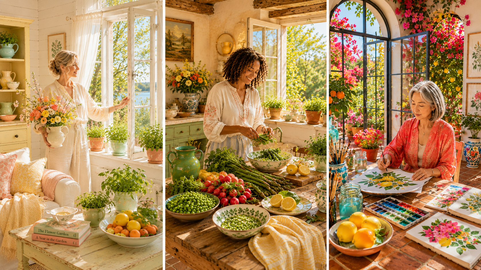
Spring: Fresh, Light, and Full of Possibility
Spring homes feel hopeful.
They’re bright, open, and filled with the kind of natural light that makes everything feel a little easier. Colors are clear and warm, and materials stay relaxed—never fussy, never overworked.
Picture painted furniture, woven baskets, crisp cotton, branches clipped from the garden, and windows thrown open on the first warm afternoon of the year.
These are homes that feel awake.
Bringing Spring indoors doesn't require a complete redesign. A few seasonal touches—fresh flowers, woven baskets, lightweight linens, and simple pottery—can completely change the atmosphere of a room.
Cheerful without being loud. Elegant without being formal. Fresh without tipping into minimalism.
Think: French country cottages, English garden rooms, Mediterranean villas, sunlit breakfast nooks overlooking blooming gardens.
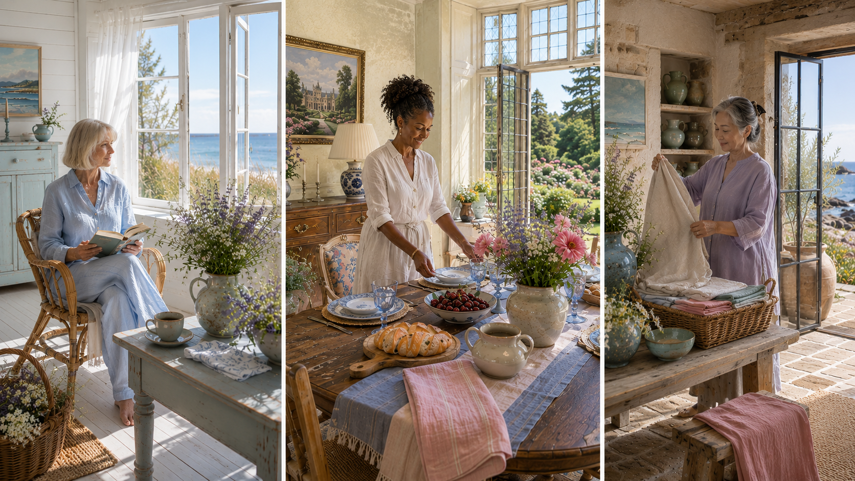
Summer: Soft, Calm, and Collected
Summer homes invite you to exhale.
Nothing shouts. Nothing demands attention. Colors are softened, textures are layered, and every detail feels intentional in a quiet, effortless way.
Weathered wood, natural linen, brushed metals, handmade pottery, sea glass, and muted florals create rooms that feel lived in rather than styled. Light drifts gently through sheer curtains, softening every edge.
These spaces don’t chase trends because they don’t need to.
Summer-inspired interiors are often built from texture more than color. Natural linen, handmade pottery, soft lighting, and weathered wood create the calm, collected feeling many of us associate with boutique hotels and coastal retreats.
They’re timeless, restful, and deeply soothing.
Think: Boutique hotels along the Cornish coast, Scandinavian summer cottages, relaxed New England coastal homes, elegant Paris apartments softened by age and natural light.
Autumn: Warm, Layered, and Welcoming
Autumn homes embrace richness.
Not extravagance — depth.
Rooms are filled with natural textures, collected objects, warm woods, aged leather, antique brass or copper, stone fireplaces, woven baskets, and candlelight that grows more beautiful as evening settles in.
Colors feel grounded and comforting, creating spaces that encourage lingering — long dinners, slow mornings, weekends spent at home.
These are interiors with soul, even if the house itself is new.
The atmosphere is generous, textured, and quietly refined.
Think: Tuscan farmhouses, Cotswold cottages, vineyard estates, mountain lodges, historic libraries where every object feels like it has a past.
Winter: Elegant, Refined, and Architectural
Winter homes are defined by clarity.
Every object feels chosen. Every line feels intentional. Contrast becomes part of the design language, creating spaces that feel sophisticated without ever becoming cold.
Natural stone, polished metals, dark woods, sculptural lighting, crisp linens, and carefully edited collections allow the materials themselves to shine.
Winter interiors don’t rely on abundance—they rely on precision.
They celebrate craftsmanship and beautiful materials. A few thoughtfully chosen pieces often have more impact than an entire room of accessories.
The result is confident, timeless elegance.
Think: Paris apartments with marble fireplaces, Stockholm penthouses, contemporary boutique hotels, restored townhouses, modern homes where the architecture is the artwork.
As you can see, none of these seasonal personalities are confined to a single decorating style.
A Soft Summer and a True Summer may both love linen, but one might gravitate toward a weathered coastal cottage while the other prefers the quiet refinement of a Scandinavian retreat.
A Deep Autumn and a True Autumn may both adore walnut and brass, yet one feels drawn to the drama of a historic library while the other prefers the warmth of a sunlit Tuscan farmhouse.
That’s the beauty of seasonal color analysis.
It doesn’t put your home in a box.
It simply helps explain why certain spaces feel instantly familiar — as though they were waiting for you all along.
In the next section, we’ll explore each of the twelve palettes more closely—and look at how their colors, textures, materials, and moods can inspire a home that feels deeply, unmistakably personal.
Twelve Homes. Twelve Atmospheres.
Light Spring: Fresh Beginnings
If Light Spring were a home, it would feel like the first warm weekend after winter finally loosens its grip.
Windows stand open. A vase of fresh flowers is set down without ceremony. Morning brightness drifts across painted wood floors. Every room carries that unmistakable sense of newness—as if the whole house has just taken a deep breath.
Nothing feels heavy or overly arranged. The beauty comes from ease: soft colors, gentle textures, and spaces that feel light enough to move through without thinking.
The Palette
Light Spring is filled with softly optimistic hues — cream, butter yellow, warm ivory, pale peach, fresh leaf green, robin’s‑egg blue, and the delicate blue of an early spring sky. Together, they create rooms that feel bright without being stark and cheerful without becoming busy.
The Details
Painted wood, pale oak, linen, crisp cotton, woven baskets, rattan, clear glass, and simple white ceramics all contribute to Light Spring's effortless warmth. Fresh tulips gathered from the garden, flowering branches arranged in oversized pitchers, and herbs growing on a sunny kitchen windowsill reinforce the feeling that nature is always close by.
Inspired By
French country cottages, Dutch gardens in bloom, and storybook villages surrounded by orchards just beginning to flower all capture the spirit of Light Spring. These are places where the changing season quietly becomes part of everyday life.
Living Here
This is the kind of home where guests instinctively linger over a second cup of tea. It feels hopeful, airy, and quietly welcoming—a gentle reminder that every day offers the chance to begin again.
This home teaches you that beauty doesn't need to be complicated to feel extraordinary. Sometimes all it takes is fresh flowers, open windows, and the willingness to notice a beautiful morning.
True Spring: Sunlit & Joyful
True Spring brings more warmth, more color, and more life.
Imagine a home where sunlight seems to follow you from room to room. A bowl of fresh citrus rests on the kitchen counter. Handmade ceramics line open shelves. Garden doors stand open whenever the weather allows, letting the outdoors drift gently inside.
There's an easy confidence here.
Nothing feels staged or overly considered. It's simply a home that delights in being lived in.
The Palette
Golden yellow, warm coral, fresh green, turquoise, creamy white, camel, and touches of soft terracotta create a palette that feels vibrant yet welcoming — colors that seem to hold a bit of sunshine even on cloudy days.
The Details
Warm oak, natural linen, wicker, handmade pottery, honed limestone, and well-loved cotton fabrics create interiors that feel relaxed and naturally beautiful. Bowls of lemons, jars of freshly gathered wildflowers, clipped olive branches, and leafy greenery tucked into quiet corners add life without trying too hard.
Inspired By
English garden rooms, the South of France, and Mediterranean villas where sunlight and fresh air are considered essential design elements all reflect the warmth and optimism of True Spring.
Living Here
The windows are almost always open, even if only for a few minutes. Conversation flows easily, meals stretch a little longer than planned, and every season carries the unmistakable brightness of spring.
This home teaches you that joy grows in everyday moments — sunlight across the kitchen floor, a shared meal, fresh herbs on the windowsill, and doors left open to welcome the season inside.
Bright Spring: Colorful Confidence
Bright Spring is joyful, spirited, and unmistakably alive — playful without ever tipping into chaos.
Imagine sunlight bouncing off white stucco walls. Bougainvillea spilling over stone pathways. Colorful artwork collected on travels hanging beside handcrafted ceramics and woven textiles. Every room feels expressive and full of personality, yet grounded by crisp whites, natural textures, and generous light.
Color isn’t used impulsively here.
It’s chosen with clarity and intention.
The Palette
Coral, aqua, sunny yellow, warm white, bright green, turquoise, and vivid cobalt create a palette that feels energetic, confident, and full of possibility — hues that celebrate life while remaining effortlessly elegant.
The Details
White plaster walls, glossy ceramics, light woods, woven cane, natural linen, artisan textiles, and sparkling glass create interiors that feel collected rather than coordinated. Bougainvillea climbing outside the window, citrus trees in terracotta pots, orchids, and lush tropical foliage add vibrant moments throughout the home.
Inspired By
Mediterranean coastal towns, colorful boutique hotels in Mexico, and island homes where craftsmanship, sunlight, and relaxed elegance naturally come together all capture the spirit of Bright Spring.
Living Here
Someone here has gathered beautiful things simply because they made them smile. The home feels creative, optimistic, and wonderfully personal — proof that vibrant color can be both sophisticated and deeply meaningful.
This home teaches you that living with color is really about living with confidence. The things that bring you joy deserve a place in your home, and beauty becomes richer when it reflects your personality.
Light Summer: Quiet Mornings
If Light Summer were a home, it would feel like waking slowly on a calm morning by the sea.
Sheer curtains sway with the breeze. A linen quilt — softened by years of washing — rests at the foot of the bed. Sunlight drifts through tall windows, blurring the edges of the room until the boundary between indoors and outdoors feels almost imaginary.
Nothing tries to stand out.
The beauty lies in the gentleness — the quiet glow of daylight, the softness of the palette, and a sense of restraint that feels intentional rather than sparse.
The Palette
Light Summer lives in airy, delicate tones: soft ivory, misty blue, pale sage, cool blush, dove gray, and the faint lavender of distant hills just after sunrise. Together, they create rooms that feel open, restful, and quietly refined.
The Details
Whitewashed oak, washed linen, cotton, woven grasses, pale stone, brushed nickel, and handmade pottery bring a soft, tactile calm. Wildflowers in simple glass vases, sea grasses, and pieces of driftwood add subtle reminders of the natural world.
Inspired By
Scandinavian summer cottages, Swedish archipelago homes, quiet coastal retreats, and lakeside cabins where craftsmanship elevates simplicity.
Living Here
Mornings unfold slowly. Coffee is enjoyed beside an open window. Books rest half‑read on side tables. Every room encourages a gentler pace. Light Summer homes feel peaceful, but never empty.
This home teaches you that peace is something we can create. By leaving room for light, quiet, and simplicity, we make space to breathe a little more deeply every day.
True Summer: Timeless Grace
True Summer feels settled in the most comforting way.
There’s a quiet confidence in these homes — not because they’re grand, but because nothing feels like it’s trying to impress. Soft blues, graceful architecture, antique pieces, fresh flowers, and well‑made objects collected over time create rooms that feel balanced, familiar, and deeply lived‑in.
This is elegance that whispers.
The Palette
Dusty blue, soft navy, rose, slate, cool gray, muted teal, lavender, and gentle berry tones — colors softened by natural light and perfectly content to coexist without competing.
The Details
Weathered oak, painted furniture, brushed silver, marble, fine linen, wool throws, and handcrafted ceramics layer together with understated sophistication. Hydrangeas, lavender, and eucalyptus add a fresh, effortless beauty that feels both classic and comforting.
Inspired By
Paris apartments softened by age, English manor houses, refined Scandinavian interiors, and historic boutique hotels where every detail feels considered but never precious.
Living Here
Fresh flowers belong on an ordinary Tuesday just as much as they do on a holiday table. Books are arranged with intention. The table is set beautifully even when no guests are expected. True Summer homes remind us that grace often lives in the smallest rituals.
This home teaches you that elegance isn’t reserved for special occasions. It lives in the quiet gestures — fresh blooms on a weekday, a thoughtfully set table, and the everyday rhythms that bring a sense of refinement to daily life.
Soft Summer: Coastal Serenity
Soft Summer doesn’t ask for attention.
It simply puts you at ease.
Imagine weathered wood faded by sea air, oversized linen sofas, muted watercolor art, and windows framing rolling hills or distant waves. Every texture feels softened by time. Every room seems to exhale the moment you step inside.
Nothing feels perfect.
Everything feels loved.
The Palette
Sea‑glass blue, dusty rose, mushroom, blue‑gray, eucalyptus, soft taupe, muted teal, and gentle lavender — colors inspired by mist, coastline, and the quiet light of late afternoon.
The Details
Weathered oak, Belgian linen, natural wool, hand‑thrown pottery, woven baskets, brushed silver, aged stone, and softly textured fabrics create warmth without heaviness. Hydrangeas, eucalyptus, olive branches, and driftwood complete the story with subtle, organic beauty.
Inspired By
Cornish coastal hotels, relaxed homes in coastal Maine, quiet English countryside villages, and restored farmhouses where simplicity feels like a luxury.
Living Here
Rooms seem to whisper rather than speak. Blankets are draped where someone might reach for them. Candles glow even on ordinary evenings. Soft Summer homes don’t try to impress — they simply make it easy to stay a little longer.
This home teaches you that comfort is its own kind of luxury. The most memorable spaces aren’t always the grandest — they’re the ones that make people feel immediately at ease and never in a hurry to leave.

Soft Autumn: Relaxed & Collected
If Soft Autumn were a home, it would feel like arriving at a country inn after a long drive through rolling hills.
The front door opens to the scent of fresh bread cooling on the counter, dried lavender hanging from a beam, and wood warmed by the late‑afternoon sun. A woven basket rests beside the hearth, books are stacked on weathered tables, and linen curtains sway gently in the breeze drifting through an open window.
Nothing feels rushed.
Everything feels quietly settled.
The beauty comes from natural textures, muted color, and a home gathered slowly — piece by piece — rather than decorated all at once.
The Palette
Soft Autumn is rooted in the landscape: sage, eucalyptus, warm taupe, muted olive, dusty terracotta, soft camel, moss, oatmeal, and the faded gold of late‑summer fields. Together, they create rooms that feel welcoming, relaxed, and deeply harmonious.
The Details
Weathered oak, limewashed walls, natural linen, woven baskets, antique pottery, aged brass, stone floors, and handmade quilts bring warmth without weight. Dried grasses, olive branches, herbs from the garden, and bowls of seasonal fruit become part of the décor simply by being useful.
Living Here
The kettle is almost always warm. Guests are encouraged to help themselves. Windows open whenever the weather allows, and every room carries the easy confidence of a home meant to be lived in, not admired from a distance.
Inspired By
The English countryside, Provençal farmhouses, quiet Cotswold villages, and family‑run inns where hospitality feels effortless all capture the spirit of Soft Autumn.
This home teaches you that beauty doesn’t need to be new to feel meaningful. The most cherished homes are gathered slowly, shaped by memories, and filled with things that have earned their place.
True Autumn: Golden‑Hour Hospitality
True Autumn feels like home at the end of a beautiful day.
Sunlight stretches across old wood floors. Copper pots hang above a well‑used range. A long dining table waits for friends to gather, and candles are lit before they’re needed — not for ceremony, but because the room feels warmer that way.
There is richness here, but never excess.
Everything feels generous, grounded, and deeply welcoming.
The Palette
Ochre, olive, walnut, burnt sienna, warm cream, amber, forest green, cinnamon, and deep terracotta — colors inspired by vineyards, harvest tables, and landscapes glowing in the last light of day.
The Details
Walnut furniture, aged leather, terracotta, natural stone, antique brass, heavy linen, woven wool, hand‑thrown ceramics, and copper cookware create interiors with depth and character. Seasonal branches, olive trees, herbs, pears, figs, and sunflowers bring the outdoors quietly inside.
Living Here
The kitchen is rarely empty for long. Meals stretch into lingering conversations. Candles appear before dessert, and guests leave with leftovers wrapped in parchment and tied with string. True Autumn homes have a way of making everyone feel like they belong.
Inspired By
Tuscan farmhouses, Umbrian villas, Burgundy vineyards, and restored stone homes where hospitality is woven into everyday life.
This home teaches you that hospitality is found in the smallest gestures — a candle lit before dinner, an extra place at the table, and the feeling that everyone is welcome to stay a little longer.
Deep Autumn: Rich & Storied
If Deep Autumn were a home, it would be the kind of place that becomes even more beautiful after sunset.
Books line dark wood shelves. Velvet cushions soften well‑loved leather chairs. A fire glows quietly in the hearth while rain taps against old windows. Every object seems to carry a history, and every room invites you to stay just a little longer.
Nothing is hurried.
Nothing is disposable.
This is beauty collected patiently over a lifetime.
The Palette
Espresso, forest green, deep olive, burgundy, aubergine, bronze, charcoal, aged gold, and rich walnut create interiors that feel enveloping, sophisticated, and quietly dramatic.
The Details
Dark walnut, velvet, aged leather, antique brass, iron, smoked glass, marble, richly woven textiles, and heirloom furniture create layers of texture and depth. Evergreen branches, antique books, dried botanicals, and candlelight become part of the home’s everyday rhythm.
Living Here
The lights come on early — not because it’s dark, but because lamplight makes every room feel warmer. Music plays softly in the background. Favorite books are always within reach. Another conversation begins before anyone thinks about leaving.
Inspired By
Historic libraries, Scottish manor houses, elegant mountain lodges, Belgian townhomes, and intimate boutique hotels where every room tells a story.
This home teaches you that some of life’s richest moments happen after the sun goes down. Good conversation, well‑loved books, warm lamplight, and time shared with the people who matter most are luxuries that never go out of style.

Bright Winter: Crisp & Modern
Bright Winter homes feel like stepping into a space where clarity and energy coexist beautifully.
Light pours across polished surfaces. Clean lines meet bold accents. A single piece of art can command an entire room, not because it’s loud, but because the space around it is intentionally quiet. There’s a sense of movement here — a spark — as if the home itself is lit from within.
Nothing is cluttered. Nothing is timid. Everything feels purposeful.
The Palette
Bright Winter thrives on cool, high‑contrast color: snow white, jet black, icy gray, cobalt, emerald, fuchsia, sapphire, and crisp silver. These hues feel electric yet refined, creating interiors that are modern, striking, and unmistakably fresh.
The Details
Polished stone, lacquered finishes, chrome, glass, sculptural lighting, smooth leather, and fine wool define the atmosphere. Architectural branches, white orchids, and dramatic greenery add life without softening the home’s crisp precision. Texture is sleek, intentional, and quietly luxurious.
Living Here
Evenings feel luminous. Light bounces off reflective surfaces. Music hums softly in the background. A single candle or a vase of white flowers becomes a focal point. Bright Winter homes remind you that modern doesn’t have to mean cold — it can feel vibrant, elegant, and deeply alive.
Inspired By
Contemporary European apartments, modern art‑filled townhomes, boutique hotels with clean architectural lines, and penthouses overlooking bright winter cityscapes all reflect the spirit of Bright Winter.
This home teaches you that clarity is a form of beauty. When you embrace contrast and intentional design, your home becomes a place where energy and elegance meet effortlessly.
True Winter: Quiet Elegance
True Winter carries a kind of stillness that feels intentional — a calm, refined clarity that settles over a home like freshly fallen snow.
Imagine tall windows framed by crisp drapery, soft lamplight reflecting off polished stone, and a fireplace quietly warming a room where every detail feels chosen with care. There’s a sense of order here, but never coldness. The beauty comes from restraint, precision, and the quiet confidence of a home that knows exactly what it is.
Nothing is cluttered.
Nothing is unnecessary.
Everything has room to breathe.
The Palette
True Winter thrives on cool, balanced tones: charcoal, snow white, deep navy, icy gray, black, cranberry, emerald, and the soft shimmer of silver. These colors create interiors that feel serene, architectural, and timeless.
The Details
Marble, glass, polished wood, crisp linen, velvet, chrome, and sculptural lighting define the atmosphere. Branches arranged in tall vases, white amaryllis, evergreen sprigs, and simple winter greenery add life without softening the home’s clarity. Texture matters here — smooth, refined, and quietly luxurious.
Living Here
Evenings are slow and intentional. A single candle glows on a side table. A favorite blanket rests neatly over the arm of a chair. Music plays softly, echoing through clean, open spaces. True Winter homes feel peaceful, elegant, and deeply grounding.
Inspired By
Parisian apartments with marble fireplaces, Scandinavian winter homes, modern penthouses overlooking snowy city streets, and boutique hotels where architecture and light do most of the talking.
This home teaches youthat simplicity can be profoundly beautiful. When you remove what isn’t essential, what remains becomes extraordinary.
Deep Winter: Dramatic & Enduring
Deep Winter carries a presence you feel the moment you step inside.
There’s a quiet intensity to these homes — a sense of drama shaped not by excess, but by clarity, contrast, and impeccable restraint. Light and shadow become part of the architecture. Dark woods meet crisp whites. Bold art hangs against deep, moody walls. Every detail feels intentional, almost sculptural.
This is sophistication with an edge.
The Palette
Ink black, snow white, charcoal, sapphire, ruby, emerald, icy gray, and cool silver create interiors that feel powerful, modern, and unmistakably refined. These colors don’t whisper — they resonate.
The Details
High‑contrast walls, polished stone, lacquered finishes, smoked glass, chrome, velvet, fine wool, and sleek architectural lighting define the atmosphere. Tall branches arranged in minimalist vases, white orchids, and dramatic greenery add life without softening the home’s bold clarity.
Living Here
Evenings feel cinematic. Lamplight glows against dark walls. Music hums softly in the background. A single piece of art can transform an entire room. Deep Winter homes remind you that drama doesn’t require noise — it requires intention.
Inspired By
Modern penthouses overlooking winter cityscapes, art‑filled townhomes, luxury boutique hotels, and contemporary European interiors where contrast and precision shape the mood.
This home teaches youthat boldness and elegance can coexist beautifully. When you embrace contrast, you create spaces that feel both powerful and deeply refined.
Creating the Home That Feels Like You

By now, you may have found yourself lingering over one season.
Or maybe two.
Perhaps the quiet serenity of Soft Summer felt instantly familiar. Maybe the warmth of True Autumn reminded you of places you’ve always loved without knowing why. Or you might have been surprised—drawn not to the colors themselves, but to the feeling they created.
That’s often how personal style reveals itself.
Long before we can articulate why certain spaces resonate, we simply know how they make us feel.
We return to the same boutique hotels whenever we travel. We pause in front of the same kinds of homes while wandering unfamiliar streets. We save the same images on Pinterest. We reach for the same flowers at the market, week after week.
Those choices aren’t random.
They’re small clues about the atmosphere we naturally seek.
And of course, no home belongs entirely to a single season.
A Soft Summer home may hold the warmth of an antique walnut table passed down through generations. A Deep Autumn interior might be softened by crisp white linen bedding. A Bright Winter apartment can feel more inviting with a basket of woven blankets beside the fire.
The most memorable homes are layered.
They evolve slowly, collecting stories alongside beautiful objects.
Seasonal color analysis isn’t meant to become another set of decorating rules.
Instead, it offers a language—a way to understand why certain colors, materials, landscapes, and interiors have always felt like home.
Maybe you’ve never thought of yourself as someone with a defined decorating style.
Maybe you’ve simply known that you’re happiest near the sea. That old stone buildings make you slow your pace. That fresh flowers can make an ordinary Tuesday feel special.
Those instincts matter.
Because creating a beautiful home isn’t about copying someone else’s aesthetic.
It’s about recognizing your own.
The rooms we remember most aren’t necessarily the most expensive or the most perfectly designed.
They’re the ones that reflect the lives unfolding inside them.
They welcome conversation. They celebrate everyday rituals. They gather family and friends around a table. They make us exhale the moment we walk through the door.
And perhaps that’s what seasonal color analysis has been pointing toward all along.
Not the perfect shade of paint.
But the feeling of finally coming home to yourself.
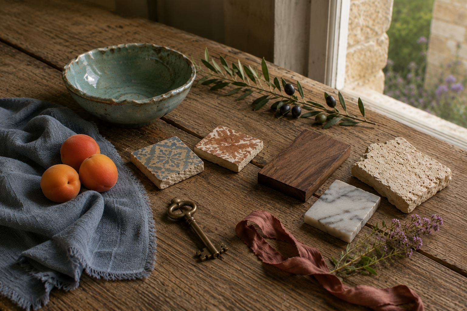
Small Details That Make A Home Feel Welcoming
I've come to realize that the homes I remember most aren't filled with expensive things—they're filled with objects that invite people to slow down.
Not because they're perfectly styled, but because they're genuinely used, quietly loved, and often hold personal meaning. A treasure discovered at a local antique market. A cherished heirloom passed down through generations. A beautiful wedding gift that has become part of everyday life. These are the pieces that quietly tell the story of the people who live there.
These are the kinds of everyday objects that add warmth, spark conversation, and help a home feel welcoming long before anyone notices the decorating.
These aren't the things that make a home beautiful on their own.
They're simply the kinds of everyday objects that become part of a life well lived. Over time, they collect memories, tell stories, and quietly reflect the people who use them.
Perhaps that's why certain homes have always felt so familiar. Long before we notice the colors or decorating style, we recognize the atmosphere.
And often, that atmosphere reflects the season that has felt like home to us all along.
Continue Exploring Your Seasonal Home Style
If one of these seasonal personalities resonated with you, this is only the beginning.
Each of the twelve seasonal guides explores one atmosphere in greater depth—its colors, materials, textures, flowers, architecture, and the quiet details that give it life. Whether you're refreshing a single room or slowly shaping a home over many years, you'll find inspiration for creating spaces that feel beautifully, unmistakably your own.
After all, the most beautiful homes aren’t the ones that follow every rule.
They’re the ones that tell your story.
Disclosure: This article may contain affiliate links. If you make a purchase through these links, I may earn a commission at no additional cost to you.