

Florence Tobacco & Terracotta: A European Color Story

Some places start working their way into our imagination long before we ever set foot in them. Florence has been that place for me.
Even though my husband and I won’t be there until the fall of 2027, the city has been quietly shaping itself in my mind for years—through photographs, paintings, old travel journals, and the work of artists who seemed just as captivated by it as I am now. Every time I explore the colors of Europe’s most beautiful destinations, I somehow end up circling back to Florence.
It’s never because of one landmark or one postcard view. It’s the character of the place that keeps drawing me in.
There’s something magnetic about a city shaped by the hands of artists, sculptors, bookbinders, leatherworkers, and architects—a place where beauty feels less like ornamentation and more like the natural result of materials that have been aging with grace for centuries.
And the colors of Florence… they’re unlike anything else.
They aren’t coastal or sun‑bleached. They aren’t bold or dramatic. They’re quieter—thoughtful, nuanced, deeply grounded.
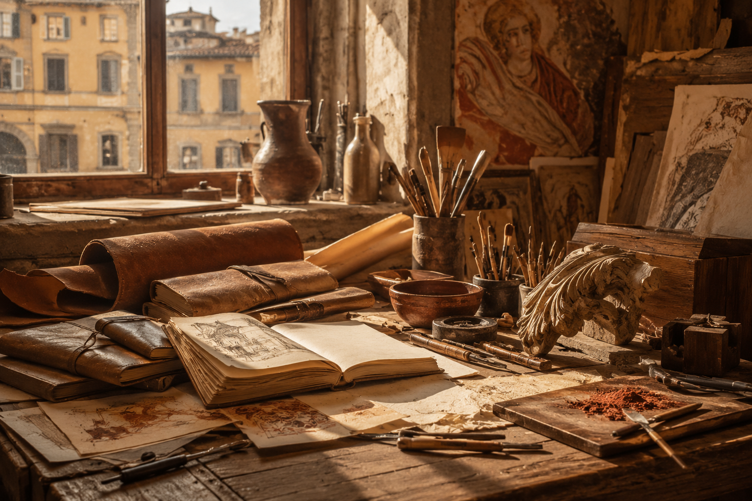
Tobacco leather. Burnt sienna plaster. Fresco pink walls. Parchment paper. Walnut wood. Burnished gold. Cool marble.
Together they form a palette that feels unmistakably Florentine—an entire color language shaped by craftsmanship, Renaissance history, and the kind of artistry that lingers in the air.
I know I’ll experience these colors differently when I’m finally standing there in person, but even now, from a distance, they’ve become one of my favorite examples of how a place can influence more than travel. Sometimes it shapes the way we see style, interiors, and even the small, everyday details around us.
Some places begin teaching us long before we arrive. Florence has been doing that for me for years.
The Difference Between Florence and Other Italian Cities
When many of us picture Italy, our minds go straight to the colors we’ve seen a thousand times in photographs.
The lemon yellows of the Amalfi Coast. The pastel villages of Cinque Terre. The rolling greens and golden fields of Tuscany.
But Florence… Florence stands apart.
Even though it’s often grouped with the rest of Tuscany, the city has a personality entirely its own. What fascinates me most is that its palette seems to come less from the landscape and more from the people who have shaped it over centuries.
So many beautiful places are defined by nature. Florence feels defined by human hands.
Its colors seem to rise from workshops rather than gardens. From studios rather than coastlines. From pigments and tools rather than wildflowers.
As I paid closer attention to Florence’s visual character, I kept noticing the same materials appearing again and again:
Leather worn soft from years of use. Marble shifting with the changing light. Stacks of handmade paper in quiet artisan shops. Walnut furniture polished by generations. Frescoes whose colors have mellowed into something tender. Gilded frames surrounding Renaissance masterpieces.
Even the architecture feels shaped by intention rather than excess—nothing rushed, nothing disposable. Every surface seems to hold a story.
Maybe that’s why Florence’s colors feel so resonant. Not because they’re bold or dramatic, but because they carry time.
A tobacco leather journal is compelling because it’s been handled. A fresco wall is compelling because it has aged. A marble sculpture is compelling because you can almost sense the artist’s hand in it.
Florence is a place where time becomes part of the design, and that gives its palette a depth entirely different from the coastal blues of the Mediterranean or the sun‑washed pastels so often associated with Italy.
The colors of Florence don’t simply decorate the city. They record it.
They tell the story of artists, craftsmen, scholars, and makers whose work still shapes its presence centuries later.
That, to me, is what makes Florence feel so distinctive. Its palette isn’t just beautiful—it’s inseparable from the people who created it.
Florence's Core Color Palette
Tobacco
If Florence has a signature color, I’m convinced it might be tobacco.
Not brown. Not tan. Not camel. Something deeper—something lived‑in.
It’s the color that comes to mind first when I picture the city, not because of its grand museums or famous piazzas, but because of the small, intimate details that seem to define Florence’s soul.
A leather‑bound journal resting in a shop window. A well‑worn satchel crossing a quiet square. The polished surface of an antique writing desk. The warm interior of a centuries‑old workshop where the same craft has been practiced for generations.
Tobacco doesn’t behave like modern neutrals. It isn’t flat or anonymous. It carries a sense of history—of hands, of time, of use. It’s a color that becomes more compelling the longer it’s lived with, which feels perfectly aligned with Florence itself.
As I studied photographs of bookbinders, leather studios, historic libraries, and artisan workshops, this color kept appearing. Not always in the same shade, but always with the same presence.
Sometimes it leans dark, almost walnut. Sometimes it glows like aged saddle leather. Sometimes it softens into something sun‑worn and familiar.
But the impression is always the same:
Rich. Grounded. Steady. Impossible to rush.
Maybe that’s why tobacco feels so essential to Florence’s palette. It reflects one of the city’s quiet truths: beauty doesn’t have to be new to matter. It doesn’t have to be polished to hold value. Some things become more interesting precisely because they’ve been used, repaired, touched, and appreciated over time.
Tobacco captures that idea perfectly.

Burnt Sienna
If tobacco gives Florence its depth, then burnt sienna is the color that makes the city glow.
It’s a shade woven into Florence’s identity—not just because it appears everywhere, but because it carries that unmistakable blend of art, history, and craftsmanship that defines the city. Long before I imagined visiting Florence, burnt sienna lived in my mind as an artist’s color—the shade of paint palettes, sketchbooks, and Renaissance underpaintings. It has always felt like a color that belongs in a studio.
Which makes Florence the perfect home for it.
Look closely at photographs of the city and burnt sienna begins to reveal itself in quiet, consistent ways:
In plaster walls warmed by the afternoon sun. In rooftops stretching across the skyline. In architectural details softened by centuries of weather. In terracotta vessels tucked into courtyards and gardens.
Unlike brighter oranges or reds, burnt sienna never tries to be loud. Its warmth is gentler—more mature, more grounded. It carries the softness that comes from age, which is probably why it feels so enduring. Burnt sienna isn’t trying to stand out. It feels less like a color choice and more like part of the city’s vocabulary.
And when a color appears naturally, over centuries, it becomes part of a place’s identity in a way trends never can.
One of the things I love most about Florence’s palette is how seamlessly the colors work together. Burnt sienna settles in beside tobacco, parchment, walnut, and marble with an ease that feels inevitable. Each shade deepens the others. Together they create a warmth that feels inviting rather than dramatic.
Maybe that’s why Florence wears it so beautifully.
The city never feels covered in burnt sienna. It feels illuminated by it.
Fresco Pink
Some colors announce themselves the moment you see them. Fresco pink isn’t one of them.
It asks you to slow down.
At first, it barely registers as part of Florence’s palette. The city is so often defined by leather, stone, terracotta, and warm earth tones that the softer shades can feel almost invisible. But once you start noticing fresco pink, it begins appearing everywhere.
In weathered plaster walls. In fading architectural details. In centuries‑old paintings. In small fragments of color that have mellowed with time rather than disappearing.
Unlike modern pinks, fresco pink doesn’t feel sweet or delicate. It feels artistic. Historical. Subtle in the most intentional way.
Maybe that’s because it was never meant to stand alone. In Renaissance frescoes, colors were layered to create depth and atmosphere. Pink tones were muted by earth pigments, softened by age, and balanced by warmer neutrals. What remains is a shade that feels remarkably refined.
Not blush. Not peach. Not rose. Something quieter—a pink shaped by time.
As I studied photographs of Florence’s churches, courtyards, museums, and centuries‑old streets, I realized how often these softened pinks appear beside tobacco, sienna, parchment, and marble. They never demand attention. They simply add another layer.
And that’s what makes fresco pink so compelling. It brings lightness without disrupting the sense of history. It softens the stronger colors. It creates balance. It reminds us that even the grandest cities are built from small, thoughtful details.

Parchment
If tobacco is the color of Florence’s craftsmanship, then parchment might be the color of its imagination.
I can’t think about Florence without thinking about the generations of artists, writers, architects, scholars, and dreamers who moved through the city carrying notebooks, sketchbooks, letters, and ideas. Some cities are remembered through monuments. Florence is remembered through what people created there. And parchment feels like the color that connects all of those creations.
Not bright white. Not cream. Not beige. Something softer. Warmer. A color shaped by ink, sunlight, and time.
It’s the shade of handmade paper stacked inside artisan stationery shops. The pages of old journals filled with sketches and observations. The worn edges of manuscripts passed through countless hands. The sketchbook resting beside a painter’s easel. The letter tucked inside a favorite book.
Maybe that’s why parchment feels so essential to Florence’s palette. Without it, the deeper colors might feel heavy. Without it, the richness of tobacco and burnt sienna would have nowhere to rest. Parchment creates space. It allows the other colors to breathe. And in a city defined by art and architecture, that feels especially fitting.
The best paintings understand the importance of negative space. The best interiors understand the importance of restraint. The best cities understand that not every surface needs to demand attention.
Parchment brings that same quiet clarity to Florence.
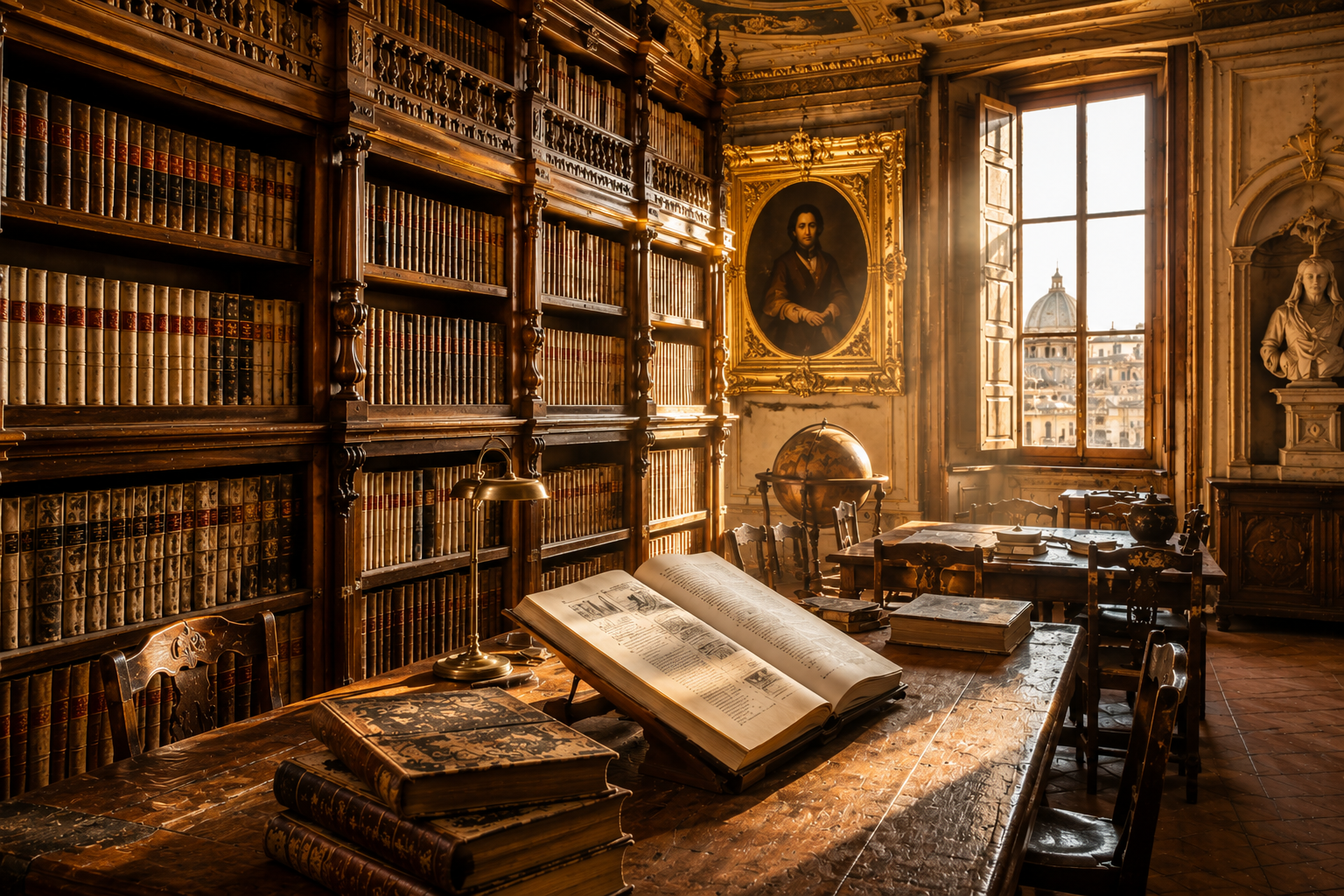
Walnut
If parchment is the page, then walnut is the structure that holds the library together.
It’s one of the darkest colors in Florence’s palette, yet it never feels heavy. Instead, it feels steady. Dependable. Lasting. Walnut is the color I associate with the city’s sense of permanence.
The carved doors that have welcomed generations. The library tables where people have read, sketched, studied, and dreamed. The workshop benches worn smooth by decades of craftsmanship. The antique cabinets, wooden shutters, and architectural details that seem to grow richer with age rather than fade from it.
Unlike black, walnut feels alive. It carries warmth. Grain. Texture. Memory.
Maybe that’s why it feels so essential to Florence’s color story. Without walnut, the palette might drift toward softness. Without walnut, the lighter tones of parchment and fresco pink would have less to lean against. Walnut provides structure. It anchors the palette. It gives the eye a place to rest.
As I studied photographs of historic libraries, artisan workshops, quiet cafés, and centuries‑old interiors, walnut kept appearing. Not dramatically. Not demanding attention. Simply present—supporting the space around it.
Its confidence comes from purpose rather than display. Walnut doesn’t need to stand out to matter. It contributes depth without becoming dominant. A quality that feels deeply, unmistakably Florentine.
Burnished Gold
Some colors belong to objects. Burnished gold belongs to light.
If tobacco is the color of craftsmanship and parchment is the color of imagination, then burnished gold feels like the color of Florence’s spirit.
It’s not the bright metallic gold of holidays or polished luxury. It isn’t flashy or attention‑seeking. Florence’s gold is gentler than that.
It’s the softened gold that lingers in Renaissance paintings after centuries have mellowed their brilliance. The glow of candlelight brushing against historic stone. The gilded frame surrounding a masterpiece. The warm afternoon sun settling across a piazza. The last light catching the curve of the Duomo.
Some cities change at sunset. Florence seems to become more fully itself.
As the light softens, the city begins to glow. Marble warms. Stone turns honey‑colored. Tobacco deepens. Burnt sienna grows richer. Even the shadows feel illuminated.
Maybe that’s why burnished gold feels so essential to Florence’s palette. It’s the color that connects everything else—not because it dominates, but because it touches every surface.
A little warmth on stone. A little light on wood. A little glow on plaster.
It moves quietly through the palette, bringing life to the colors around it.
Marble Stone

If burnished gold is the light of Florence, marble stone is its foundation.
It’s the color that has been quietly present throughout this entire story—beneath the tobacco leather, beneath the frescoes, beneath the gilded frames and parchment pages. Marble is what Florence is built upon.
Some cities are defined by their skylines. Florence is defined by what generations of artists, architects, and sculptors created from stone.
The city seems to understand something many of us forget: permanence can be beautiful. Not permanence as resistance to change, but permanence as the act of creating something worthy of enduring.
When I think of Florence, I don’t think of marble as just a material. I think of it as a symbol.
The marble facades that catch the shifting light. The sculptures that continue to inspire centuries after they were carved. The architectural details that feel as relevant today as the day they were imagined.
Unlike the warmer tones in Florence’s palette, marble introduces calm. Balance. Clarity.
It allows the richer colors—tobacco, walnut, burnt sienna—to shine without overwhelming the eye. And maybe that’s why marble feels so essential. It reminds us that beauty doesn’t always need to announce itself. Sometimes it exists in proportion, in intention, in patience.
Marble doesn’t compete. It elevates. And in doing so, it becomes unforgettable.
Bringing Florence Into Your Wardrobe

One of the reasons Florence’s palette feels so endlessly appealing is how naturally it translates into everyday style. These aren’t trend colors that flare up for a season and disappear. They’re colors rooted in materials that have been beautiful for centuries.
Tobacco leather. Burnt sienna clay. Parchment paper. Walnut wood. Burnished gold. Marble stone.
They feel timeless because they already are.
Florence’s palette works especially well for women who prefer thoughtful dressing over trend chasing. Nothing feels loud. Nothing feels overly coordinated. The beauty comes from combining colors that naturally complement one another.
Imagine a tobacco linen dress accented with burnished gold jewelry. A parchment blouse paired with walnut trousers. A fresco pink scarf softening deeper earth tones. A marble‑colored knit layered beneath a tobacco suede jacket.
The overall effect feels collected rather than styled. Elegant without being formal. Interesting without trying too hard.
Style doesn’t need to demand attention to be memorable. Sometimes the most beautiful wardrobes are built the same way beautiful cities are—slowly, intentionally, and with an appreciation for things that improve with time.
Bringing Florence Into Your Home

Florence’s palette feels just as at home in interiors.
Not because it follows a decorating trend, but because it reflects the materials people have loved for generations:
Warm wood. Natural stone. Handmade ceramics. Linen textiles. Leather. Paper. Soft metallic accents.
Together they create spaces that feel layered, welcoming, and deeply lived in.
A Florence‑inspired room isn’t about recreating Tuscany or filling a home with Italian décor. It’s about embracing the qualities Florence embodies so well:
Craftsmanship. Restraint. Texture. Patina.
A tobacco leather chair beside a marble‑topped table. Walnut shelving filled with books. Parchment‑colored walls warmed by afternoon light. Burnished gold accents that glow rather than shine.
The result is a home that feels collected rather than decorated— a home that tells a story, a home where beauty emerges through materials, time, and thoughtful choices rather than constant reinvention.
Florence reminds us that the most inviting spaces aren’t necessarily the most elaborate or expensive. They’re the ones that feel authentic.
Why Florence’s Palette Feels So Timeless

The more I studied Florence’s colors, the more I realized that what makes the palette compelling isn’t the colors themselves.
It’s the relationship between them.
None of Florence’s colors feel trendy. There are no neon brights. No sharp contrasts. Nothing designed to shout for attention.
They possess the same quiet assurance as the city itself.
The palette is built on something far more enduring: harmony.
Tobacco gives depth. Burnt sienna gives warmth. Fresco pink adds softness. Parchment creates space. Walnut provides structure. Burnished gold brings light. Marble stone offers balance.
No single color dominates. No shade feels out of place. Together they create something richer than any one color could achieve alone.
Florence doesn’t rely on trends. It relies on proportion. On intention. On restraint. On the understanding that beauty often comes from combining rather than competing.
As I kept returning to photographs of Florence, I noticed that the most memorable spaces shared the same unforced quality.
Nothing felt overly decorated. Nothing felt excessive.
The beauty came from materials that naturally belonged together.
A tobacco leather chair beside a marble wall. A burnished gold frame surrounding a fresco. A walnut table layered with parchment‑colored books.
Each element supported the others rather than competing with them.
That sense of harmony feels surprisingly relevant today. We live in a world that often encourages more— more color, more trends, more decoration, more attention.
Florence offers a different perspective.
It reminds us that beauty doesn’t always come from adding. Sometimes it comes from refining. Choosing carefully. Letting quality, texture, and craftsmanship take center stage.
Perhaps that’s why Florence’s palette feels as inspiring now as it must have centuries ago. The colors aren’t tied to a moment. They aren’t chasing relevance. They aren’t trying to impress.
They’re shaped by materials, artistry, and ideas that have endured because they continue to resonate.
Timelessness isn’t about preserving the past. It’s about creating something meaningful enough to remain beautiful long into the future.
Conclusion: The Beauty of What Endures
Before I ever set foot in Florence, the city has already taught me something meaningful.
That beauty doesn’t always come from novelty. Sometimes it comes from longevity. From intention. From choosing materials, colors, and ideas that continue to reveal their character over time.
Perhaps that’s why Florence feels so compelling.
Its palette isn’t built on trends. It’s built on things that last.
Leather that softens. Wood that deepens. Stone that gathers history. Art that continues to move us. Light that turns ordinary surfaces into something extraordinary.
I know I’ll experience these colors differently when I finally visit Florence in 2027. But even now, from a distance, they’ve become a reminder that timelessness isn’t about holding on to the past.
It’s about creating something meaningful enough to remain beautiful long into the future.
And few places seem to understand that better than Florence.