

Barcelona's Layered Mineral Colors: A European Color Story

I expected Barcelona to be brighter.
I imagined vivid Mediterranean blues, colorful mosaics, and bold architectural color at every turn. In my mind, the city existed somewhere between sunlight and saturated pigment.
What struck me instead was stone.
Warm stone. Weathered stone. Stone softened by centuries of sunlight.
The more photographs, architecture, and streetscapes I studied, the more Barcelona seemed less like a colorful city and more like layers of mineral pigment. Clay roofs, faded ochre walls, oxidized green balconies, sea-glass blues, and the quiet gray of wrought iron all seemed to belong to the same conversation.
Nothing shouted.
Everything belonged.
A wall faded by decades of sun sat comfortably beside a balcony softened by age. Terracotta pottery echoed the roofs overhead. Olive trees repeated colors found in old shutters and ironwork. Even images of the Mediterranean felt less brilliant and more nuanced than I expected—blue softened by haze, light, and distance.
Barcelona is not one color.
It is many colors layered together over centuries.
The Colors Hidden in Plain Sight
Some cities announce themselves immediately through color.
Barcelona reveals itself slowly.
The more I studied Barcelona's architecture and streetscapes, the more I noticed that the city's palette wasn't concentrated in a single landmark or neighborhood. It was woven into the everyday details—facades, courtyards, balconies, rooftops, gardens, and streets.
The first color I noticed was limestone.
Not the bright white stone often associated with Mediterranean destinations, but warm mineral tones that seemed to absorb sunlight rather than reflect it. Buildings glowed in shades of pale sandstone, warm ivory, soft taupe, and weathered cream. The effect felt grounded and timeless.
Then came terracotta.
Roof tiles stretching across the city introduced warmth without becoming overwhelming. Clay planters appeared outside cafes and apartment buildings. Burnt sienna accents surfaced in architectural details and pottery displayed in shop windows.
The next layer appeared in metalwork.
Balcony railings, gates, and architectural details carried the soft green patina that only comes with age. The color wasn't bright green. It was oxidized green—subtle, complex, and beautifully imperfect.
One of the most surprising observations was blue.
Not a tropical blue.
Not a postcard blue.
A sea-glass blue.
It showed up in ceramic tiles, fragments of mosaic, reflections along the waterfront, and the distant Mediterranean itself.
Olive and sage appeared everywhere once I began looking for them. Courtyard gardens, potted plants, climbing vines, and ancient trees brought softness to the city's mineral palette.
And throughout it all was charcoal.
Soft charcoal appeared in ironwork, shutters, and architectural details throughout the city.
While much of Barcelona's palette comes from weathered stone and Mediterranean light, there is also a quieter influence from the work of Antoni Gaudí.
His architecture introduced colors that seem to echo throughout the city long after you've left his buildings behind. Fragments of sea-glass blue, oxidized green, honey gold, soft ceramic whites, and weathered earth tones appear repeatedly in his mosaics and organic forms. Even when you're not standing in front of one of his masterpieces, those colors feel woven into Barcelona's visual identity.
They become part of the city's larger conversation between nature, architecture, and time.
Why Barcelona Feels So Beautiful
Barcelona's beauty is difficult to explain because it isn't dependent on any single view.
It is a feeling.
A mood.
A rhythm created by color.
The city's palette feels grounded because it originates from natural materials. Stone, clay, wood, iron, water, and plants all contribute to the visual experience.
Barcelona also feels artistic.
Not because every surface is colorful, but because the palette is layered with intention and restraint. The colors complement one another rather than compete.
Warm limestone softens terracotta.
Olive balances stone.
Sea-glass blue cools the warmth of clay.
Charcoal anchors everything.
The result is harmony rather than contrast.
Perhaps that is why Barcelona feels so memorable. The city doesn't overwhelm the senses.
The longer you look, the more beautiful it becomes.
If Barcelona Were a Seasonal Palette
One of the things I love most about seasonal color analysis is that it teaches us to see color relationships rather than individual colors.
A single shade rarely tells the whole story.
The magic happens when colors interact with one another.
Cities work the same way.
And while I don't believe a city can be assigned to a single season any more than a person can be reduced to a single color, some destinations naturally evoke certain palettes.
Barcelona feels like a conversation between Soft Autumn and Soft Summer.
At first glance, Soft Autumn seems like the obvious choice.
The city is filled with weathered terracotta, olive green, mineral taupe, warm stone, aged bronze, and sun-faded ochre. These colors carry the muted warmth that defines Soft Autumn so beautifully.
It is the color of clay warmed by afternoon sun.
Of old leather.
Of pottery collected over generations.
Of olive trees that have stood in the same place for decades.
Yet the longer I studied Barcelona's palette, the more I noticed another influence quietly appearing beneath the surface.
Soft Summer.
The city contains surprising moments of coolness.
Sea-glass blue ceramic tiles.
Weathered stone facades softened by shadows.
Pale gray ironwork.
Muted blue-green reflections along the waterfront.
These colors introduce a calm elegance that balances the warmth of the city's earthier tones.
Without them, Barcelona might feel too heavy.
Without the warmth, it might feel too cool.
The city never tips too far in either direction.
Warm and cool exist side by side.
Stone softens clay.
Sea glass softens terracotta.
Olive connects them all.
If I were translating Barcelona into a seasonal color palette, it would look something like this:
Barcelona's Soft Autumn Influence
Weathered terracotta
Olive green
Mineral taupe
Burnished bronze
Warm sandstone
Soft ochre
Barcelona's Soft Summer Influence
Sea-glass blue
Dusty blue-gray
Weathered limestone
Soft charcoal
Muted teal
Cool stone
Together they create something richer than either season alone.
Dressing Like the City

Whenever I travel, I pay attention to the colors that seem most at home in a place.
Not because I want to match my surroundings, but because local palettes often reveal something about the atmosphere of a destination.
Barcelona doesn't seem to call for dramatic contrast or trend-driven dressing.
It invites ease.
Natural textures.
Quiet confidence.
The colors that feel most at home here are the same colors found throughout the city itself:
Warm ivory
Limestone
Soft olive
Terracotta
Dusty blue
Sea-glass teal
Mineral gray
Soft charcoal
A linen shirt in soft white paired with olive trousers.
Terracotta sandals worn with a dusty blue dress.
A sea-glass blue scarf worn beneath a soft charcoal jacket.
The combinations feel natural because they already exist throughout the city.
Barcelona also reminds me that texture matters as much as color.
Linen.
Leather.
Cotton.
Suede.
Weathered metals.
These materials mirror the tactile quality of the city itself.
The most elegant wardrobes often have that same sense of ease.
Pieces gathered over time.
Favorite fabrics softened through wear.
Accessories chosen because they are beautiful and useful.
Not because they follow a trend.
The Beauty Colors Barcelona Taught Me to Notice
One of the unexpected gifts of travel is that it changes the way we see color.
Not just while we're away.
Long after we return home.
Barcelona made me pay attention to quieter colors.
The colors that rarely dominate a room but somehow make everything around them feel more beautiful.
For years, beauty trends have encouraged us to chase contrast. Brighter lips. Stronger contour. More dramatic eyes. More color.
Barcelona reminded me that sophistication often lives in subtlety.
And that same approach translates beautifully to makeup.
The eyeshadow shades that feel most at home in Barcelona are not vibrant blues or dramatic blacks. They are the colors of old iron gates, olive trees, weathered stone, and terracotta rooftops.
Think:
Warm taupe
Aged bronze
Mineral charcoal
These colors create depth without harshness.
They enhance rather than overwhelm.
As many women discover after 45, softer contrast often feels more flattering than stronger contrast. Barcelona's palette seems to understand that instinctively.
The same principle applies to blush.
The more I examined Barcelona's visual palette, the more often clay, terracotta, sandstone, and warm peach tones appeared.
Those colors translate beautifully to the face.
Instead of bright pinks or highly saturated corals, Barcelona suggests:
Apricot nude
Soft cinnamon
Warm peach
These shades bring warmth and life to the skin while still feeling natural.
The effect is healthy rather than heavily made up.
For lips, Barcelona inspires colors that feel lived in and elegant.
Muted brick.
Burnished peach.
Soft cinnamon nude.
The kinds of shades that look beautiful with linen, leather, sunlight, and age.
The kinds of shades that become signature colors rather than seasonal trends.
Even nail colors seem different through the lens of Barcelona.
The city makes me reach for:
Clay
Stone gray
Olive taupe
Colors that feel grounded rather than attention-seeking.
And perhaps that's what many of us are searching for in beauty as we get older.
Not perfection.
Not transformation.
Simply becoming a more refined version of ourselves.
Bringing Barcelona Home

Of all the cities I've studied through a design lens, Barcelona may be one of the easiest to translate into a home.
Not because it relies on a particular decorating style.
But because its palette is rooted in timeless materials.
The foundation of a Barcelona-inspired home begins with stone.
Not literal stone necessarily, but the feeling of stone.
Walls painted in warm ivory, limestone, pale sand, or soft mineral taupe create the same quiet backdrop found throughout the city.
These colors allow everything else to breathe.
They provide warmth without demanding attention.
Against that backdrop, terracotta becomes the natural next layer.
A collection of clay vessels.
Handmade pottery.
Weathered ceramic bowls.
Simple earthenware that feels as though it has a story to tell.
Terracotta brings soul to a space.
It introduces warmth without relying on trend-driven color.
Barcelona also reminds us that green belongs indoors.
Olive textiles.
Sage accents.
Trailing vines.
Natural foliage that softens architectural lines.
The city's courtyards seem to blur the boundary between architecture and nature, and that same balance feels beautiful at home.
Then there are the details.
Black iron.
Aged brass.
Weathered wood.
Natural linen.
Woven textures.
The materials that become more beautiful with use.
Instead, the rooms feel gathered over years.
A pottery piece discovered while traveling.
A linen throw that has softened with age.
A wooden table marked by countless conversations.
The result is a home that feels deeply personal.
A Table Inspired by Barcelona
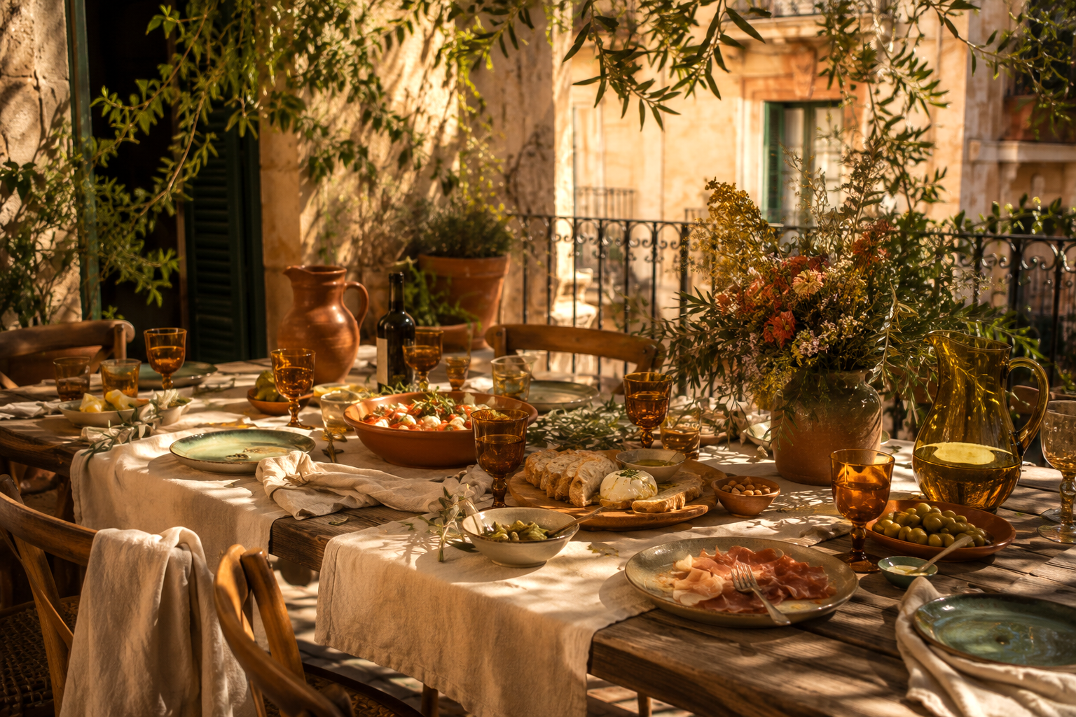
The city seems built around conversation: long lunches, crowded terraces, shared meals, and late evenings.
The kind of moments where no one is looking at the clock.
A Barcelona-inspired table begins with simplicity.
Natural linen rather than elaborate linens.
Stoneware rather than formal china.
Terracotta vessels rather than ornate centerpieces.
The beauty comes from texture and atmosphere rather than perfection.
I imagine a table layered with a soft linen runner, scattered olive branches, amber glassware catching candlelight, and handmade ceramic plates filled with simple Mediterranean food.
Nothing overly formal.
Nothing overly complicated.
Just thoughtful.
The colors naturally echo the city itself.
Warm clay.
Soft stone.
Olive green.
Honey amber.
Weathered wood.
Flickering candlelight.
The effect feels welcoming rather than impressive.
And that's one of my favorite lessons from Barcelona.
The most memorable spaces rarely feel staged.
They feel lived in.
They invite people to settle in, stay longer, and linger over conversation.
Much like the city itself.
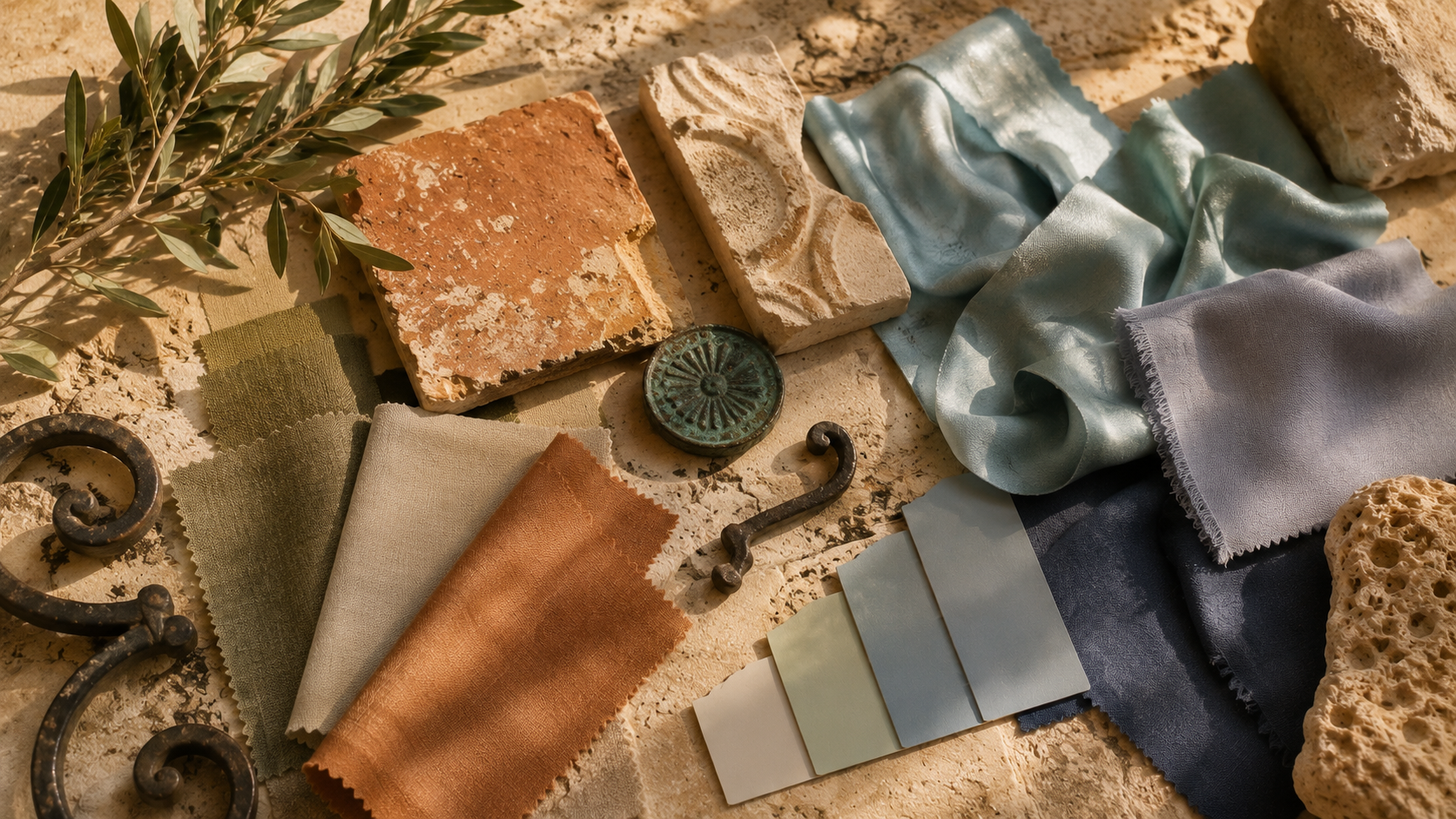
The Palette at a Glance

One of the reasons Barcelona's colors work so beautifully is that they translate effortlessly into everyday life.
The same palette that appears in architecture also works in wardrobes, beauty routines, interiors, and entertaining.
Rather than existing separately, each part feels connected.
Viewed together, these colors tell the story of the city more effectively than any single photograph.
They remind us that Barcelona's beauty isn't found in one landmark.
It's found in the repetition of color, texture, and light throughout everyday life.
Barcelona’s Palette Changed the Way I Think About Color
Every destination leaves something behind.
Sometimes it's a favorite memory.
Sometimes it's a photograph.
Sometimes it's a new perspective.
Barcelona changed the way I think about color.
Like many people, I’ve spent years assuming beautiful color palettes are carefully designed, coordinated, intentionally matched and balanced according to rules.
Barcelona challenged that idea.
The city's palette doesn't feel designed.
It feels discovered.
A wall faded by sunlight sits beside an oxidized balcony.
Terracotta pottery rests against limestone facades.
Olive trees soften ironwork.
Sea-glass blues appear unexpectedly among warm earth tones.
Nothing matches exactly.
Yet everything belongs.
The city feels beautiful because its colors have accumulated over time.
Stone fades.
Metal oxidizes.
Wood softens.
Gardens grow.
Buildings age.
The palette evolves rather than being imposed.
I found myself wondering how often we try to create beauty too quickly.
Whether in our homes, our wardrobes, or even our lives.
Barcelona suggests another approach.
Gather thoughtfully.
Layer gradually.
Allow time to do some of the work.
Trust that beauty often emerges through accumulation rather than perfection.
Closing
The most memorable cities leave behind more than photographs.
They leave behind a color memory.
Long after travelers forget specific streets, restaurants, or hotel rooms, they often remember how a place felt.
Barcelona's gift is its layered mineral palette.
Stone warmed by sunlight.
Terracotta softened by age.
Olive trees growing against historic walls.
Sea-glass blues scattered throughout the city like quiet reminders of the Mediterranean.
Together, these colors create something larger than a palette.
They create atmosphere.
They create emotion.
They create a sense of place.
Barcelona reminds us that beauty is rarely created in a single moment.
It is layered slowly through time, light, texture, memory, and experience.
Perhaps that is why the city stays with us long after we leave.
Disclosure: This article may contain affiliate links. If you make a purchase through these links, I may earn a commission at no additional cost to you.