

The Most Elegant European Color Stories for a Beautiful Home

I started noticing it in Barcelona first.
Not Gaudí exactly. Not the dramatic architecture everyone photographs until their camera rolls become entirely tiled staircases and curved balconies. It was smaller than that.
Apartment windows left open in early evening. Warm air moving linen curtains around. Terracotta walls faded unevenly by years of sun. Oxidized teal shutters beside stone buildings glowing softly around dinner time.
I took an embarrassing number of photos of walls on that trip.
Not architecture. Walls.
The rooms looked better because they’d clearly been used for years. Chairs slightly worn at the arms. Paint faded unevenly near windows. Books stacked wherever they fit instead of styled by color. Nothing felt overly precious.
I think a lot of homes lose that now. Everything starts looking so untouched. Beautiful, yes. But faintly stressful.
Like nobody is allowed to sit down with wet hair or leave a coffee cup anywhere without apologizing first.
Meanwhile, the apartments I kept remembering from Europe usually had something imperfect happening. Crooked shelves. Chipped plaster. Dining chairs probably one bad dinner party away from collapse.
Still beautiful.
Maybe more beautiful because of it.
Lately I’ve become much more interested in homes that respond to season and climate instead of looking visually identical all year long. Some colors need gray skies. Others need salt air and open windows. Certain rooms make sense only once the lamps are on and dinner has gone on much longer than planned.
Others need morning light and coffee.
I used to think good interiors had to feel timeless all the time. Now I’m not even sure what that means anymore.
And honestly, after years of seeing aggressively neutral interiors online, I’m always relieved when somebody uses an actual color.
Barcelona: Terracotta, Dusty Coral, Oxidized Teal, and Olive

Barcelona feels warm even in shadow.
Not polished-warm. Sun-on-stone warm.
The colors there have movement in them. Dusty coral walls. Tobacco wood. Olive trees turning silver in the heat. Faded teal shutters thrown open late in the evening while dishes clatter somewhere below on the street.
Nothing feels overly coordinated, which is probably why it works.
Mediterranean-inspired homes become much more elegant when the colors feel weathered instead of tropical. Less “vacation rental with inspirational signage.” More “this apartment has hosted loud dinners for thirty years.”
There’s also a softness to Mediterranean colors in real life that photographs never fully capture. Terracotta especially. Good terracotta isn’t bright orange. It leans dusty, earthy, almost faded in strong light.
Beautiful with walnut wood. Cream plaster. Wrinkled linen. Bowls of citrus sitting out because someone came back from the market an hour ago.
Barcelona in summer also cured me permanently of wanting cold minimalist interiors everywhere.
Some places need warmth to feel believable.
Copenhagen: Buttercream, Pale Oak, Smoke Blue, and Soft Black
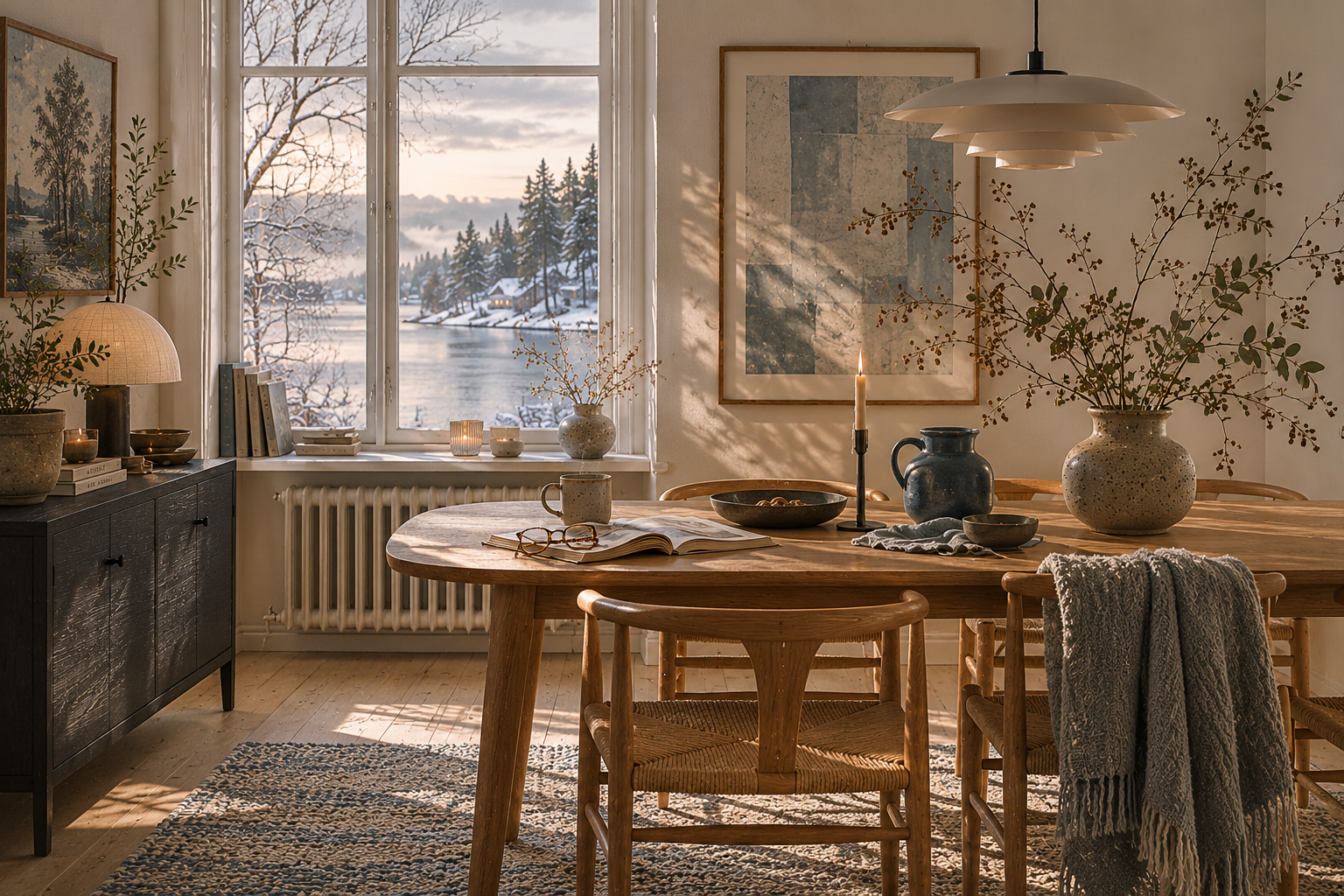
Copenhagen changed my opinion about simplicity.
Or maybe just my opinion about how much visual clutter I can tolerate anymore.
I stayed in a hotel there that was almost comically restrained. Pale oak floors. Cream walls. One black chair. Tiny lamp. Blue-gray curtains. That was essentially the entire room.
It should have felt cold.
Instead it felt peaceful in a way I kept thinking about afterward while standing in my own kitchen surrounded by approximately nine competing shades of beige pretending to match each other.
The Scandinavian palette works because the contrast stays soft. Nothing fights for attention. Pale woods. Matte ceramics. Warm whites instead of icy ones. Smoke-blue textiles that look beautiful in winter but somehow still make sense in summer when daylight lingers forever.
Also, Scandinavian interiors understand lamps better than most of us.
This is a hill I’m willing to die on.
Good lighting fixes an alarming number of problems. Possibly even family moods.
Florence: Fresco Pink, Espresso, Sage, and Cathedral Stone

Florence feels richer than Barcelona, but quieter about it.
The colors remind me of old paintings after varnish darkens slightly with time. Fresco pink. Espresso brown. Dusty sage. Marble worn smooth at the edges. Deep olive greens that look almost black by evening.
Even the sunlight feels heavier there.
Not oppressive. Just slower somehow.
I remember wandering into tiny shops where everything looked softened by age and heat. Leather bags. Paper boxes. Wooden tables marked by decades of use. The rooms felt layered without trying to impress anyone.
Florence also convinced me that some homes need depth more than brightness.
Not every room wants stark white walls.
Some colors look better once the sun starts going down. Especially with table lamps instead of overhead lighting, which continues to make otherwise attractive people look vaguely exhausted after dinner.
I notice lighting constantly now.
This may simply be middle age.
Santorini: Chalk White, Mineral Blue, Sea Glass, and Volcanic Stone
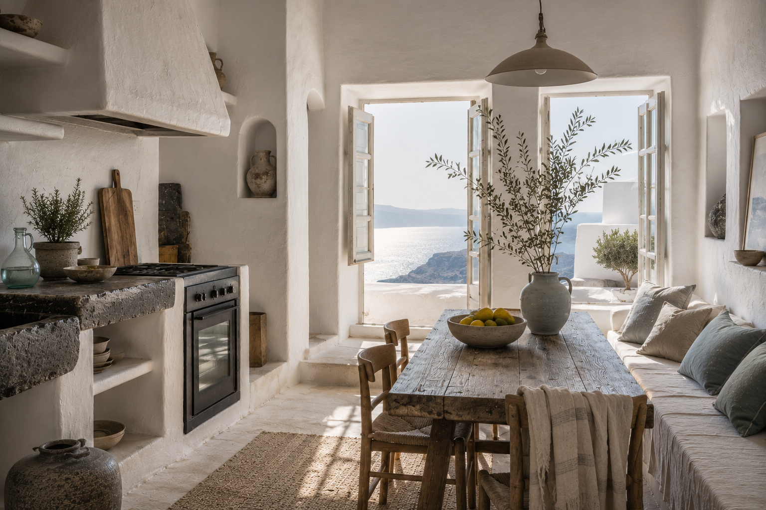
Santorini surprised me because the colors felt much softer in person than they do online.
The white isn’t crisp. It’s chalky and sun-softened. The blues shift constantly depending on sky and water. Sometimes silver-blue. Sometimes nearly gray by evening.
And then suddenly there’s volcanic stone grounding everything before the palette floats away entirely.
The whole island feels airy.
Not minimalist exactly. More elemental.
I think homes inspired by Santorini work best when people resist the urge to over-decorate them. This palette needs breathing room. Open shelves. Natural textures. Rooms that can handle bright light without becoming sterile by noon.
Also, probably fewer decorative objects announcing that life is better at the beach.
We know.
One thing I noticed there: sunlight changes color aggressively near water. Pale blue walls that looked calm in the morning suddenly looked almost electric by midday. By evening everything softened again.
I came home from that trip briefly convinced I needed white walls everywhere.
Then Oregon rain happened.
Galway: Atlantic Blue, Fog Gray, Peat Brown, and Wildflower Green

Western Ireland feels windswept in the best possible way.
The colors there aren’t polished. They’re weathered by actual life and weather. Atlantic blue water. Fog-gray skies. Green hills that somehow look soft and feral at the same time. Bright painted doors against endless cloud cover.
And wool everywhere.
I don’t think I fully appreciated texture until spending time in colder coastal climates. Smooth minimalist interiors make much less emotional sense when everyone entering the house is carrying damp jackets, muddy boots, and approximately seventeen layers of knitwear.
The beauty of Galway feels softer than people expect.
Less dark pub. More faded cottage near the sea with books stacked everywhere and tea perpetually brewing in the kitchen.
Also, rooms there seem completely unbothered by imperfection.
Scuffed floors. Uneven tables. Paint wearing away near windows.
Nobody appears emotionally devastated by this.
Honestly refreshing.
Prague: Garnet, Pine, Smoke, and Candlelight Ivory

Prague feels better in shadow.
Some cities do.
I remember ducking into cafés there during late afternoon when everything outside looked silver-gray and cold. Then suddenly the interiors glowed. Garnet walls. Dark wood. Amber lamps reflecting against old mirrors. Candle wax ivory beside black coffee and deep green velvet seating.
The colors feel literary there.
Not airy. Not minimalist. Definitely not afraid of mood.
And somehow it works because the palette stays grounded in warmth instead of trying too hard to feel dramatic.
This kind of color story works beautifully in libraries, bedrooms, dining rooms, or anywhere you want people to settle in for a while instead of drifting through distracted.
Some rooms should feel slightly enclosed.
Like weather can’t quite reach you there.
Why Certain Colors Stay With Us
I don’t think people become attached to color in the abstract.
Usually it’s memory.
The faded coral wall seen at sunset after a long dinner. Pale mineral blue from a hotel window left open near the sea. Dark green walls somewhere in Prague while snow fell outside and everyone inside finally looked warm again.
That’s probably why the most beautiful homes rarely feel formulaic. The colors shift depending on climate, architecture, season, and the people living there.
The room changes over time.
Honestly, I think that’s part of the beauty.
I still bring home paint samples from trips sometimes. Most of them look completely wrong once I get them home to Oregon light. Mediterranean colors become surprisingly aggressive during gray February rain.
But every once in a while, one works.
And suddenly a room feels calmer at four in the afternoon than it used to. The light settles differently. Evening feels slower somehow.
That’s usually how I know I’ve found the right color.
Disclosure: This article may contain affiliate links. If you make a purchase through these links, I may earn a commission at no additional cost to you.