

The Complete True Autumn Color Guide
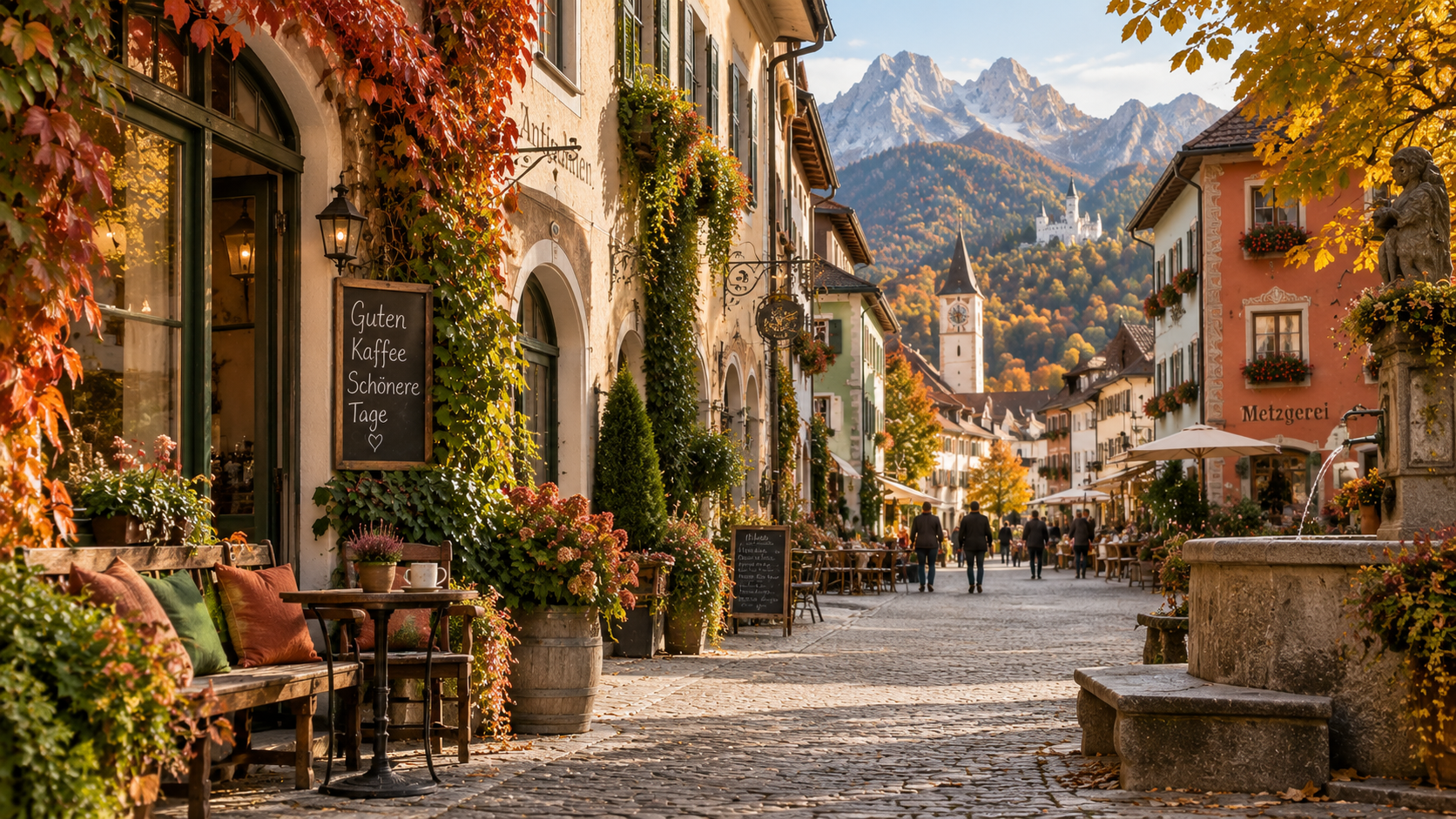
Perhaps you have a rust red sweater that you wear far more often than you expected. It felt like an adventurous choice in the store, yet at home it slips easily into outfits you already own. You like what it does for your complexion, too. Now it rarely stays in the closet for long.
For a True Autumn, those familiar favorites often tell you something. Camel, cognac, and burnt orange belong in this season. So do dark forest green and the kind of deep teal that makes a simple blouse feel like enough of an outfit on its own.
Other colors are more challenging. Pale pink leaves you reaching for blush, and the bright white shirt you admired on someone else can feel stark on you. Even two browns can behave differently.
True Autumn has a reputation for orange and brown, and there are beautiful versions of both in this palette. But if that is all you have seen, there is quite a bit more to enjoy.
In this guide, we will look at the full True Autumn palette and how to wear it in clothes, makeup, hair color, nails, and jewelry. We will also compare it with the other Autumn seasons and talk about what happens when your coloring changes with age.
What Is True Autumn?
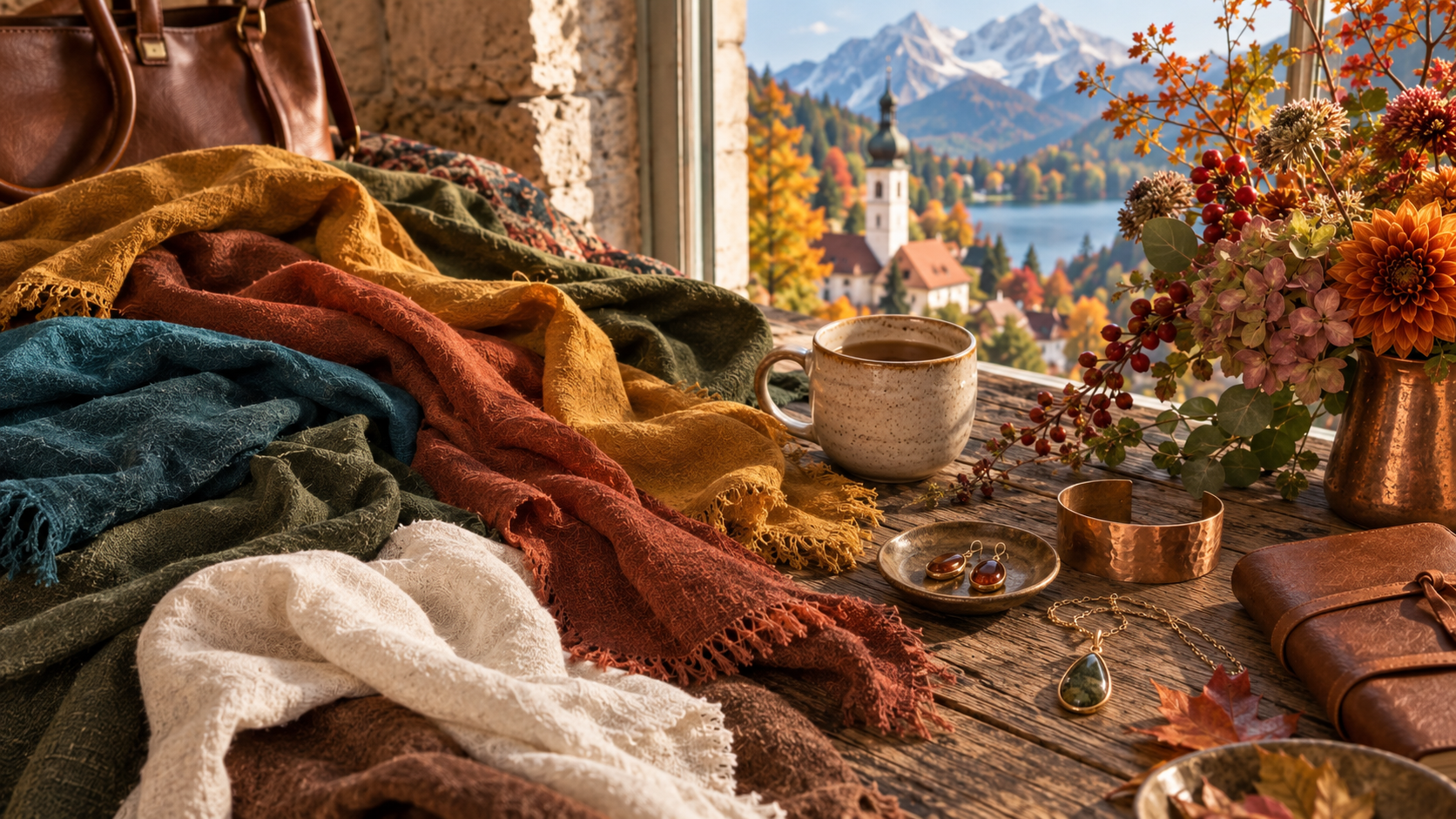
True Autumn sits at the warm heart of the Autumn family. Its colors are warm, rich, and earthy, with warmth making the biggest difference.
Seasonal color analysis looks at temperature, value, and chroma: how warm or cool a color is, how light or dark it is, and how clear or muted it appears. Temperature matters most for True Autumn, though the other qualities explain why every warm color won’t suit you equally well.
Mustard is a good example. It has more depth and earthiness than a clear lemon yellow. Brick red has a warmer, browner character than raspberry. These differences are much easier to see when the colors are beside each other.
Burnt orange and peacock have plenty of color without the sharp brightness of the clearest Spring shades. That slight softness keeps them earthy. Next to Soft Autumn’s gentler versions, though, their warmth and richness are much more apparent.
The lighter shades matter as well. Warm ivory, cream, and almond give the palette a range beyond its familiar deep colors.
You’ll also see this season called Warm Autumn. We’re using the twelve-season meaning here; some systems treat True Autumn and Warm Autumn as separate categories. If you’ve had an analysis, your own palette is the best reference when the names differ.
Characteristics of a True Autumn
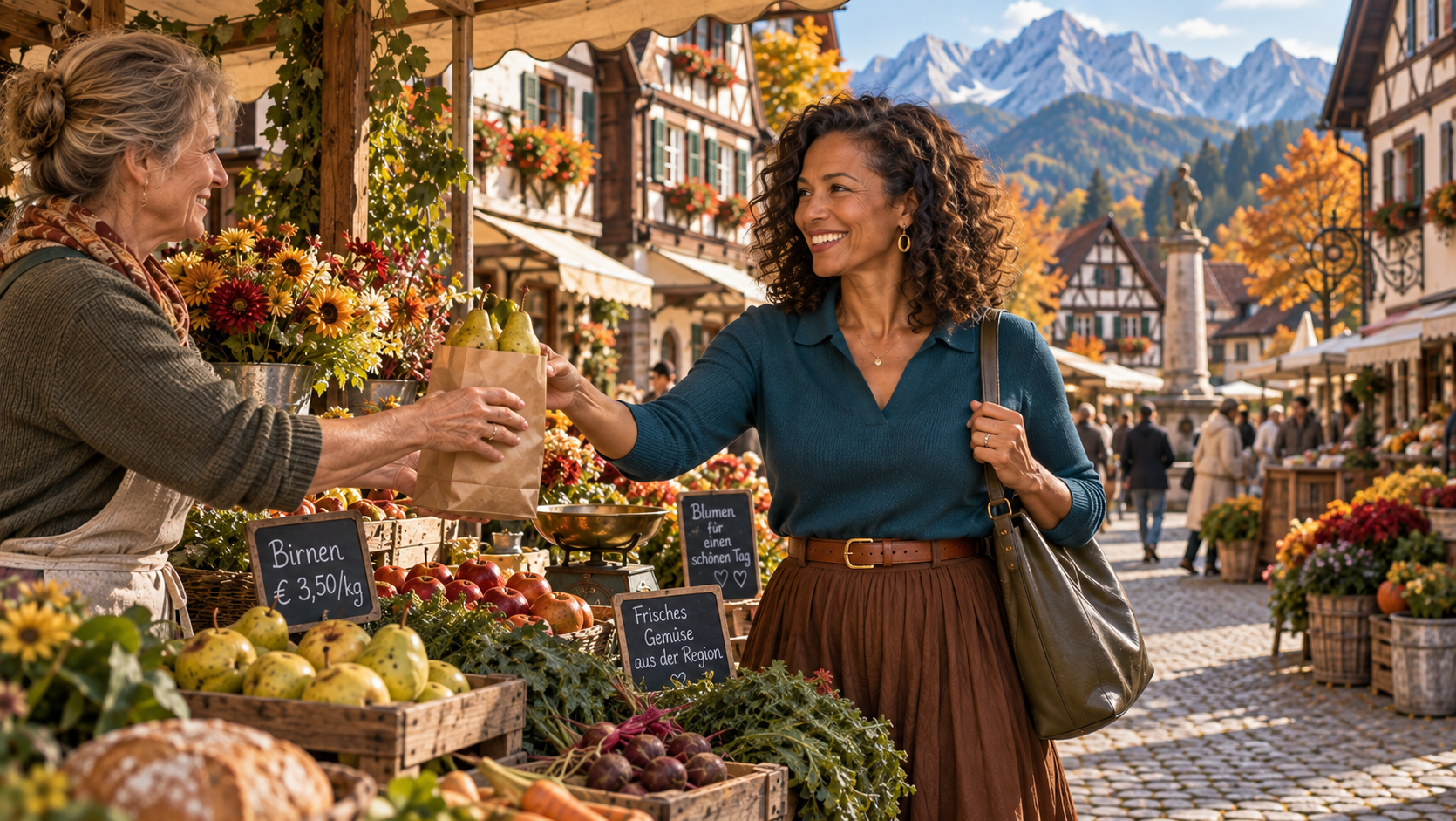
Photographs of red-haired women with hazel eyes tell only part of the Autumn story. If you’ve been looking at them and wondering where that leaves you, there’s much more variety than those familiar examples suggest.
True Autumn shows up across a wide range of skin tones and ethnicities. Some complexions carry an obvious peach or golden warmth; others read more olive or even fairly neutral at first glance. Surface redness can disguise warmth, and vein color will not settle the question either.
Eye color varies just as much. Brown, green, and hazel are familiar examples, but no season is tied to a single eye shade. Details in the iris may sharpen beside one color and soften beside another, which is far more useful than the color itself.
Hair runs the full spectrum too: golden blondes, chestnut brunettes, copper reds, and women with much deeper hair. Texture does not determine your season, and you do not need freckles or visible gold in your hair to belong here.
True Autumn outfits often look great with moderate contrast, though your own coloring shapes what feels right. Deep skin against silver hair creates a different light and dark relationship than brown hair against medium skin. You may enjoy a stronger contrast than another True Autumn, or prefer your colors sitting closer together.
Your face will always give you better information than any checklist. Try comparing several colors in consistent daylight, with little or no makeup, and simply watch how your skin responds. Sometimes a shadow around the mouth becomes more noticeable with one fabric, or a certain shade makes the surface of the skin look calmer and more even. When you see the same reaction across a handful of colors, that pattern tells you far more than one flattering shade ever could.
What Happens When True Autumns Age?
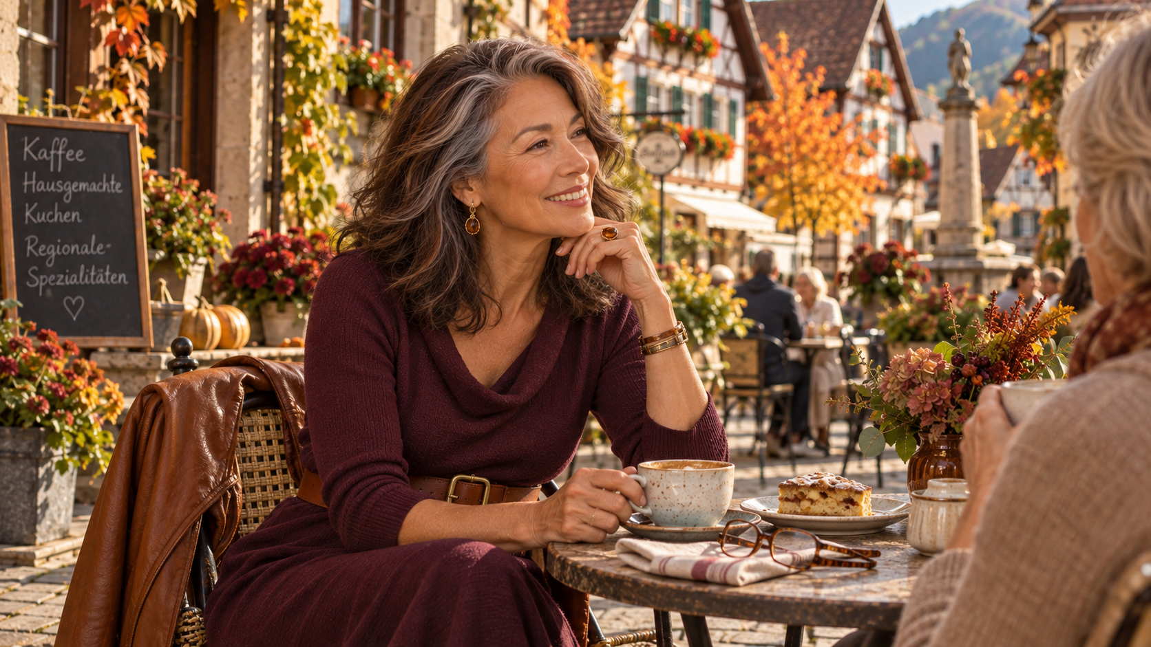
You may notice that a favorite outfit starts to feel different once gray begins to frame your face. A dark top that used to blend into your hair suddenly has a stronger presence, or you might find yourself wanting a touch more color near the neckline.
Hair, brows, and the way skin reflects color all shift with age, and the combinations you enjoy can shift right along with them. Going gray doesn’t automatically mean you need a cooler palette. Your season stays the same, even if you begin gravitating toward lighter or softer versions of your usual shades.
Before you replace a color you’ve always loved, try adjusting the amount of it. A lighter shade at the neckline or a smaller area of deeper color near your face can make a familiar hue feel right again. Sometimes the proportion matters just as much as the shade itself.
Silver hair can look incredible with brick red. Becoming lighter is an invitation to explore how color interacts with you now.
The Unexpected Range of True Autumn
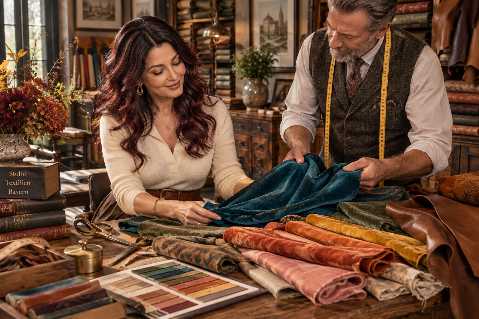
The green and blue-green parts of this palette are easy to underestimate. There’s the quiet, gray-green character of loden, the stronger color of viridian, and the rich blue-green of peacock. They scarcely suggest the same wardrobe, yet all belong here.
Orange has a generous range of its own. Cinnamon leans toward brown; pumpkin is unmistakably orange. Peach pink and salmon offer a gentler direction. Then there are the yellows: saffron, ochre, and amber have far more variety than a single mustard swatch suggests.
Warmth in a teal is relative: it leans toward green rather than a cooler, more violet blue. That’s why a warm palette can include blue-greens as well as its more obvious reds and oranges.
Your Complete True Autumn Color Palette
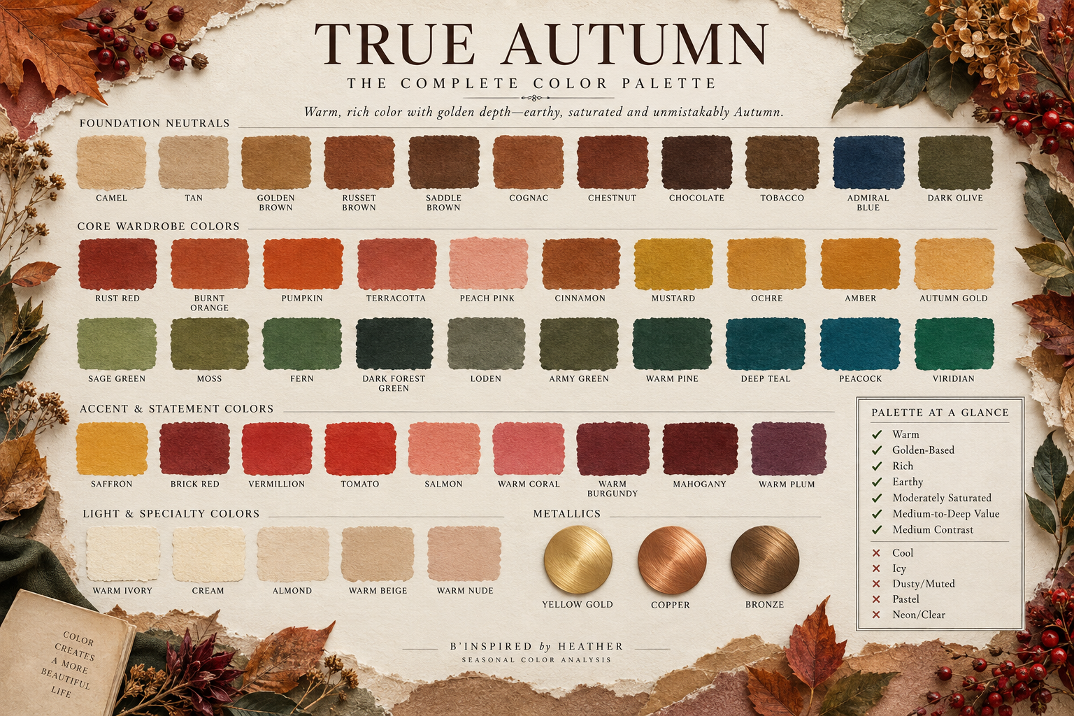
The colors below are grouped by how you might use them. Some will become everyday favorites; others may be colors you enjoy occasionally.
Color names are a starting point. One shop’s olive may be golden and another’s quite gray, so look at the actual fabric whenever you can.
Foundational Neutrals
These are useful for coats, trousers, bags, and pieces you want to wear often:
Camel
Tan
Golden brown
Russet brown
Saddle brown
Cognac
Chestnut
Chocolate
Tobacco
Admiral Blue
Dark olive
Tobacco and chestnut have enough color to be interesting in their own right. Admiral Blue and dark olive broaden the darker end beyond brown.
I’d choose the brown you love most before buying several. If you’re always drawn to dark clothes, chocolate may do far more for your wardrobe than a camel coat you admire but never reach for.
Core Wardrobe Colors
For dresses, shirts, knitwear, and jackets, there’s plenty to choose from:
Rust Red
Burnt orange
Pumpkin
Terracotta
Peach Pink
Cinnamon
Mustard
Ochre
Amber
Autumn gold
Sage green
Moss
Fern
Dark forest green
Loden
Army Green
Warm pine
Deep teal
Peacock
Viridian
Loden and army green fit into your regular outfits as naturally as any neutral. A pumpkin sweater is a little brighter, but there’s no reason to save it for a particular day.
Accent & Statement Colors
These work in a small accessory or a garment, depending on how much color you want:
Saffron
Brick red
Vermillion
Tomato
Salmon
Warm coral
Warm burgundy
Mahogany
Warm plum
Mahogany has a deep red-brown character that is especially beautiful in a coat or lipstick while warm coral and salmon bring a lighter mood.
The plum here is browned and red-influenced rather than cool violet.
Light & Specialty Colors
For the lighter end of your wardrobe:
Warm ivory
Cream
Almond
Warm beige
Warm nude
Warm ivory often softens where bright white feels stark. Almond and warm beige keep the lighter end from becoming all cream.
Metallics
Yellow gold, copper, and bronze echo the warmth of the palette. Finishes range from quiet brushed metal to a bright polish.
Colors to Consider Carefully
Cool, icy, very bright, or stark shades tend to be harder to wear. A blue-violet that looked gorgeous on the hanger may seem unflattering once it’s near your face.
Optic White
Cool Gray
Icy Pastels
Cool Rose
Cool Cobalt
Blue-red and Blue-violet
Bright Fuchsia
Neon Brights
Stark Black
The True Autumn Palette at a Glance
✓ Fully warm
✓ Rich and earthy
✓ Medium in overall depth
✓ Medium saturation with some softness
✓ Moderate contrast
✓ Golden rather than dusty or cool
✓ Earthy and colorful
X Icy
X Cool or blue-based
X Dusty and heavily muted
X Brilliantly clear
X Pastel-light
X Neon-bright
X Dominated by black and optic white
You don’t need to build your wardrobe around rust, camel and brown just because you’re a True Autumn. You might love peacock, viridian and warm red, while another True Autumn reaches for mustard, chocolate and burnt orange. Use the colors you actually like.
The True Autumn Style Philosophy
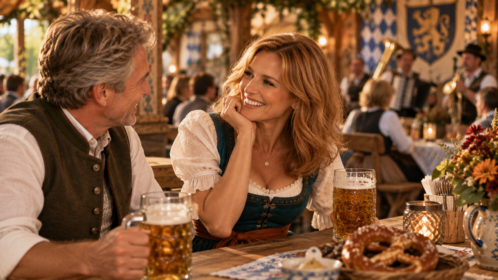
Sometimes you like every piece of an outfit and still change before leaving the house. The colors may be right, but the pattern feels busy or one pale area pulls your attention. Contrast and fabric often explain why.
Building Contrast
Warm ivory with chocolate creates clear light and dark contrast, while camel with golden brown feels more blended. Moderate contrast usually suits True Autumn, although the balance will be different for each person.
Proportion matters. A small amount of ivory at the collar feels different from a full light shirt under a dark jacket. If an outfit seems too divided, try adjusting how much of each color shows.
Wearing Neutrals
Choose a few neutrals that work with the clothes you already own. If beige has never appealed to you, there are other ways to build a practical wardrobe.
Admiral blue and dark olive can anchor a darker closet. Texture keeps an outfit in one neutral from feeling flat, especially when smooth and knitted surfaces sit together.
Prints and Patterns
A print’s background occupies more space than you might expect. A large bright‑white ground can make the whole garment feel sharp, even when the smaller details belong to your palette.
Stripes, checks, abstract designs, and florals all work. The colors matter more than the motif, so a geometric print is just as promising as a floral.
Texture and Fabric
Suede, wool, and linen give these colors depth and texture. Smooth leather and silk bring more shine. Choose the fabric for the garment and for the way you want it to feel when you wear it.
Makeup for True Autumns
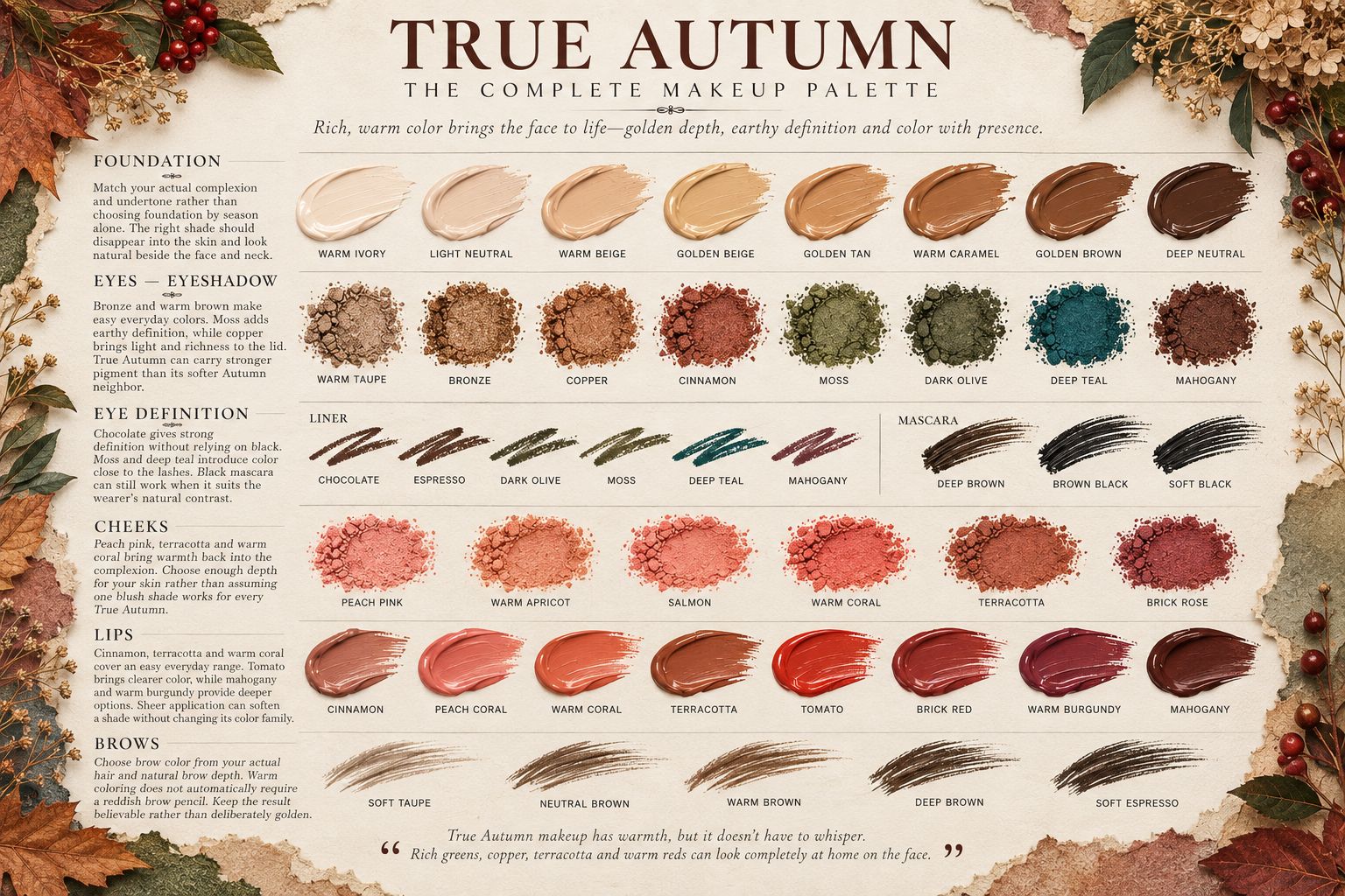
A terracotta lipstick can look perfect in the tube and much stronger once it is on your face. Before you decide it is too bold, try pressing on a lighter layer. Sometimes the color is right; it just needs a softer hand.
Foundation
Match your foundation to your skin, not your season. You do not need to make your complexion more golden to be a True Autumn.
Test a few close shades along the jaw and look at your face and neck together in daylight once they have settled. The best match should disappear into your skin. If foundation gathers around expression lines, try using a little less there before switching products. Add coverage where you want it and keep the rest lighter. Freckles and texture do not stop makeup from looking finished.
Eyes
Bronze and warm brown blend easily across the lid. Moss works well close to the lashes, and a touch of copper brings light to the eyes.
A small amount of fine shimmer on the lid can be lovely. Choose what works on your own lids rather than ruling it out because of your age.
Cheeks
Peach pink, terracotta, and warm coral all fit nicely here. Pick enough depth for your skin. Pale peach pink can look chalky on deeper skin, while a richer terracotta often feels more natural.
Build blush slowly, then step back and look at it with your whole face. If it seems patchy, check how the formula sits over your usual base.
Lips
Cinnamon, terracotta, and warm coral cover a wide range of everyday lip colors. For a stronger lip, tomato is an option; for something deeper, try mahogany or warm burgundy.
Be cautious about choosing an opaque beige just because it is labeled nude. A sheer brick red can look more natural on strongly pigmented lips. On lighter lips, a gentle cinnamon may be enough.
Pressing on a small amount as a stain is a good way to try a stronger shade. If you prefer it at that intensity, look for a sheerer formula in the same color family next time. If very matte lipstick feels dry, a satin finish is usually more comfortable. A liner close to your lip or lipstick color helps define the edge without creating a visible border.
Brows and Liner
Your brow pencil does not need to be golden just because your palette is warm. Match the effect of your own brows and hair. A reddish pencil can be surprisingly noticeable in brows that look fairly neutral.
Chocolate liner gives definition close to the lashes, and moss is a good alternative when you want a bit of color. Black mascara still works for many True Autumns.
The Best Hair Colors for True Autumn
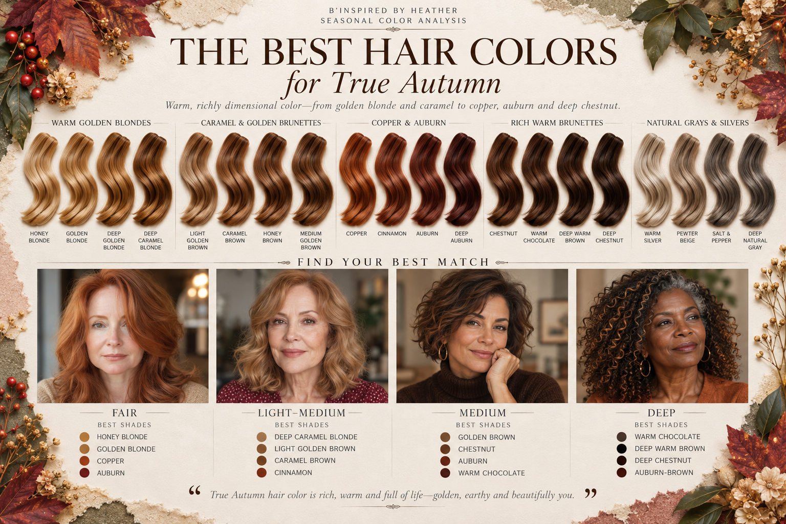
Hair color can be confusing because warm covers a wide range. A honey blonde and a deep auburn are both warm, yet they create completely different effects around your face.
Bring pictures to your colorist, including a few examples of what you do not want. The depth of the shade matters just as much as the warmth.
Blonde
If lighter hair suits you, you might look at:
Honey blonde
Golden blonde
Deep caramel blonde
A little depth running through the hair keeps blonde from turning into one pale, flat area. If your current shade feels icy, you may only need a warmer or slightly deeper version rather than a full shift to brunette.
Brunette
There are plenty of rich brown options:
Golden brown
Caramel brown
Chestnut
Warm chocolate
Deep warm brown
Pay attention to the base color as well as the highlights. A few golden strands will not change the overall effect if the base is very dark and cool.
Red
True Autumn has some beautiful red possibilities:
Copper
Cinnamon
Auburn
Deep auburn
Earthy copper and auburn keep the red within Autumn’s richer range. Very bright orange‑red or violet‑leaning red create a different impression.
Highlights
Caramel highlights bring light into warm brown hair. Their width and placement determine whether the result looks softly blended or more boldly striped.
Your cut and texture influence how highlights show, and it helps to ask how the color will grow out.
If Your Hair Is Gray
You do not have to color it.
A brow pencil that suddenly feels heavy may need adjusting, or you might prefer a little more lip definition. Small changes are worth trying before you make a decision about your hair.
If you want to blend or color the gray, ask your stylist what the regrowth will look like and how often it will need attention. The upkeep is part of the choice just as much as the color itself.
The Best Nail Colors for True Autumns
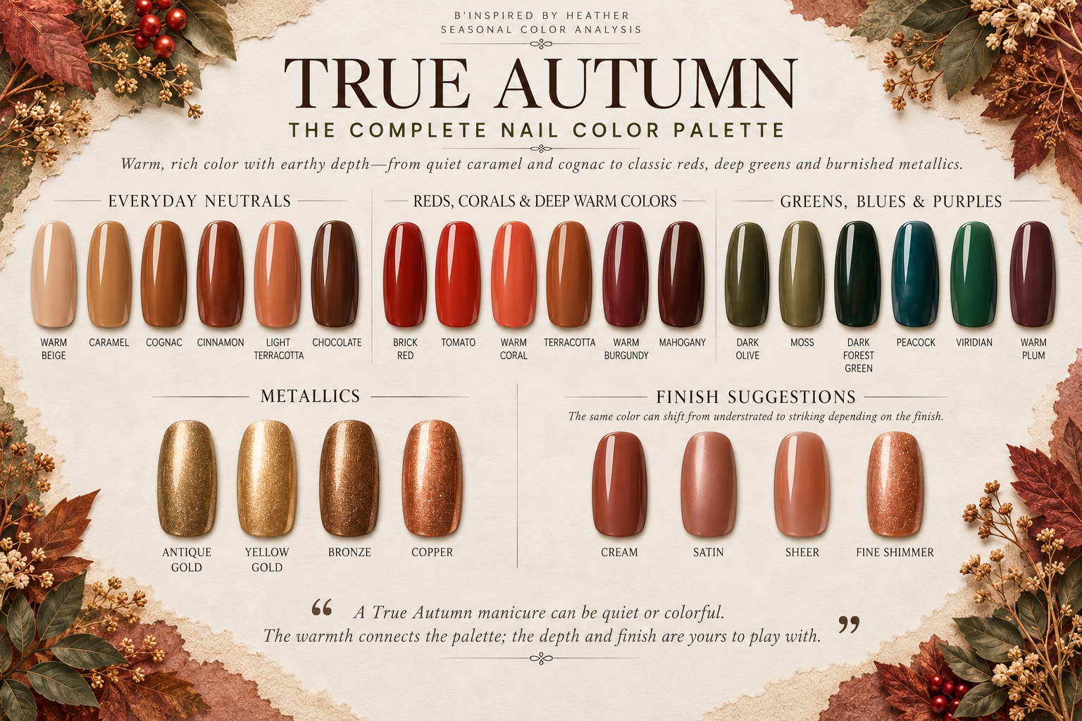
Nails let you flirt with a color you would never commit to in a sweater. Warm plum can look great in a manicure even if you would not wear it anywhere else.
Everyday Neutrals
For an everyday manicure, try:
Warm beige
Caramel
Cognac
Cinnamon
Light terracotta
Chocolate
Nude polish is completely tied to your own skin tone. A beige that melts into one person’s hand might look much lighter on yours. Testing it on a nail helps, particularly when the bottles look almost identical.
Reds, Corals & Berries
For more color:
Brick red
Tomato
Warm coral
Terracotta
Warm burgundy
Mahogany
Brick red has the comfort of a classic red manicure. Mahogany is deeper and browner, without the blue‑pink influence you see in many berry polishes.
Greens, Blues & Purples
These are worth a look:
Dark olive
Moss
Dark forest green
Peacock
Viridian
Warm plum
Glossy dark forest green is my first choice here for a dark manicure. Viridian is more colorful, especially in daylight.
Metallics
Copper, bronze, and warmer golds all fit. Fine shimmer catches the light as your hands move; a smooth metallic finish gives a stronger reflection.
Jewelry & Gemstones for True Autumns
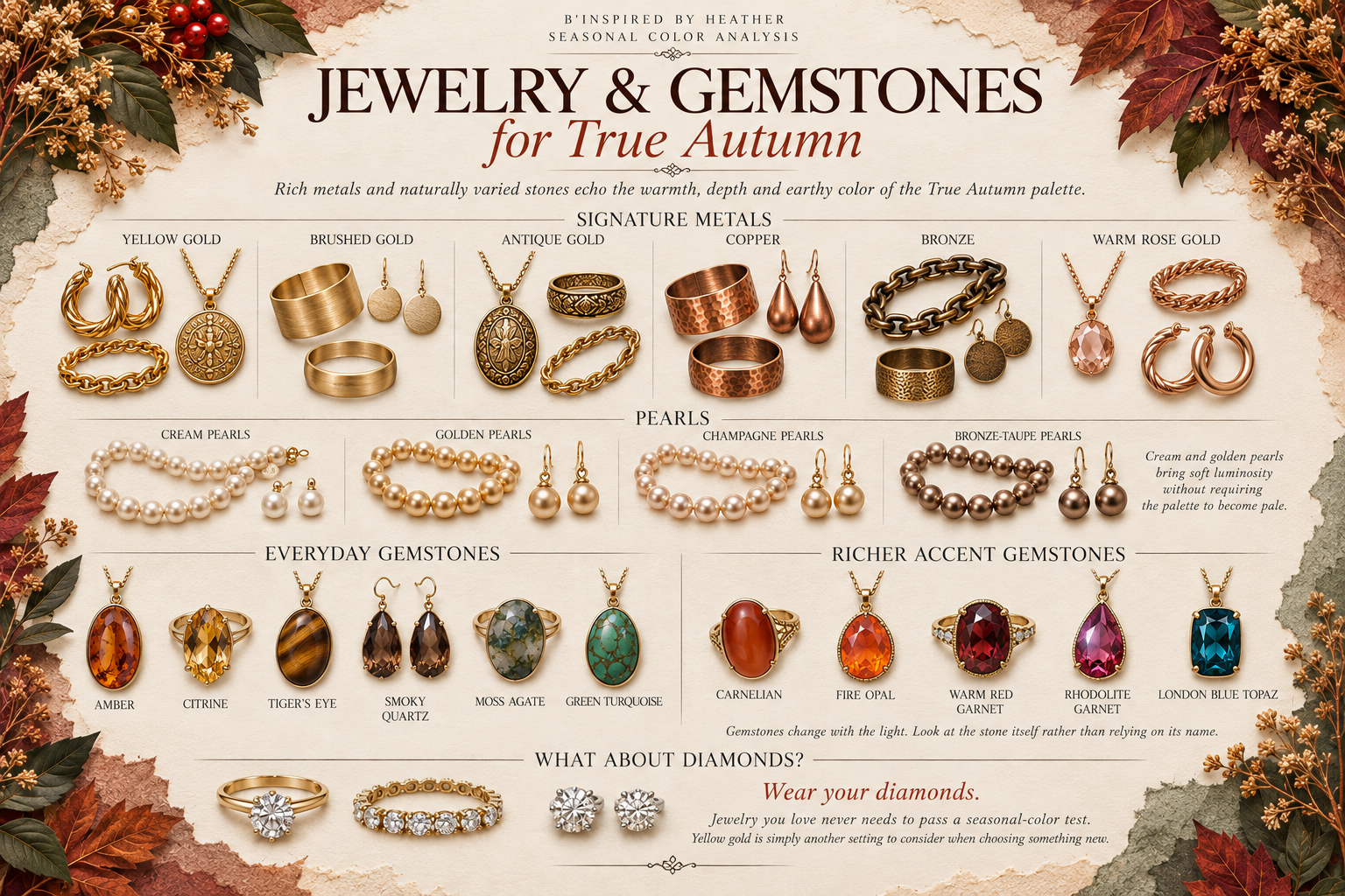
A plain sweater you’ve stopped noticing can feel finished again with a pair of amber earrings. Jewelry puts some of the palette’s richest color close to your face in a very small amount.
Metals
Warm metals include:
Yellow gold
Brushed or antique gold
Copper
Bronze
Rose gold varies from quite pink to more coppery, so look at the actual piece.
Pearls
Cream and golden pearls have a warmth that bright white strands lack. Their soft luster is lovely beside mature skin.
Gemstones
These offer plenty of warm color:
Amber
Citrine
Carnelian
Fire Opal
Rhodolite Garnet
Tiger’s eye
Smoky Quartz
Warm red garnet
Moss agate
Green Turquoise
London Blue Topaz
Take a moment to study the stone. A garnet that glows warm red in daylight can look much darker inside, almost black, and that is important if you are picking it for its color.
What About Diamonds?
Enjoy them. If you’re buying a new piece, yellow gold is a good setting to consider. Your existing diamonds in white metal don’t need replacing.
Common Styling Mistakes True Autumns Make
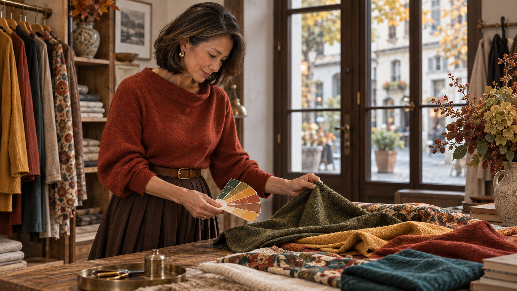
Knowing your season makes it easier to spot colors in a shop. It can also make you forget, just for a moment, everything you already know about buying clothes.
Buying the Color Instead of the Clothes
It’s easy to fall for a shade and ignore everything else. A blouse can be the perfect salmon and still have sleeves that drive you crazy.
Take a second to check the fit, the fabric, and what you’d actually wear it with. If you wouldn’t want the piece in another good color, it’s worth asking whether you want it at all.
Trying to Match the Palette Card Exactly
Fabric moves, catches light, and has texture. A printed swatch doesn’t behave the same way, so chasing an exact match can turn into a headache.
Look at the garment with the palette as a whole. A color that belongs doesn’t need to match one tiny square perfectly.
Buying a Whole New Wardrobe
Start with what’s already in your closet. Pull your warm pieces together and see what you have before you make a shopping list.
Then buy for the gaps. One shirt that works with several things will help you far more than a handful of new tops with nothing to wear underneath.
Forgetting About the Clothes Away From Your Face
Color has the most influence when it sits right under your face. That gives you plenty of freedom with trousers, shoes, and bags.
Your favorite black trousers can stay. I’d be more selective about a high neckline than a pair of boots.
Letting Your Season Become Your Style
Your season describes your coloring, not your personal style. Keep the tailoring, dresses, or dramatic pieces you love. You don’t have to dress in a way that looks traditionally Autumn.
How Does True Autumn Compare to the Other Autumn Seasons?
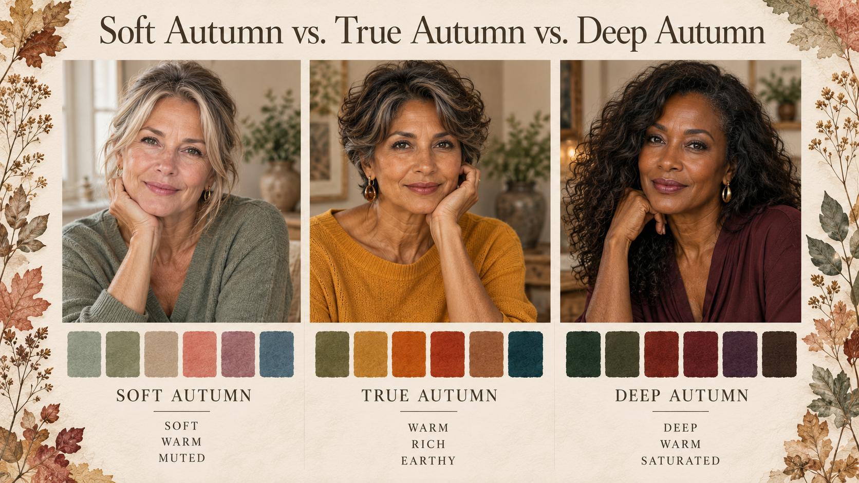
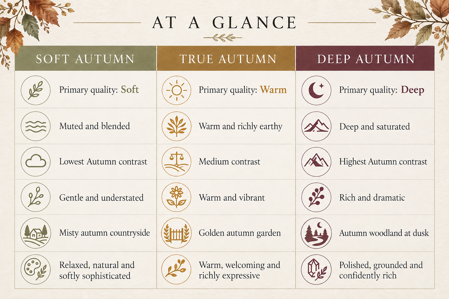
All three Autumn seasons share warmth, but they use it in different ways. Soft Autumn leans into softness, True Autumn leans into warmth, and Deep Autumn leans into depth.
It’s easier to see the difference inside a single color family. A green can soften, turn golden, or go very deep. Thinking of them side by side helps the distinctions make sense.
True Autumn
True Autumn puts the strongest emphasis on warmth. Mustard and burnt orange show it clearly, with enough richness to give the colors presence without feeling heavy.
Deep Autumn
Deep Autumn leans more toward dark, saturated color. Its deepest greens and browns carry a weight that a True Autumn might not want in every outfit. Depth is what defines this season. Those very dark colors can feel too heavy on someone whose coloring responds better to True Autumn’s warmth.
Soft Autumn
Soft Autumn is gentler and more muted, with warmth that feels quieter. Its sage shades have a grayer softness when you place them next to the warmer moss in the True Autumn palette.
Frequently Asked Questions About True Autumn
How Do I Know If I’m True Autumn or Soft or Deep Autumn?
The distinction is which quality does the most for you: warmth, softness, or depth. Use the daylight method in Characteristics of a True Autumn with the differences described above in mind.
If the result stays unclear, an analyst’s controlled drapes can help separate those qualities.
Does My Season Change When I’m Tan?
A tan changes the visible depth of your skin. It doesn’t, by itself, mean you’ve moved into another season.
You may prefer different contrasts, and your foundation shade may need adjusting. Check makeup against your current skin rather than assuming last winter’s shade is still the right one.
What If I Seem to Sit Between Two Seasons?
That happens. The categories are useful, but you don’t have to love every color in one palette and reject every color in the next.
Keep track of the shades that work consistently. If you’ve had an analysis, ask about the colors near your boundaries and how to recognize them in clothes. I wouldn’t spend more time finding the perfect label than enjoying the colors you’ve already found.
Do I Need Professional Color Analysis to Know for Sure?
Not necessarily, though an in-person consultation can help when you’re stuck between palettes. Choose someone who explains what they see and uses consistent lighting and drapes.
Phone photographs can be misleading because the camera adjusts color and exposure. One flattering photograph is too little to settle your season.
Final Thoughts
The rust red sweater might still be the one you reach for most. But now you may also pause at a rail of greens you used to walk right past, or notice the warmth in a amber blouse before you even think to check your palette card.
That’s where True Autumn becomes more interesting than its reputation for orange and brown. You start to see what saffron, viridian, and almond have in common, even though they look nothing alike at first glance. Eventually, “Is this True Autumn?” stops being the main question. You recognize the warmth, and then you move on to the real decision: whether you actually like the clothes.
Shop the True Autumn Guide
If you’re ready to add something, choose a piece that fills a gap in what you already wear.
Modern Wardrobe Essentials
Jewelry That Complements True Autumn
Makeup
Peach pink or terracotta blush suited to your skin depth
Warm rose, Coral, Cinnamon, brick red, or warm berry lipstick
Brushes
Nails
Beautiful Accessories
For glasses, check the frame color on your face as well as the fit.
Style Inspiration
Continue exploring Soft Autumn and seasonal color analysis.
Editor’s Note
Give a new color a few outings before deciding how you feel about it. Wear it with familiar clothes and see whether you reach for it again. Your preferences are useful information, including the occasional shade you enjoy that sits outside the palette.
Disclosure: This article may contain affiliate links. If you make a purchase through these links, I may earn a commission at no additional cost to you.
