

The Complete Soft Autumn Color Guide
Most of us have a color we reach for without thinking. You put it on and your skin looks healthier, your eyes a little brighter. Mostly, you just feel good in it.
For a Soft Autumn, it might be a soft teal sweater that has been a favorite for years or an olive jacket that earns compliments every time you wear it. I love those sleeper colors because they never compete for attention. People notice you rather than your clothes.
The colors that miss tell you just as much. Black is the easy choice but can feel too sharp near the face. Stark white may wash you out, while a bright emerald that looks spectacular on a True Winter can be overwhelming. Even the classic Autumn shades can go a little wild. Pumpkin becomes very orange, and a deep rust can feel as though it is wearing you instead of the other way around.
We tend to picture Autumn as camel, rust, olive and brown, but Soft Autumn has much more range than that.
If you tried the classic Autumn shades and thought, absolutely not, you may have written off the whole season when those particular colors were simply too strong. A softened cinnamon behaves differently from a brilliant orange. Eucalyptus and olive may both be green, yet one can look wonderful on you while the other just looks wrong.
In this guide, we’ll look at the full Soft Autumn palette and how to use it in clothes, makeup, hair color, nails and jewelry. We’ll also compare it with the other Autumn seasons, especially where the differences get tricky.
What Is Soft Autumn?
Soft Autumn sits between Soft Summer and True Autumn. It shares Soft Summer’s muted quality but has more warmth, while True Autumn takes those colors warmer, stronger and more golden.
Seasonal color analysis looks at temperature, value and chroma. In Soft Autumn, chroma becomes important. The colors are less saturated than those in the richer parts of the Autumn family. The palette leans warm, although some shades come quite close to neutral, and most sit somewhere in the middle in depth.
The word soft can be misleading because it describes saturation, not how light or delicate a color is. Burgundy can be deep and still muted, and forest green can be rich without being bright.
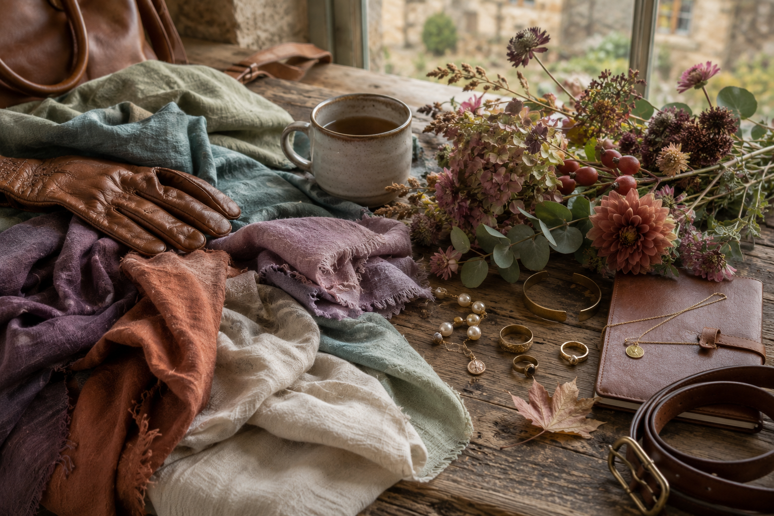
I think of an old terracotta pot that has spent several summers outside. It is still unmistakably terracotta, but the sun and weather have taken away that new-pot brightness. Soft Autumn colors remind me of that.
Color names only get you so far. Put two sweaters labeled olive beside each other and they can look completely different. One may be warmer, darker or much brighter than the other. Seeing those differences is far more helpful than memorizing a list of approved names.
Characteristics of a Soft Autumn
Two women can have medium brown hair and hazel eyes, put on the same olive blouse, and get completely different results. This is why I’m cautious about photographs that promise to identify your season from a certain combination of hair, skin and eye color.
Soft Autumn shows up across a wide range of skin tones. Some complexions have obvious peach or golden warmth; others look fairly neutral. You might discover that icy colors drain you, try something very warm instead and find that bright orange is just as bad.
Eyes give us clues, but they don't settle the question. Hazel and green are familiar Soft Autumn examples, but brown, blue-green and gray-green belong here too. I pay more attention to what a color does to the eyes. Muted teal might bring out green you barely noticed before, while warm rose can pick up the amber in hazel eyes.
There is plenty of variety in hair too. Soft Autumn includes blondes and brunettes, from obvious copper and chestnut warmth to brown hair with only a slight golden cast. Having naturally dark brunette hair doesn’t necessarily mean you are excluded.
Look at your features together instead of expecting one of them to tell you your season. Soft Autumn coloring tends to look fairly blended overall.
I wouldn’t worry if you don’t look anything like the Soft Autumn woman you see on a color-analysis chart. Seasonal color analysis would be far easier if every Soft Autumn showed up with hazel eyes and chestnut hair, but when has nature ever organized itself that neatly?
What Happens When Soft Autumns Age?
You may have worn the same colors for decades and then notice that a few don't look quite the way they used to. This becomes more noticeable as hair turns silver and brows get lighter. It doesn't mean your season has changed. You may simply wear parts of your palette differently now.
Gray hair can make things confusing because we see silver and think cool. It's tempting to start buying cooler clothes to go with it. I recommend trying them on before you overhaul your closet. If icy blue-gray makes you look tired and your warmer, softer colors still look good, trust what you see.
I'm also not convinced by the old advice that our wardrobes should get safer as we get older. As some of the natural contrast in the face fades, a closet full of beige and gray may not be doing you any favors so having some color near the face matters even more.
You might start reaching for the lighter and middle parts of the palette more than you once did, or stop wearing your darkest shades from head to toe. Pay attention to what looks good now instead of trying to recreate what worked twenty years ago.
The Unexpected Range of Soft Autumn
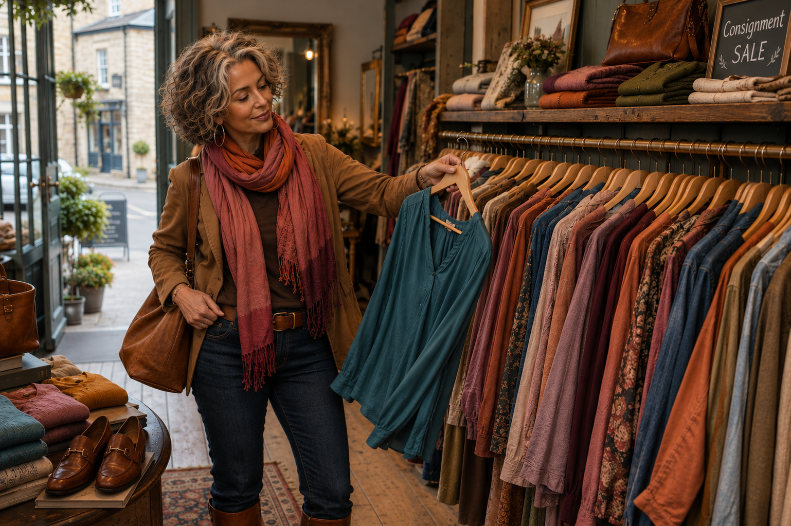
Say Autumn color palette and most of us can picture the wardrobe before we reach it: camel coats, rust scarves and enough brown shoes to outfit a small village. They belong to the season, but they've also made Autumn look much browner than it really is.
The blues are a good example. Softened denim fits beautifully within the palette, and some blue-greens look nothing like the earthy colors we expect from Autumn. Even periwinkle can work when the brightness is softened. Put it beside cognac leather or a warm neutral and it starts to make sense.
Aubergine, muted raspberry and brick red aren't the colors most of us picture either. I love having them here because they keep the wardrobe from becoming too earthy and predictable. There are only so many camel sweaters one woman needs.
Color names are partly to blame. We hear blue and think cool, but blue changes just like every other color does. It can be icy and bright, softer and warmer, or move toward blue-green. Once you start seeing those differences, Soft Autumn gets a lot bigger.
So if you came to Soft Autumn worried that you were about to spend the rest of your life dressed like a cinnamon stick, you can breathe a sigh of relief.
Your Complete Soft Autumn Color Palette
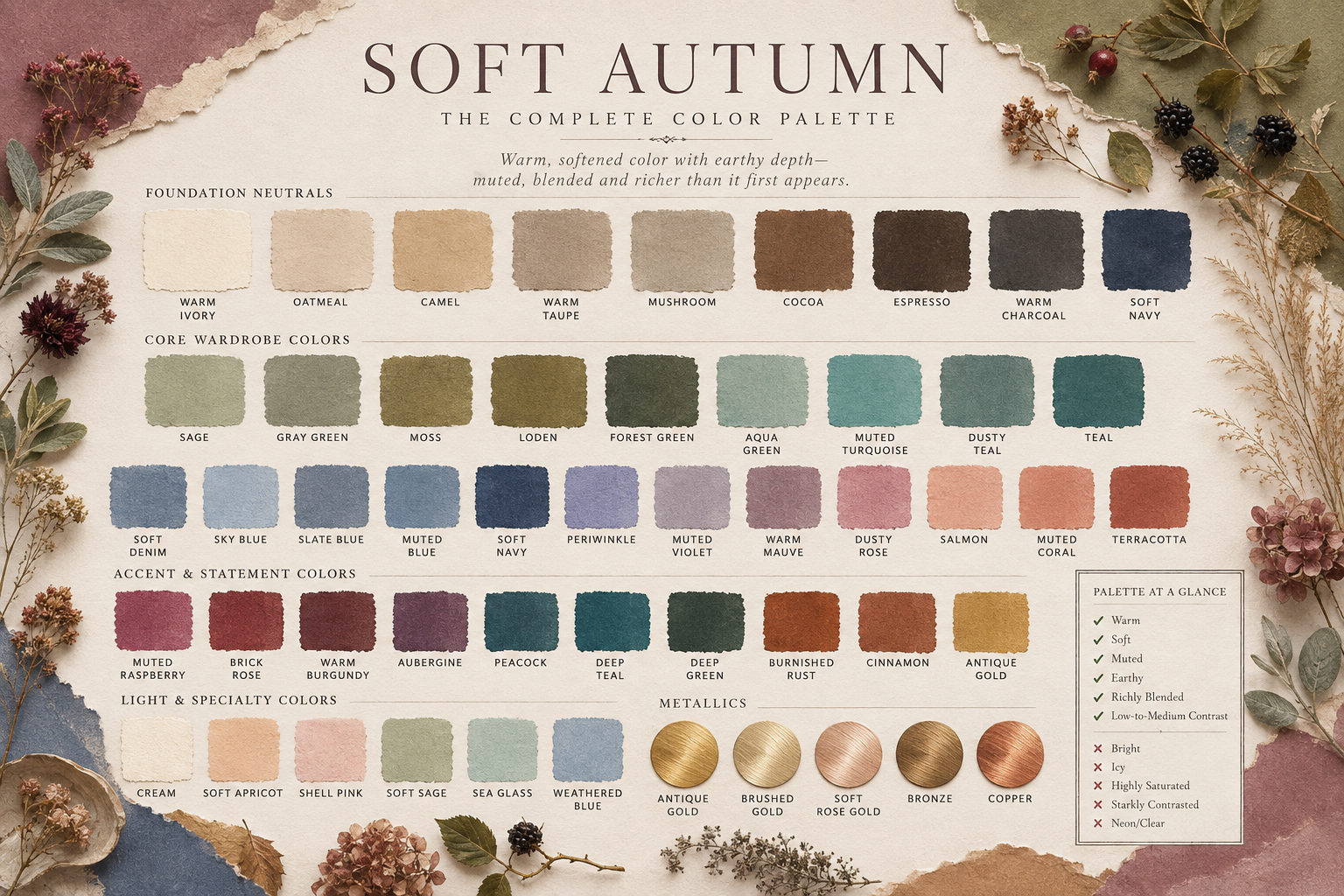
The Soft Autumn palette moves from creamy light shades into a large middle range and then into deeper colors. Greens and warm neutrals may be what we expect from Autumn, but there are plenty of blues, pinks, purples and reds here too.
Foundation Neutrals
These are the shades that give a Soft Autumn wardrobe its foundation:
Warm Ivory
Cream
Oatmeal
Parchment
Light Mushroom
Muted Khaki
Camel
Warm Taupe
Mushroom
Walnut
Coffee
Warm Charcoal Brown
Instead of stark white, black or cool gray, you'll find creamier light shades, softened tans and warm browns. Mushroom and warm taupe are especially handy when you want a neutral that doesn't look like another version of beige.
Core Wardrobe Colors
This is the largest part of the palette:
Sage
Gray Green
Moss
Loden
Forest Green
Deep Green
Aqua Green
Turquoise
Dusty Teal
Teal
Soft Denim
Sky Blue
Slate Blue
Muted Blue
Soft Navy
Periwinkle
Muted Violet
Warm Mauve
Dusty Rose
Salmon
Muted Coral
Terracotta
Green runs from Sage and Gray Green into Loden and deeper shades. Soft Denim, Slate Blue and Soft Navy make blue easy to use every day, while Warm Mauve, Dusty Rose and Salmon keep the closet from turning into one long row of earth tones.
Accent & Statement Colors
The richer end of the palette includes:
Warm Plum
Aubergine
Soft Berry
Muted Raspberry
Brick Red
Cinnamon
Mahogany
Muted Burgundy
Deep Petrol
Forest Green
Cognac
Warm Plum and Aubergine give you a break from the expected Autumn shades, while Deep Petrol and Forest Green give you depth without going all the way to black.
Light & Specialty Colors
A smaller group extends the lighter end of the palette:
Soft Peach
Apricot
Champagne
Pale Sage
Muted Aqua
These give you lighter choices beyond cream and ivory, especially for tops, summer clothes and prints. Just watch for pastels that turn icy or chalky.
Metallics
The easiest metals to incorporate are:
Brushed Gold
Antique Gold
Champagne Gold
Bronze
Copper
Soft Rose Gold
Finish makes a difference here. Bright polished gold can look surprisingly strong, while brushed, hammered and antique finishes are easier to wear.
We'll get into metals, pearls and gemstones in the jewelry section.
Colors to Consider Carefully
These colors sit farther from Soft Autumn’s muted, warm-to-neutral-warm character:
Black
Optic White
Icy Pastels
Electric Blue
Bright Fuchsia
Clear Emerald
Vivid Purple
Scarlet
Neon Coral
Bright Orange
Bright Mustard
Very Dark Espresso
These aren't colors to completely ban from your closet. If you love your black leather jacket, I’m certainly not coming to your house to confiscate it.
I'd simply suggest paying more attention when one of these colors is close to your face. Black trousers and a black handbag are a different story from a black turtleneck. The same goes for a tiny bit of icy blue in a print versus an entire icy blue blouse.
The Soft Autumn Palette at a Glance
✓ Muted
✓ Warm to neutral-warm
✓ Medium in overall depth
✓ Low to moderate saturation
✓ Blended rather than sharply contrasting
✓ Rich without becoming heavy
✓ Earthy and colorful
✗ Icy
✗ Brilliantly clear
✗ Extremely dark overall
✗ Starkly contrasting
✗ Neon-bright
✗ Intensely golden or orange
✗ Dominated by black and optic white
You don't need to wear every part of the palette equally. You might love sage, mushroom and softened blue, while another Soft Autumn lives in plum, brick red and deep green. Use the colors you actually like.
The Soft Autumn Style Philosophy
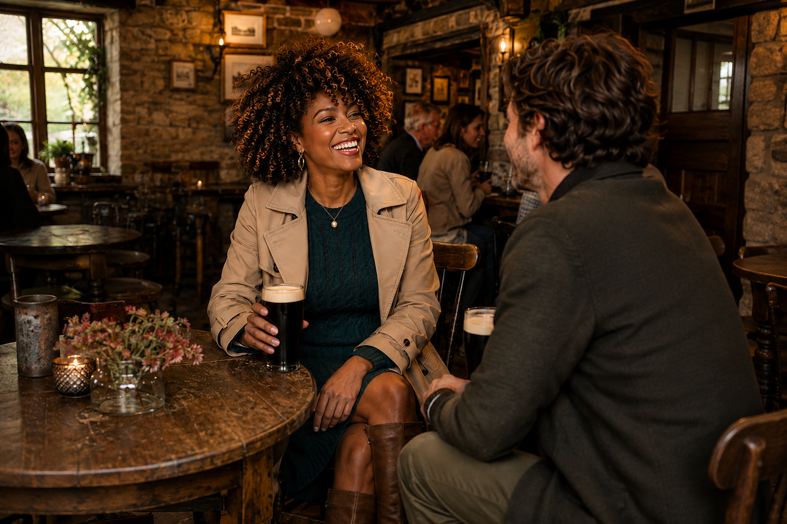
Knowing your palette is one thing. Standing in front of the closet on an average workday morning is another.
Building Contrast
Soft Autumn usually looks good with low to moderate contrast. You can still wear a dark jacket or carry a deeper handbag. Just watch very sharp jumps from light to dark.
And soft doesn't mean everything has to blend together. Tailoring, shape and a darker shoe or jacket can give an outfit plenty of structure.
Wearing Neutrals
Neutrals are wonderfully easy to collect. They are also how you wake up one morning with six taupe sweaters and absolutely nothing you feel like wearing. Let some color pieces become part of your everyday wardrobe too.
Prints & Patterns
Stand back from a print and notice what you see first. If the overwhelming impression is black and white, one perfect little patch of Soft Autumn green probably isn't going to help.
Beyond that, wear the patterns you like. Plaids, stripes, geometrics, paisleys and botanicals all work when the overall color story feels right.
Texture & Fabric
Washed denim, linen, suede, brushed wool and worn-in leather look beautiful in Soft Autumn colors. Their texture gives the colors a little more life.
Silk, satin and polished leather are lovely options as well.
Makeup for Soft Autumns
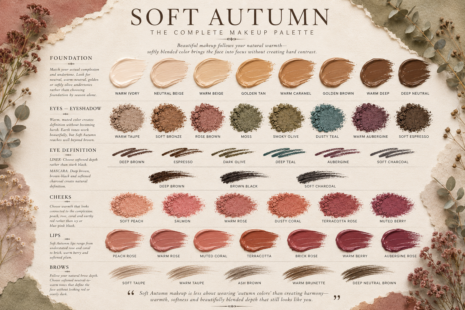
You buy the warm peach lipstick that seems perfect for Soft Autumn, put it on and somehow the lipstick is all you can see. The one two shades over might be much better. Still peach, still warm, just not quite so bright.
Foundation
Match foundation to your skin, not your season. Being a Soft Autumn doesn't automatically mean you need a bottle marked warm or golden. Test it along your jaw and choose the one that disappears into your skin.
Eyes
Warm taupe, bronze and deeper browns are the go-to everyday choices but depending on your eye color, Aubergine, forest green and olive can provide more depth.
Shimmer and a soft bit of shine can be beautiful on the right eye shape. I would just go lighter with anything very icy or frosty.
Cheeks
Peach, apricot, warm rose and terracotta are good places to start. Build the color slowly. You want blush to look like it belongs on your face, not like it was added afterward.
Lips
Don't assume Soft Autumn means just nude beige lipstick. Soft coral, warm rose, cinnamon, brick, muted berry and deeper warm reds give you plenty of beautiful shades to work with.
When you want something stronger, try going darker before going brighter. And if the lipstick enters the room several seconds before you do, I'd probably try a softer shade in the same color family.
Brows & Liner
Match your brow pencil to the hair and brows you actually have now. If your hair has gotten lighter or turned gray, the pencil you've always used may now look too dark.
Brown is an easy choice, but deep green, plum, muted blue-green and softened charcoal are good alternatives when black feels too hard.
The Best Hair Colors for Soft Autumn
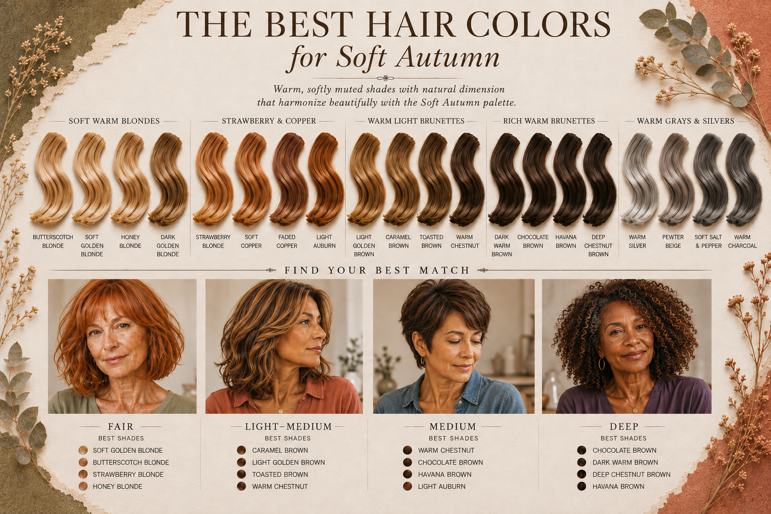
Hair color can get confusing for Soft Autumn because warm doesn’t always mean flattering. You ask for golden brown and end up wondering why your hair looks orange; go too far in the other direction with a very ashy brown and your skin may look washed out. The best shades have some warmth, but not so overpowering that you notice the warmth before you notice the person.
Blonde
Soft Autumn blondes look beautiful in shades that have a little cream, strawberry or gold in them:
Butterscotch Blonde
Soft Golden Blonde
Honey Blonde
Dark Golden Blonde
Platinum can look very cool against Soft Autumn skin, while a strong yellow-gold can be too much. If you're lightening your hair, I'd look for a blonde that still has some subtle warmth and softness to it.
Brunette
There are plenty of good choices for brunettes:
Golden Brown
Caramel Brown
Chestnut
Warm Medium Brown
Soft Chocolate
Warm Dark Brown
I especially like brunette hair when there is some natural variation in the color. A little caramel or chestnut running through brown hair gives it movement without making the highlights obvious.
Very dark, solid brown is worth watching, particularly if your coloring has become lighter with age. Sometimes taking the base up just a shade or breaking up the color with a few lighter pieces is enough.
Red
Soft Autumn and red hair can be a beautiful combination:
Strawberry Blonde
Soft Copper
Cinnamon
Soft Auburn
The tricky part is copper. It can go from gorgeous to very orange quickly. If the hair color is the first thing you see when you look in the mirror, I would soften it a little.
Highlights
Caramel, honey beige and warm beige are good places to start. I’d keep highlights fairly close to the base color so they look as though they could naturally belong there.
If Your Hair Is Gray
You absolutely do not have to color gray hair because you are a Soft Autumn.
If you love your silver, keep it. If you want to add a little warmth, a gloss, a few lowlights or some warmer pieces around the face may be enough.
Bring your palette with you when you see your stylist. Warm brown can mean something very different to you than it does to your hairstylist.
The Best Nail Colors for Soft Autumns
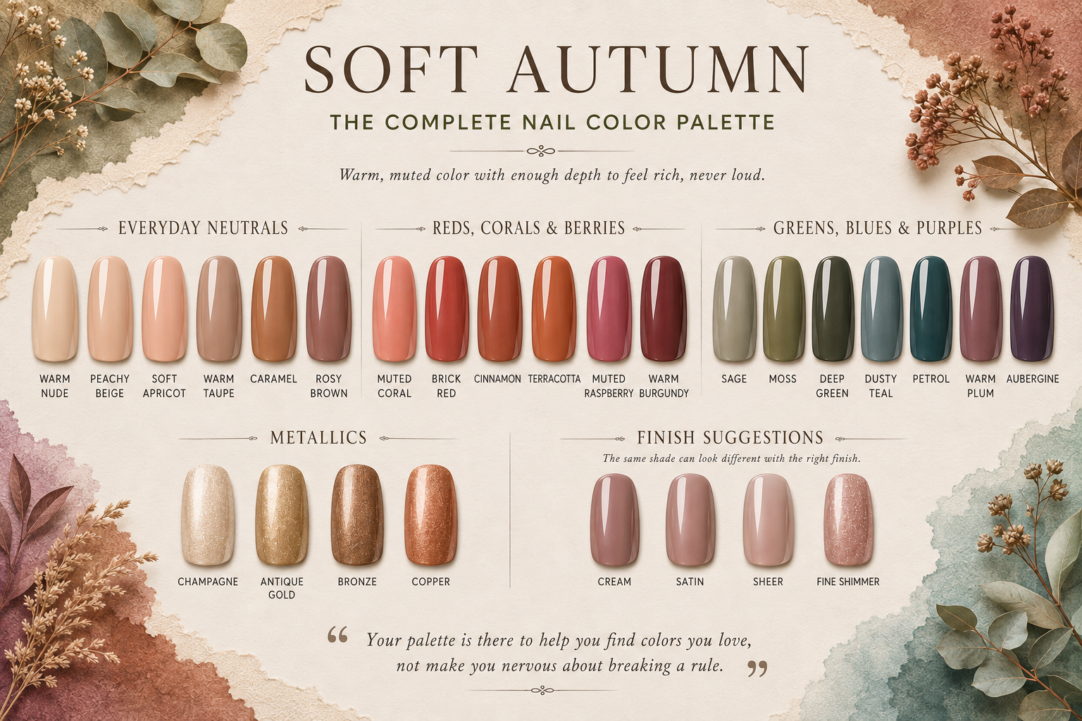
Nail polish is a great place to play with colors you might hesitate to wear in a sweater or coat. If you’re curious about that moss green or aubergine but aren't ready to build an outfit around it, try it on your nails first.
Everyday Neutrals
For an easy everyday manicure, try:
Warm Nude
Peachy Beige
Mushroom
Warm Taupe
Caramel
Rosy Brown
Nude polish is personal because skin tone makes such a difference. One person's perfect warm nude can look oddly yellow or muddy on someone else. I’d try it on a nail before buying the bottle whenever possible.
Reds, Corals & Berries
For more color:
Muted Coral
Brick Red
Cinnamon
Muted Raspberry
Warm Burgundy
Mahogany
Brick red is a particularly good choice if you love a classic red manicure but find bright red a little too strong. Burgundy gives you something darker without going all the way to black.
Greens, Blues & Purples
This is where the palette gets more fun:
Sage
Moss
Deep Green
Dusty Teal
Petrol
Warm Plum
Aubergine
Deep green and petrol are beautiful fall and winter nail colors, and aubergine gives you that dark, moody manicure without looking quite as harsh as black.
Metallics
Bronze, copper, antique gold and champagne all work well. I’d also look at the finish. A fine shimmer is very different from chunky silver glitter, even when both bottles are labeled metallic.
And nails are small. If you love glossy black polish or a bright red pedicure, wear it. Your palette is there to help you find colors you love, not make you nervous about breaking a rule.
Jewelry & Gemstones for Soft Autumns
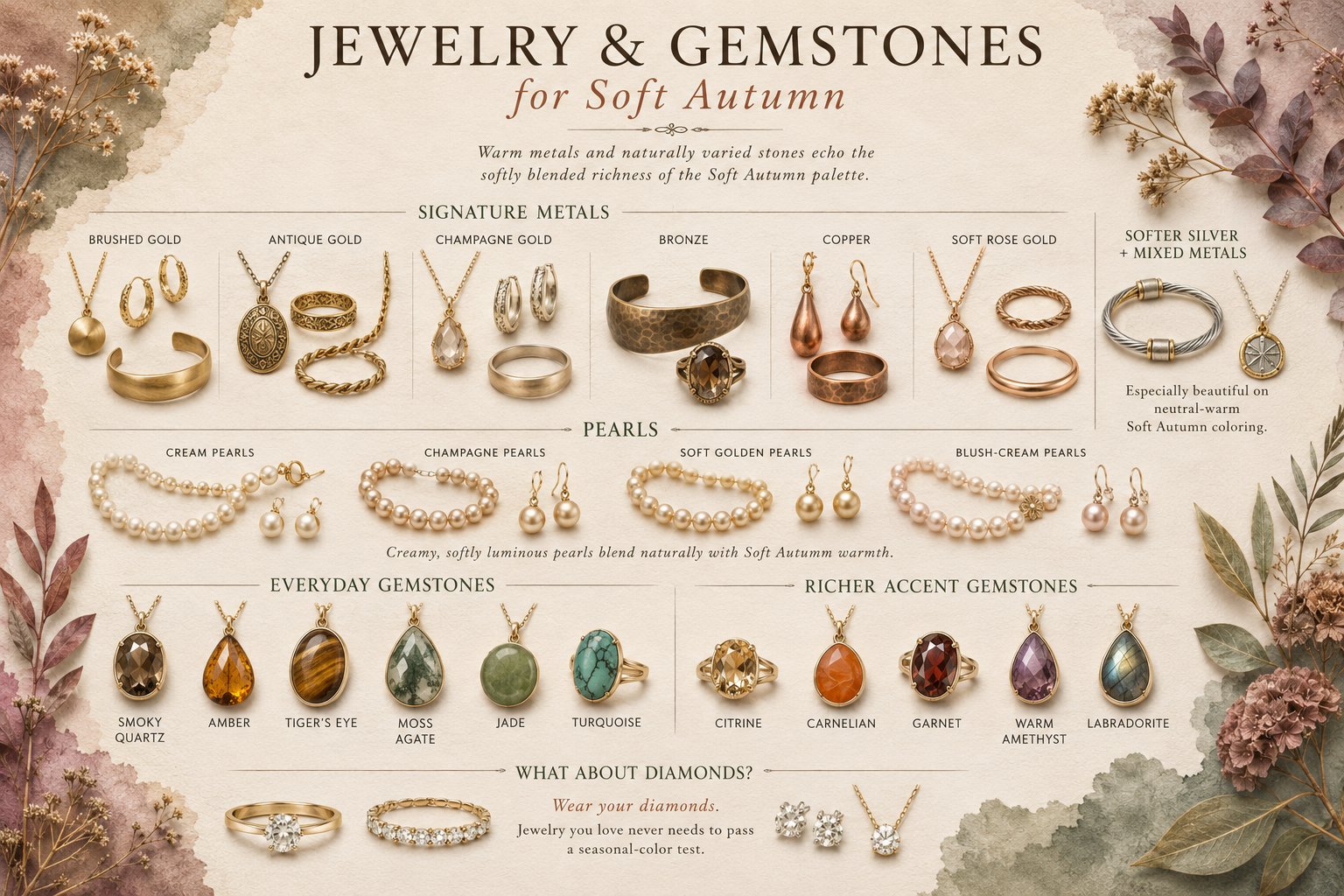
Soft Autumn has plenty of options in jewelry, especially in warmer metals and natural stones.
Metals
Brushed Gold
Antique Gold
Champagne Gold
Bronze
Copper
Soft Rose Gold
Yellow gold is an easy choice, but it isn't the only one. Softer silver and mixed metals are worth trying too, especially if your coloring sits closer to neutral.
Pearls
Cream, champagne and softly golden pearls are lovely choices for Soft Autumn. If traditional bright white pearls have never been your favorite, compare them with a creamier strand. You may prefer the difference.
Gemstones
Soft Autumn has plenty of gemstone colors to play with:
Smoky Quartz
Amber
Citrine
Garnet
Carnelian
Tiger’s Eye
Moss Agate
Jade
Turquoise
Labradorite
Warm Amethyst
Natural stones are especially nice here because their color isn't perfectly uniform. A garnet may have brown running through the red; turquoise can have beautiful veining; moss agate looks different from one stone to the next.
Choose the ones you love. Jewelry is also an easy place to wear a color you enjoy but wouldn't necessarily buy as a blouse or dress.
What About Diamonds?
Wear your diamonds.
A color analysis should never leave you wondering whether you need to stop wearing your wedding ring. If you're choosing a new piece, you might find that yellow or champagne gold looks especially good on you. Existing jewelry you love doesn't need to pass a seasonal-color test.
Common Styling Mistakes Soft Autumns Make
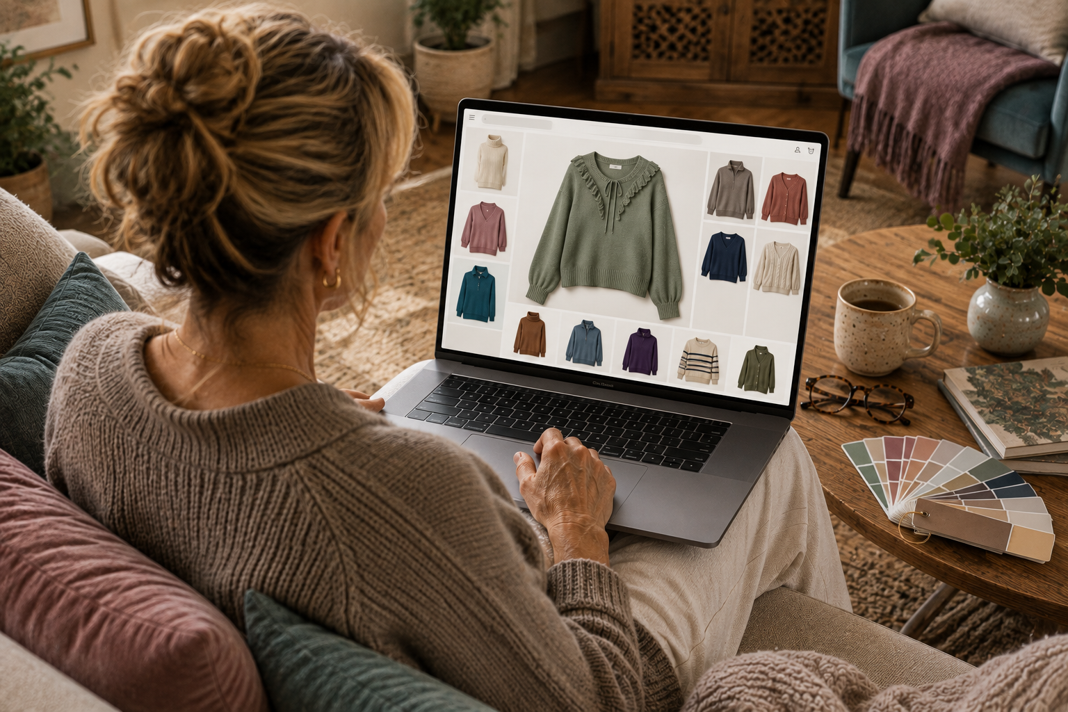
Once you know your season, the mistakes tend to happen less with identifying colors and more with trying to build a wardrobe around them.
Buying the Color Instead of the Clothes
Finding your season can make shopping a little funny for a while. You spot a perfect Soft Autumn green across the store and head straight for it, even though you don't particularly like the sweater.
The color still has to earn its place in your closet. If you don't like the neckline, the fabric feels cheap or you already own three sweaters that do the same job, the perfect shade of green isn't enough to make it a good purchase.
Trying to Match the Palette Card Exactly
A palette card is a reference, not a paint chart.
You don't need to hold every blouse against a swatch and wait for an exact match. Fabric and lighting change the way color looks. Step back and look at the garment as a whole. Does it look like it belongs with the rest of your palette?
This gets easier surprisingly quickly. After you've shopped with your palette for a while, you'll start spotting the obvious misses before you even pull them off the rack.
Buying a Whole New Wardrobe
Please don't come home from a color analysis and start filling donation bags.
Go through what you already own first. You'll probably find pieces that fit your palette beautifully, others that work well enough, and a few that finally explain why you never seem to wear them.
Replace things as you need them. Your next coat, blouse or pair of glasses can be a better choice without turning Soft Autumn into a very expensive weekend project.
Forgetting About the Clothes Away From Your Face
A color that isn't wonderful next to your skin may be perfectly fine somewhere else.
That gives you much more freedom with trousers, skirts, shoes and handbags. It also means an old favorite doesn't have to leave the closet just because its color isn't on your palette card.
I'd be pickier about a turtleneck than a pair of shoes.
Letting Your Season Become Your Style
This may be the mistake I care about most. Soft Autumn describes your coloring. It doesn't mean you need to dress earthy, romantic, bohemian or traditionally “Autumn.”
If you love clean tailoring, wear it. If your closet is full of feminine dresses, keep them. If you prefer modern clothes and barely own a floral print, there is no Soft Autumn rule requiring you to start.
How Does Soft Autumn Compare to the Other Autumn Seasons?
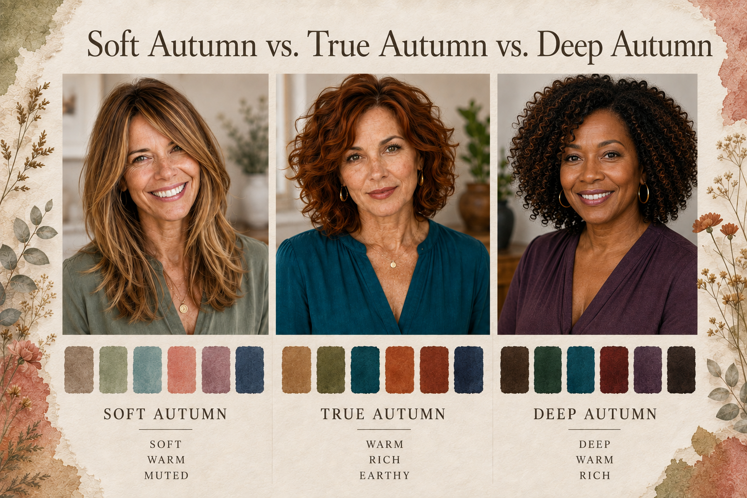
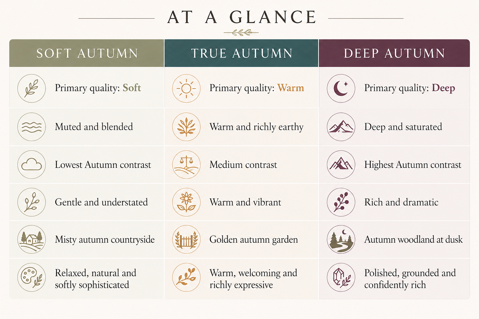
All three Autumn seasons share warmth, but they don't use it in quite the same way. Soft Autumn is led by softness, True Autumn by warmth, and Deep Autumn by depth. Seeing them together makes those differences much easier to spot.
True Autumn
True Autumn carries more warmth and strength. Its classic fall colors have a golden, rich quality that Soft Autumn doesn't need.
If you've been fairly sure you're an Autumn but the traditional fall palette keeps feeling like too much, compare yourself with True Autumn. This is especially useful with the stronger colors in each palette, where the difference becomes much easier to see.
Deep Autumn
Deep Autumn moves much farther into dark color. It has the depth to carry shades that may begin to feel heavy on a Soft Autumn.
If you've been considering Deep Autumn, pay attention to what happens as the colors get darker. Do they give your face more definition, or do you keep wanting to choose the lighter shades from the palette? That tells us more than hair or eye color alone.
Soft Autumn
Soft Autumn sits at the gentler end of the Autumn family. It doesn't have True Autumn's strong golden warmth or Deep Autumn's darkness.
If you're deciding among the three, compare the same type of color rather than three unrelated swatches. Put an Autumn green from each season beside your face, then try a red or neutral. Keeping the color family the same makes it much easier to see whether softness, warmth, or depth gives you the best result.
Frequently Asked Questions About Soft Autumn
How Do I Know If I’m Soft Autumn or Soft Summer?
This is one of the easier pairs to confuse because both seasons are muted.
Soft Summer leans cool; Soft Autumn leans warm. Instead of comparing the colors the two palettes have in common, try the ones that pull them apart. Compare a cooler mauve with a warmer rose, a blue-gray with a warmer green-gray, or cool silver with softer gold.
If the cooler choices make you look a little pale while the warmer ones bring some life back to your face, Soft Autumn is more likely. If the warm shades start looking yellow or earthy on you, look more closely at Soft Summer.
Does My Season Change When I’m Tan?
No. A tan changes the depth of your skin, but it doesn't normally change your underlying season.
You may prefer slightly different colors when you're tanned because the contrast between your skin, hair and clothing has changed. Your overall palette should still make sense.
What If I Seem to Sit Between Two Seasons?
You might.
The twelve-season system gives us useful categories, but people don't arrive in twelve perfectly organized groups. Someone close to Soft Summer may borrow a few colors from that palette; someone closer to True Autumn may handle more warmth.
I wouldn't spend too much energy trying to force yourself into the exact center of Soft Autumn. Figure out which palette gives you the best starting point, then notice where you have a little extra room.
Do I Need a Professional Color Analysis to Know for Sure?
Not necessarily, although a good in-person analysis can be helpful when you're stuck between seasons.
At home, compare colors in natural daylight with little or no makeup. Don't ask whether you like the color. Watch your face. Does your skin look clearer? Do your eyes become easier to see? Do shadows around the eyes or mouth become more noticeable?
And don't decide from one good sweater. Look for a pattern across several colors.
Final Thoughts
After a while, a rack of green sweaters stops looking like twenty versions of the same green. You start seeing the one that's too bright, the one that's cooler than you expected and the one you want to try before you've even checked the price tag.
You'll also figure out which corner of Soft Autumn feels most like you. Maybe you wear the greens constantly, discover that salmon is much better than the pinks you've been buying, or finally find a warm neutral that works with half your closet.
Eventually, you stop thinking about the palette quite so much. You just get better at spotting your colors.
Shop the Soft Autumn Guide
If you're ready to put the palette to work, these are useful places to start.
Modern Wardrobe Essentials
Start with versatile pieces that can work with plenty of what is already in your closet.
Jewelry That Complements Soft Autumn
Warm metals and natural-looking stones make this an especially pretty category to shop.
Beauty Favorites
A few well-chosen beauty colors are an easy way to bring Soft Autumn closer to the face.
Makeup
Brushes
Nails
Choose a small range that moves easily from quiet everyday manicures to deeper color.
Beautiful Accessories
Accessories are useful when you want to add another part of the palette without buying more clothes.
Style Inspiration
Continue exploring Soft Autumn and seasonal color analysis.
Editor’s Note
Don't worry about getting Soft Autumn exactly right on your first shopping trip. Start with the colors you already know make you feel good and pay attention from there. A blouse you wear constantly will teach you more about your palette than a swatch you keep staring at and aren't quite sure about.
Disclosure: This article may contain affiliate links. If you make a purchase through these links, I may earn a commission at no additional cost to you.
