

How to Choose the Most Flattering Blush After 50: Placement, Color and Lift

I don't think I've ever met a woman in her fifties or sixties who suddenly decided she needed more blush.
Usually the opposite happens.
Many of us become more cautious with color as we get older.
We worry about looking overdone. We worry about drawing attention to texture. We worry about makeup settling where it never used to settle.
Yet one of the most common things I notice when working with mature women is not too much blush.
It's not enough.
Or more accurately, not enough in the right place.
Over the years, I've watched countless women sit down in my treatment room, glance into a mirror, and tell me they feel they look tired.
What's interesting is that the solution is rarely what they expect.
Most assume they need better foundation. A different concealer. More coverage. A brighter under-eye product.
Sometimes that's true.
More often, what I notice first is a lack of warmth and vitality through the center of the face.
As we move through menopause and beyond, our natural coloring often changes in subtle ways. Skin can appear less luminous. The healthy flush that once appeared after a brisk walk, a good laugh, or a day spent outdoors becomes softer and less predictable. Features that used to feel naturally defined can begin blending together visually.
It's rarely dramatic.
In fact, the shift is often so gradual that many women can't quite identify what feels different.
They simply know their makeup doesn't create the same effect it once did.
This is where blush becomes surprisingly important.
Not because it makes someone look younger.
But because it restores warmth, dimension, and energy to the complexion.
A well-chosen blush can bring life back to the complexion, create gentle structure, and guide the eye upward in a way that feels effortless rather than obvious.
The challenge is that many of the blush techniques we learned years ago aren't necessarily the techniques that serve us best today.
A few thoughtful adjustments can completely change the way the face looks and feels.
The goal isn't to wear more blush.
The goal is to wear it more intentionally.
The Placement Mistake That Changes Everything
One of the reasons blush can feel less flattering over time has very little to do with the blush itself.
More often, it's where we're putting it.
Many of us learned blush placement decades ago.
Smile.
Find the apples of the cheeks.
Add color to the roundest part.
For years, that advice worked beautifully.
The challenge is that faces are not static.
As we age, facial volume gradually shifts. The contours of the face soften. Features that once sat higher naturally settle slightly lower. It's simply part of being human.
Yet many women continue applying blush exactly where they did twenty or thirty years ago.
The result is often subtle but important.
Color sits lower on the face than it once did.
The eye follows that placement downward.
Instead of creating freshness and energy, blush can sometimes make the face feel heavier than it actually is.
This is one of those beauty adjustments that seems almost too small to matter.
Until you see it.
I often compare it to hanging artwork in a room.
Move a picture just a few inches higher and the entire space feels different.
The artwork hasn't changed.
The room hasn't changed.
Only the placement.
Blush works much the same way.
A slight shift upward can create an entirely different visual effect.
The Placement That Creates a Natural Lift
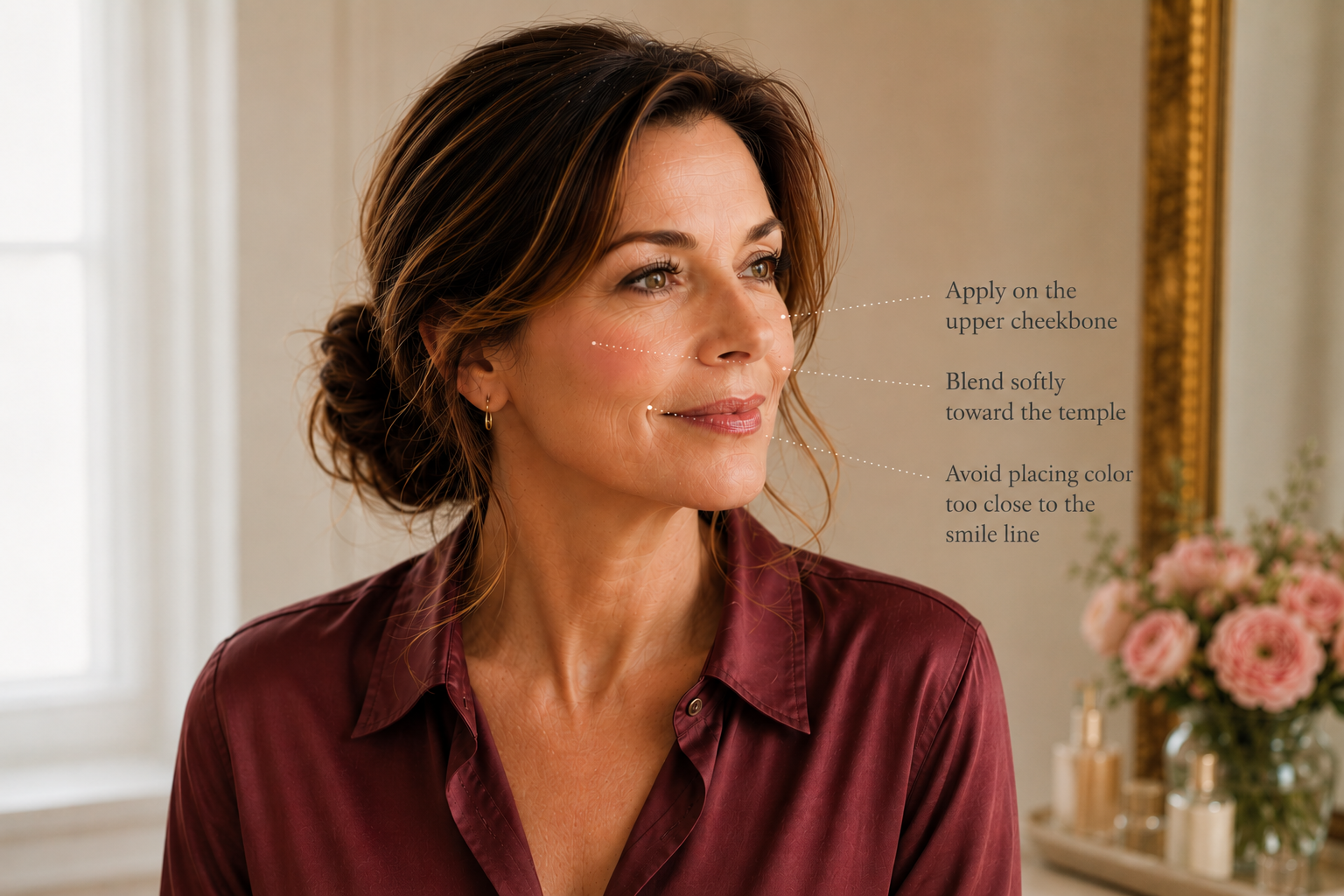
One of the most flattering adjustments for mature faces is moving blush slightly higher than traditional placement.
Rather than concentrating color directly on the center of the cheeks, begin along the upper portion of the cheekbone and blend softly outward and upward toward the temples.
Notice that I didn't say "toward the hairline."
One of the mistakes I occasionally see is women taking blush so far outward that it begins to disappear into the sides of the face.
Focus on creating a gentle upward direction.
Think of a watercolor wash rather than a stripe.
The blush should seem to melt into the skin rather than sit on top of it.
When placement is right, people rarely notice the blush itself.
What they notice is that the face appears brighter.
More awake.
More vibrant.
The effect is subtle, but it can be remarkably effective.
Why Lift Matters More Than Color
This may sound surprising coming from someone who loves color analysis, but placement usually matters more than shade.
I’ve seen women wearing the perfect blush color in the wrong location with disappointing results. I’ve also seen a less-than-perfect shade placed beautifully and still look wonderful.
Color certainly matters, but placement creates structure. Once blush is sitting in a more flattering place, choosing the right color becomes much easier.
How to Choose a Blush Color That Actually Flatters You
If placement creates lift, color creates harmony.
And harmony is often what separates makeup that looks beautiful from makeup that simply looks noticeable.
One of the reasons blush can feel frustrating after 50 is that many women are wearing colors chosen years ago.
The blush isn't necessarily bad.
It simply belongs to a different version of them.
Hair color changes.
Skin tone evolves.
Natural pigmentation softens.
Even the way light reflects from the complexion shifts over time.
The shades that once felt effortless may suddenly seem too bright, too dull, too warm, or oddly disconnected from the rest of the face.
This is where understanding your coloring becomes incredibly helpful.
Because while trends come and go, harmony rarely goes out of style.
Start With Temperature
Before worrying about specific blush brands or formulas, it helps to understand whether your coloring generally leans warm or cool.
Warm coloring often looks beautiful in:
Soft peach
Warm coral
Cinnamon rose
These shades tend to bring warmth and vitality back to the complexion without overwhelming it.
Cool coloring often comes alive in:
Soft pink
Berry rose
Rose beige
These shades create freshness and softness while maintaining balance.
One of the easiest clues is your lipstick drawer.
If your favorite lip colors tend to be peachy, coral, or warm rose, you may naturally gravitate toward warmer blush tones.
If you consistently reach for pinks, mauves, berries, and cooler roses, cooler blushes often feel more harmonious.
Of course, seasonal color analysis allows us to go much deeper than warm versus cool.
But even this simple distinction can eliminate a surprising amount of trial and error.
Why "Universal" Blush Colors Rarely Exist
Beauty marketing loves the phrase "universally flattering."
In reality, most colors flatter some women more than others.
A blush that looks fresh and luminous on a Spring woman may appear too bright on a Summer.
A beautiful berry rose on a Winter may feel heavy on an Autumn.
This isn't a flaw.
It's simply evidence that coloring matters.
Think of blush the way you might think about fabric.
A color that looks stunning in a cashmere sweater doesn't automatically belong in every wardrobe.
The same is true of makeup.
The idea isn’t to find a universally flattering blush.
It's finding the one that looks as though it naturally belongs on you.
The Most Flattering Blush Colors by Season

Spring
Spring women often shine in colors that feel fresh, clear, and light-filled.
Beautiful choices include:
Soft peach
Apricot
Light coral
Warm pink
These colors bring brightness to the complexion without appearing heavy.
Summer
Summer coloring tends to be softened and elegant.
Some of the most flattering choices include:
Soft pink
Rose beige
Mauve pink
Delicate berry rose
These shades create a natural flush that feels refined rather than obvious.
Autumn
Autumn women often come alive in richer, earthier tones.
Look for:
Warm rose
Soft terracotta
Burnished peach
Copper rose
These shades echo the natural warmth already present in the complexion.
Winter
Winter coloring often benefits from greater contrast and clarity.
Beautiful options include:
Berry rose
Raspberry
Cool pink
Cranberry rose
These colors add vitality while maintaining the crispness that Winters wear so beautifully.
The Shade That Makes You Look Rested
When women ask me for a single shortcut, this is usually what they're really asking.
"What blush color gives me that healthy glow?"
The answer is almost always a shade that recreates the natural flush your skin would have if you had just returned from a brisk walk on a cool morning.
When blush begins to mimic the natural color that already exists within your complexion, something interesting happens.
The makeup becomes difficult to identify.
People don't notice your blush.
They simply notice that you look well.
And in my experience, that's usually the most flattering result of all.
Cream vs. Powder Blush After 50

If there is one beauty category that has undergone a dramatic shift over the past decade, it's blush.
For years, powder blush was simply what most of us used.
A compact lived in the makeup bag.
A brush sat on the bathroom counter.
Color went on almost automatically.
Then cream blush began appearing everywhere.
Suddenly beauty experts were declaring powder outdated, insisting that every woman over 50 should abandon her powder products immediately.
As with most beauty advice, the truth is more nuanced.
I don't believe mature women need to stop wearing powder blush.
I do think we benefit from understanding what different formulas do—and how our skin changes over time.
One of the most noticeable shifts many women experience after menopause is dryness.
Skin often becomes thinner, less oily, and less naturally reflective than it once was. Products that looked soft and seamless ten or fifteen years ago can sometimes appear more obvious on the surface of the skin.
This is one reason cream blush has become so popular.
Cream formulas tend to melt into the complexion rather than sitting on top of it. They often create the impression that color is coming from within the skin rather than being applied over it.
The effect can be incredibly beautiful.
Fresh, natural. and almost effortless.
When applied lightly, cream blush often mimics the kind of glow many women feel they've lost over time.
That said, powder isn't the villain it is sometimes made out to be.
A beautifully formulated powder blush can still look elegant on mature skin.
In fact, some women prefer it.
Those with combination skin, warmer climates, or longer wear requirements often find powder easier to manage throughout the day.
The difference usually comes down to texture and finish.
A finely milled satin powder tends to look far more flattering than an overly matte formula.
Likewise, a cream blush that remains tacky or overly dewy can sometimes emphasize texture just as much as the wrong powder.
The goal is not cream versus powder.
The goal is skin that looks like skin.
I often encourage women to stop asking:
"Which formula is best for mature skin?"
and start asking:
"Which formula looks most natural on my skin?"
The answer may be different for every woman.
Some love the softness of creams.
Others prefer the ease and longevity of powders.
Many discover that a combination of both creates the most beautiful result.
A touch of cream blush for freshness.
A whisper of powder blush layered lightly on top for longevity.
What matters most is not following a trend.
It's paying attention to what happens when you look in the mirror.
Does the color appear integrated into the complexion?
Does it enhance the skin rather than sit on top of it?
Does it create vitality without drawing attention to itself?
When the answer is yes, you've found the right formula—regardless of what beauty trends happen to be popular this season.
Five Blush Mistakes That Can Add Years Instead of Lift

One of the things I find most reassuring about makeup is that small changes often create the biggest improvements.
Blush is a perfect example.
Most women don't need a completely different makeup routine.
They usually need a few thoughtful adjustments.
Over the years, I've noticed that the blush mistakes mature women make are rarely about the blush itself.
They're usually about placement, proportion, and habit.
Many of us continue doing things simply because we've always done them that way.
The challenge is that our faces change.
The mirror changes.
The rules occasionally need to change too.
Applying Blush Too Low
If I could change only one thing for most women, this would probably be it.
Blush placed too low on the face can subtly pull attention downward.
The effect is often difficult to identify.
The face doesn't necessarily look "wrong."
It simply looks heavier than it could.
When color sits slightly higher on the cheekbone and diffuses upward, the entire face often appears fresher and more energized.
The difference can be surprisingly significant.
Choosing Color Based on Trends Instead of Coloring
Every year seems to bring a new must-have blush shade.
The problem is that trend colors don't automatically become flattering colors.
A blush that looks extraordinary on someone with bright Spring coloring may feel overwhelming on a Soft Summer.
Likewise, a muted rose that looks effortless on a Summer woman can seem almost invisible on a Winter.
The intention isn't to wear the color everyone else is wearing.
It's to wear the color that brings your complexion to life.
This is one reason seasonal color analysis can be so helpful.
It removes much of the guesswork.
Applying Too Much Product at Once
This is particularly common with highly pigmented formulas.
A blush can go from beautiful to overpowering in a matter of seconds.
Whenever possible, I prefer building color gradually.
A light application can always be strengthened.
Removing excess product is much more difficult.
One of the most elegant makeup techniques is patience.
Apply.
Step back.
Look at the face as a whole.
Then decide whether more is actually necessary.
Forgetting to Blend Beyond the Edges
Beautiful blush rarely has a clear beginning and end.
Instead, it seems to fade naturally into the complexion.
Harsh edges often draw attention to the makeup itself.
Soft transitions draw attention to the face.
Whenever I finish applying blush, I almost always spend a few extra seconds blending around the perimeter.
Those final moments often make the difference between makeup that looks applied and makeup that looks integrated.
Trying to Recreate the Face You Had at Thirty
This may be the most important point of all.
Many beauty frustrations begin when we continue chasing results that belonged to a different season of life.
The face changes.
Skin changes.
Color changes.
What looked beautiful twenty years ago may not create the same effect today.
And that's perfectly normal.
The objective isn't to recreate the face you had at thirty.
It is to work beautifully with the face you have now.
In my experience, the women who look most elegant aren't the ones fighting every change.
They're the ones who understand how to adapt.
A slightly different placement.
A more flattering color.
A softer formula.
Small adjustments.
Beautiful results.
How to Make Blush Look Like It Belongs There
One of the easiest ways to identify beautiful blush application is that you usually don't notice the blush.
You notice the woman.
Her complexion looks alive.
There is warmth in the face.
A sense of vitality.
But your eye isn't immediately drawn to a stripe of color sitting on top of the skin.
That's because the most flattering blush application is often the one that appears almost accidental.
This is where makeup begins to feel less like a collection of products and more like an art form.
The goal isn't to paint color onto the face.
The goal is to recreate the impression of natural color.
Step Away From the Mirror
One of the most common mistakes I see is evaluating blush from three inches away.
At that distance, every detail feels important.
Every edge looks sharper.
Every variation in color feels magnified.
Yet no one experiences your face from three inches away.
They see you across a table.
Walking through a room.
Sitting across from them at dinner.
After applying blush, I always encourage women to step back from the mirror.
Look at your entire face.
Look at your eyes.
Look at your lips.
Look at the overall balance.
Very often, what felt like too little color up close suddenly looks perfect from a normal viewing distance.
Natural Light Tells the Truth
Bathroom lighting can be surprisingly deceptive.
So can magnifying mirrors.
Some of the most flattering blush applications I've ever seen looked almost invisible indoors.
Then came alive beautifully in natural daylight.
Whenever possible, check your makeup near a window before deciding you need more product.
Natural light has a way of revealing whether blush has truly blended into the complexion or whether it's beginning to dominate it.
The answer is usually obvious the moment you see it.
Think About Harmony, Not Features
One of the reasons women become frustrated with makeup is that we often evaluate every feature separately.
The eyes.
The lips.
The cheeks.
The skin.
But beautiful makeup isn't created feature by feature.
It's created through harmony.
A soft blush paired with a strong lip can look stunning.
A brighter blush paired with minimal eye makeup can feel fresh and modern.
The question isn't whether the blush looks good by itself.
The question is whether it belongs with everything else happening on the face.
The most elegant makeup applications always feel connected.
Nothing competes.
Nothing overwhelms.
Each element supports the others.
Build Slowly
There is a reason professional makeup artists often work in thin layers.
Color is much easier to add than remove.
A gentle wash of blush can always be strengthened.
An overly intense application often requires correction.
Whenever you're uncertain, stop one step earlier than you think you should.
Live with it for a few minutes.
Walk into different lighting.
Look again.
You may discover that what initially seemed understated is actually exactly right.
The Goal Isn't Perfection
This may be the most important beauty lesson of all.
Many women spend years trying to perfect makeup.
Perfect placement.
Perfect color.
Perfect symmetry.
Perfect blending.
Yet some of the most beautiful faces I've ever seen were not perfect.
They were expressive.
Warm.
Interesting.
Alive.
Blush should support that.
It should bring energy to the complexion without becoming the center of attention.
It should enhance rather than distract.
And when it's working beautifully, people rarely ask what blush you're wearing.
They simply tell you that you look wonderful.
Which, in my opinion, is the entire point.
The Real Purpose of Blush After 50
If there is one thing I hope women take away from this conversation, it's that blush is not really about color.
At least not in the way most people think.
It's not about following trends.
It's not about owning the newest product.
And it's certainly not about trying to recreate the face you had at twenty-five.
The women I meet who look the most beautiful rarely have the most makeup on.
They aren't chasing every trend that appears on social media.
They aren't trying to erase every line, soften every shadow, or fight every visible sign of age.
Instead, they've learned something far more valuable.
They've learned how to work with themselves rather than against themselves.
The same is true of blush.
The right placement creates lift. The right color creates harmony. The right formula creates softness.
Together, they restore something that can gradually become less visible with time: vitality.
A thoughtfully chosen blush won’t make you look like someone else. It won’t make you look twenty years younger.
What it can do is help you look more like yourself — healthy, vibrant, and beautifully alive.
And in my experience, that’s always the most flattering result of all.
Color certainly matters, but placement creates structure. Once blush is sitting in a more flattering place, choosing the right color becomes much easier.
Often that's the moment women stop feeling like they're wearing blush and start feeling like they simply look more rested.
Disclosure: This article may contain affiliate links. If you make a purchase through these links, I may earn a commission at no additional cost to you.