

The Complete Light Summer Color Guide
There’s a moment many women recognize—when a certain shade seems to lift your complexion, brighten your eyes, and make your whole presence feel softer and more at ease. And then there are colors that, no matter how lovely they look on someone else, feel a little too loud or a little too heavy the moment you put them on.
If you’ve always felt drawn to soft blues, gentle seafoam greens, delicate lavenders, and cool, airy neutrals, you may be a Light Summer.
Light Summer is one of the most luminous, refreshing palettes in the twelve‑season color analysis system. Its beauty isn’t built on contrast or drama—it’s built on harmony. It’s colors feel balanced, breathable, and quietly elegant, creating an overall impression that’s relaxed, refined, and naturally graceful. There’s nothing forced about it. Nothing demanding. Just a gentle clarity that lets you shine without ever overpowering you.
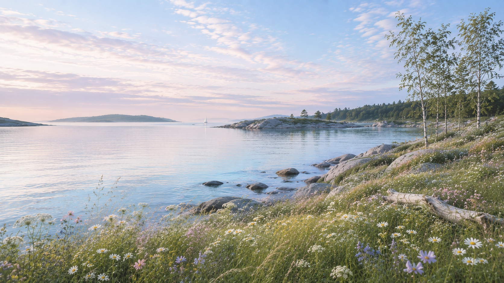
Part of what makes this palette so special is how naturally it mirrors the places many of us find inspiring. Weathered cottages in coastal Scandinavia. Misty Nordic harbors. Pale summer skies. Soft linen textiles. Brushed silver, sea glass, and wildflowers gathered from the edge of a meadow. Light Summer carries that same sense of calm beauty—timeless, understated, and deeply comforting.
This guide is designed to be your companion as you step into the world of Light Summer. We’ll explore the defining characteristics of the palette, the colors that bring it to life, wardrobe inspiration, makeup and hair color, jewelry, nail shades, and simple styling principles that make getting dressed feel easier, lighter, and more intentional.
Whether you're just beginning to explore seasonal color analysis or simply looking to refine your personal style you’ve been cultivating for years, I hope this guide helps you build a wardrobe—and a sense of confidence—that feels beautifully true to you.
What Is a Light Summer?
Light Summer is one of those palettes that feels instantly familiar once you begin to recognize it. In the twelve‑season color system, it sits gently between the freshness of Light Spring and the cool refinement of True Summer—borrowing a little brightness from one, a little softness from the other, and creating something beautifully its own.
At its core, Light Summer is defined by three qualities: cool undertones, light value, and soft chroma. In everyday language, that simply means the colors that flatter you most are cool rather than warm, lighter rather than deep, and softly muted rather than bold or intense. These shades don’t compete with your features—they support them. They create harmony instead of contrast, allowing your natural coloring to feel clear, bright, and quietly radiant.
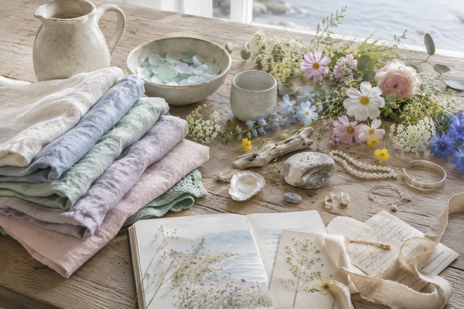
If you picture a Scandinavian morning just after sunrise, you’ll understand the palette immediately. Pale blue sky with a whisper of lavender. Soft silver light reflecting across the water. Weathered driftwood, sea glass, wildflowers, linen. Nothing demands attention, yet everything belongs. That’s the essence of Light Summer—gentle, cohesive, and effortlessly elegant.
Many women who fall into this season discover they've been choosing Light Summer colors long before they ever knew there was a name for them. Soft blues feel more natural than cobalt. Gentle pinks flatter more easily than fuchsia. Cool grays, seafoam greens, and delicate lavenders quietly become favorites because they echo the coloring you already carry.
One of the biggest misunderstandings about Light Summer is that it’s simply “pale.” It isn’t. It’s light without being washed out, soft without being dull, and cool without feeling icy. When worn well, Light Summer can feel polished, refined, and memorable in the most understated way—because the colors work together rather than competing for attention.
As you continue through this guide, you'll learn how to recognize the defining characteristics of Light Summer, identify the colors that bring your complexion to life, and build a wardrobe and beauty routine that feels cohesive, intentional, and beautifully aligned with who you are.
Characteristics of a Light Summer
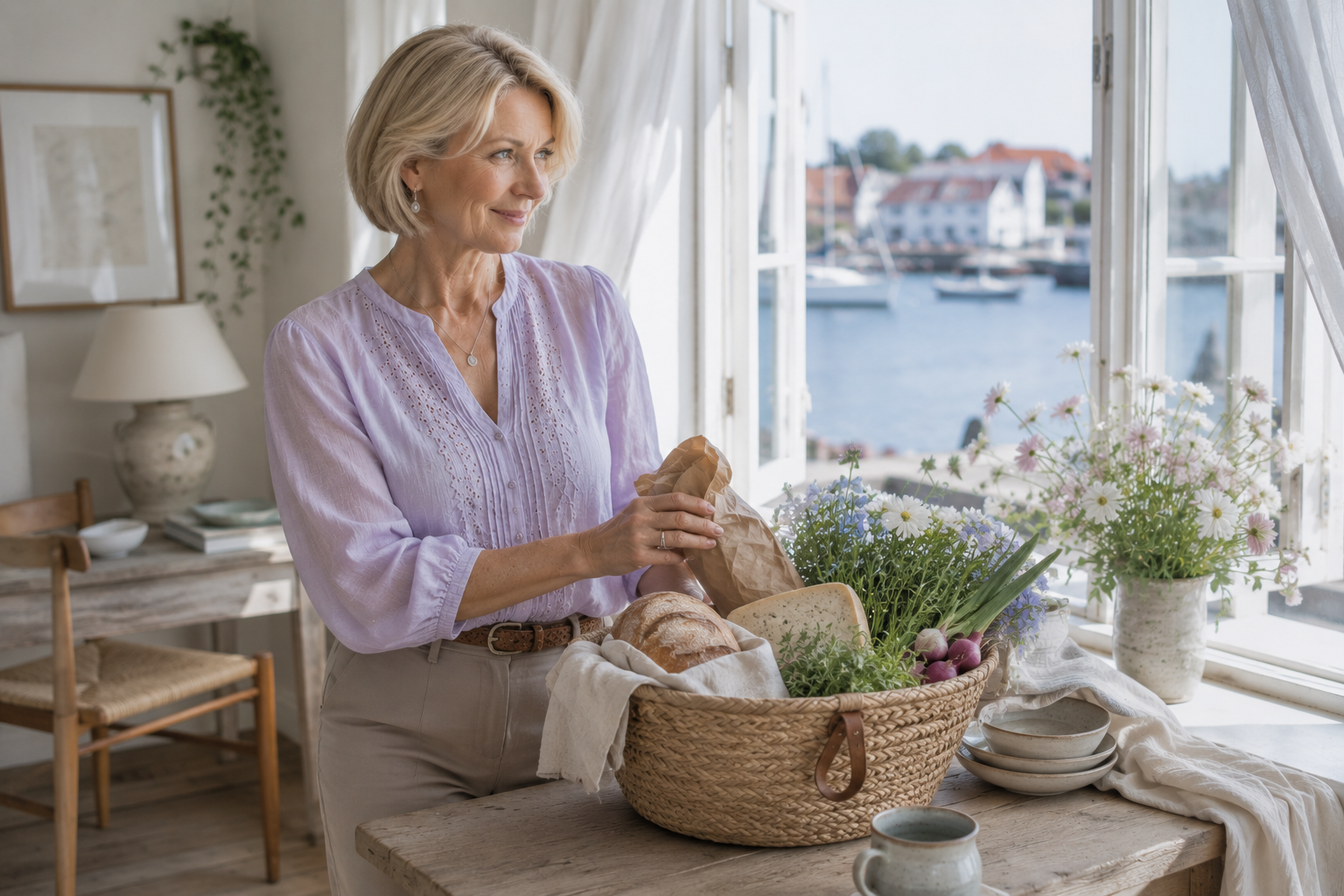
One of the questions women ask most often is, “How do I know if I’m truly a Light Summer?” The answer is never found in one isolated feature. It’s the overall harmony of your coloring—the way your skin, eyes, and hair work together—that reveals your season.
Light Summers share a feeling rather than a formula. No two women look exactly alike, yet their coloring creates a similar impression: cool, light, and softly blended. Nothing feels harsh or overpowering. Instead, everything rests in gentle balance.
Skin
Light Summer skin carries cool or cool‑neutral undertones and a naturally soft clarity. Complexions may range from fair porcelain to light or even medium tones, but they rarely show strong warmth or golden richness. Some women have a naturally rosy complexion, while others appear more neutral. Freckles may be present, but they tend to look muted rather than warm or sun‑kissed.
Eyes
Light Summer eyes often have a luminous, watercolor quality. Shades like soft blue, blue‑gray, gray‑green, light green, and cool hazel are common. Even when the eyes are striking, they don’t rely on bold contrast—they glow gently, shifting subtly depending on the light. There’s an airy, reflective quality that feels unmistakably Light Summer.
Hair
Natural hair colors typically fall in the light‑to‑medium range and lean cool. Ash blonde, dark blonde, light ash brown, and soft cool brown are frequent. What you won’t see is the golden warmth of Spring or the coppery richness of Autumn. And when silver strands begin to appear, Light Summers often find they blend beautifully, creating an elegant, harmonious transition.
Contrast
One of the defining traits of Light Summer is low to medium contrast. Skin, hair, and eyes flow together without dramatic differences in depth. This is why stark combinations—like pure black with bright white—can feel too harsh. Light Summers shine in pairings that echo their natural softness: powder blue with pearl, soft navy with cool white, seafoam with dove gray. Instead of creating drama through contrast, these combinations create elegance through harmony.
The Overall Impression
Perhaps the easiest way to recognize a Light Summer is to step back and take in the whole picture. There’s a fresh, luminous quality—calm, approachable, quietly elegant. Their beauty doesn’t rely on vivid color or bold contrast. It comes from the gentle harmony created when every element supports the next.
If much of this description feels familiar, Light Summer may very well be your season. In the next section, we’ll explore the palette itself and look at how these characteristics translate into the colors that help Light Summers look and feel their most radiant.
What Happens When Light Summers Age?
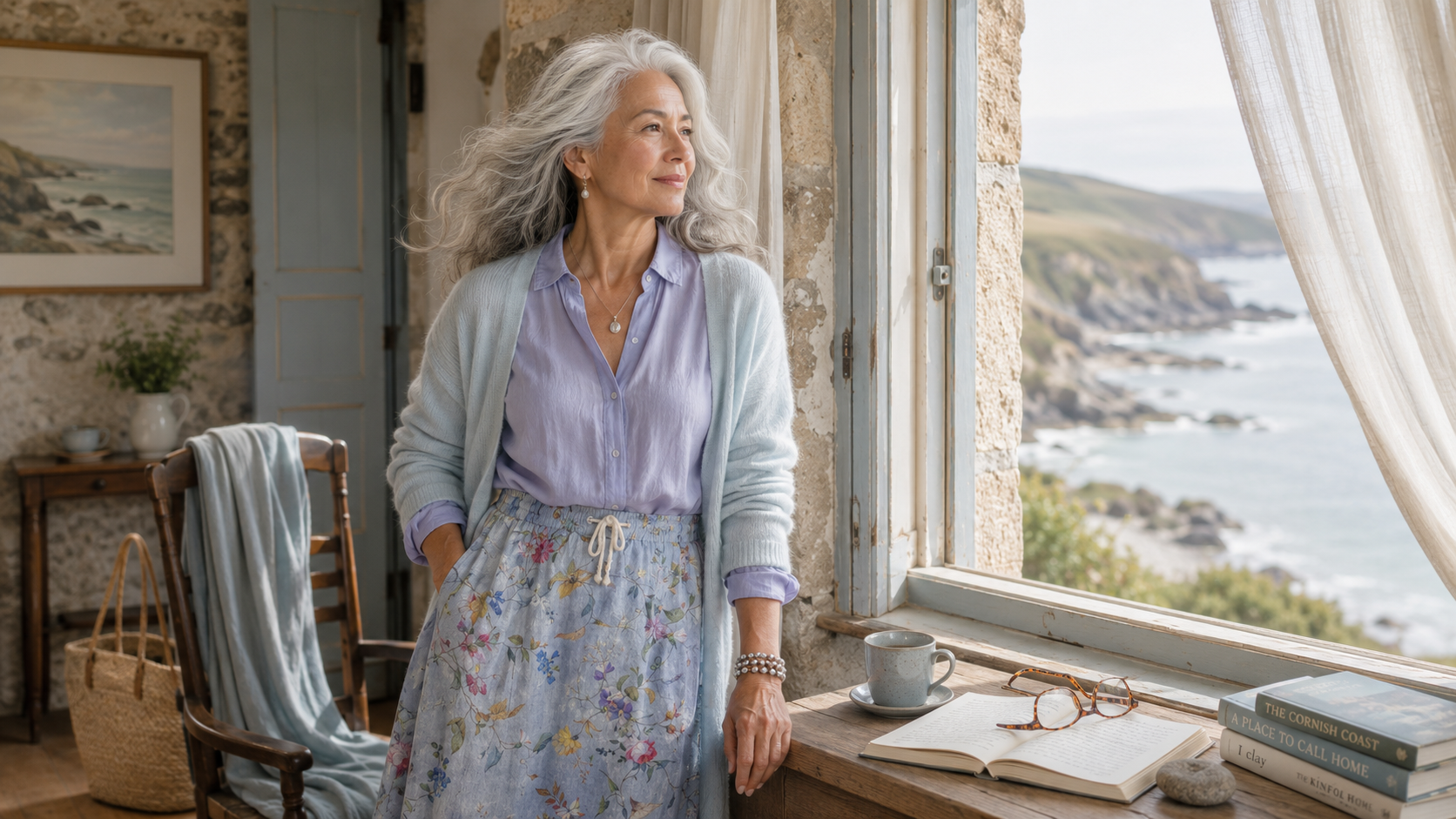
This is often the stage of life when many Light Summers begin wondering why colors that once felt effortless no longer feel quite the same.
As we age, our natural coloring continues to evolve. Hair gradually softens into silver, pearl, or cool gray. Skin often becomes more delicate in contrast, and hormonal changes during menopause can subtly influence pigmentation, texture, and overall luminosity.
It’s easy to assume that stronger colors will restore what feels lost.
Some women reach for darker clothing, hoping deeper contrast will create definition. Others turn toward brighter, more saturated shades in an effort to feel more youthful.
Ironically, both approaches can move Light Summers further away from the gentle luminosity that has always been one of their greatest strengths.
As your coloring becomes lighter and more luminous, the soft clarity that has always defined the Light Summer palette often becomes even more flattering. Delicate, cool colors reflect light gently across the complexion, allowing your skin to appear fresher, brighter, and more rested—without ever demanding attention.
Many women believe they need bolder makeup, darker clothing, or stronger colors as they grow older.
In reality, the opposite is often true.
The airy shades that once felt almost too subtle may become the very colors that bring the most life to your face. Instead of trying to recreate the contrast of earlier decades, discovering your seasonal palette allows you to embrace the quiet luminosity that naturally develops with age.
This is one of the reasons so many women discover Seasonal Color Analysis later in life and suddenly understand why certain colors have always felt effortlessly right, while others—no matter how beautiful—never truly felt like them.
Why Light Summer Colors Feel So Elegant
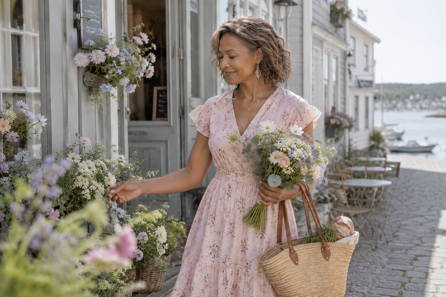
Every seasonal palette carries its own mood—its own quiet emotional signature—and that's part of what makes seasonal color analysis so endlessly fascinating. Light Summer isn’t just a group of cool shades arranged on a chart. It’s a feeling.
There’s an effortless calm woven through this palette. The colors are light enough to feel fresh, cool enough to feel refined, and soft enough to blend together without ever competing for attention. Rather than creating beauty through contrast, Light Summer creates beauty through harmony—colors that settle gently beside one another, each enhancing the next.
It’s no surprise that Light Summer feels so at home in landscapes where everything seems to exhale. Coastal villages with weathered clapboard cottages. Misty harbors where the sky and sea blur into one soft horizon. Linen curtains drifting in an open window. Wildflowers growing along quiet paths. The gentle rhythm of waves against a weathered dock. The palette mirrors the same sense of ease and quiet confidence found in these places.
Where brighter palettes make their presence known through vivid color, and deeper palettes create richness through contrast, Light Summer expresses elegance through restraint. Nothing feels excessive. Every shade has room to breathe. Colors complement rather than compete, creating a sense of balance that feels both modern and timeless.
This sensibility often extends beyond clothing. Many Light Summer women naturally gravitate toward interiors filled with natural light, soft textiles, weathered wood, brushed silver, simple ceramics, and gentle layers of color. Whether choosing a wardrobe, decorating a home, or planning a journey, there’s often a natural appreciation for spaces that feel peaceful, intentional, and beautifully lived in.
One of Light Summer’s greatest strengths is its versatility. These colors mix effortlessly, making it easy to build a wardrobe where nearly everything works together. Instead of chasing trends or filling your closet with pieces that never quite work together, you can invest in fewer, better garments that feel relevant season after season.
And perhaps that’s what I love most about Light Summer. It reminds us that elegance doesn’t need to shout to be seen. Sometimes the most beautiful things are the ones that whisper—softly, confidently, and with a quiet grace that lingers long after the moment has passed.
The Complete Light Summer Color Palette
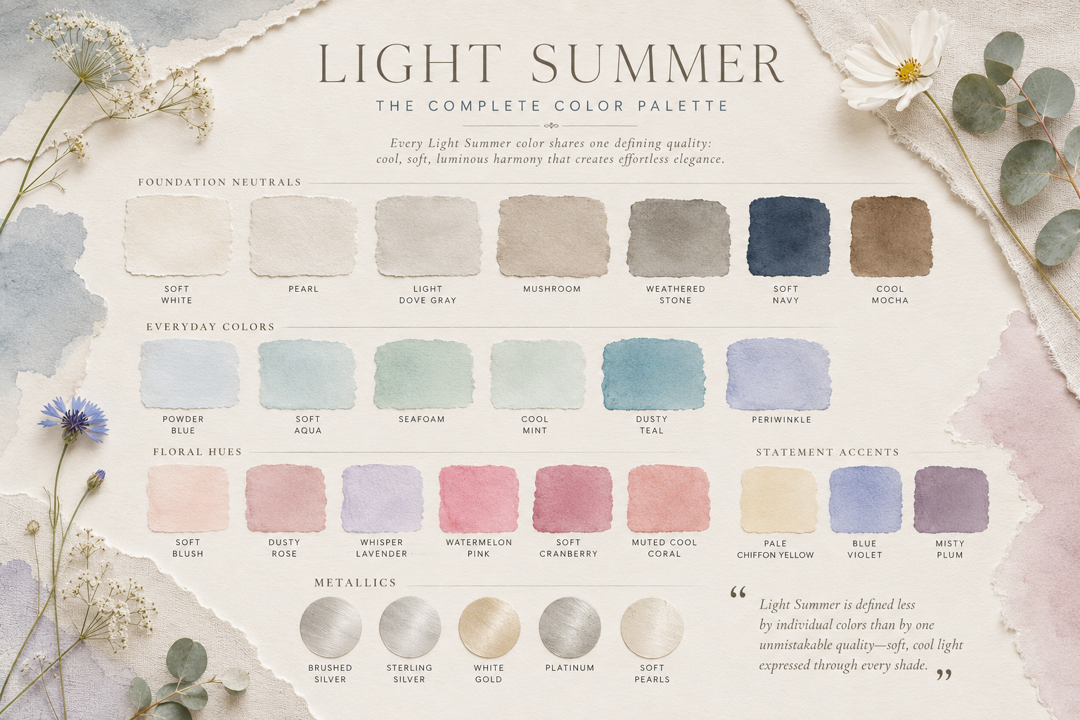
Once you understand the personality of Light Summer, the palette itself begins to feel wonderfully intuitive. These colors don’t rely on bold saturation or dramatic contrast to make an impact—they create beauty through balance. Every shade feels connected to the next, making it easy to build a wardrobe where pieces naturally mix, layer, and complement one another without effort.
One of Light Summer’s greatest strengths is its versatility. Whether you’re choosing everyday basics, special‑occasion pieces, makeup, or travel staples, the colors share the same cool, light, softly muted character. Nothing competes for attention. Instead, the palette creates harmony—a quality that makes getting dressed feel simpler, calmer, and more intentional.
For me, Light Summer always calls to mind the colors of a Scandinavian summer. Pale skies reflected across still water. Sea glass gathered along the shoreline. Weathered wood softened by salt air. Wildflowers blooming in quiet meadows. Together, these hues create a palette that feels fresh, peaceful, and timeless.
Core Neutrals
These are the foundation shades that anchor a Light Summer wardrobe. They pair effortlessly with nearly every color in the palette and create the quiet sophistication that defines the season.
Soft White
Pearl
Light Dove Gray
Mushroom
Weathered Stone
Soft Navy
Cool Mocha
Signature Colors
These hues give Light Summer its unmistakable personality—fresh, airy, and luminous without ever feeling overly sweet or brightly saturated.
Powder Blue
Dusty Teal
Soft Aqua
Seafoam
Cool Mint
Pale Chiffon Yellow
Soft Lavender
Periwinkle
Dusty Rose
Cool Blush
Accent Colors
Accent shades add depth and interest while maintaining the gentle harmony Light Summer is known for. Used thoughtfully, they provide contrast without overwhelming the palette.
Watermelon Pink
Raspberry Rose
Soft Cranberry
Muted Cool Coral
Blue Violet
Misty Plum
Metallics
When it comes to jewelry and accessories, cooler metals feel naturally at home with Light Summer’s refined softness.
Brushed Silver
Sterling Silver
White Gold
Platinum
Soft Pearls
Brushed Pewter (occasionally)
These finishes reflect light gently, enhancing the palette’s luminous quality without introducing unnecessary warmth.
Colors to Consider Carefully
Just as certain shades enhance a Light Summer’s natural coloring, others can feel too heavy, too warm, or too intense.
In general, Light Summers look their most harmonious when avoiding:
Black
Deep Charcoal
Chocolate Brown
Camel
Mustard
Pumpkin
Rust
Tomato Red
Bright Orange
Neon Shades
Highly Saturated Jewel Tones
This doesn’t mean these colors are forbidden. If you love them, simply wear them farther from your face or soften them with a Light Summer neutral. Seasonal color analysis is about creating harmony—not following rigid rules.
The Light Summer Palette at a Glance
✓ Cool
✓ Light
✓ Soft
✓ Airy
✓ Gentle Contrast
✗ Warm
✗ Heavy
✗ Deep
✗ Highly Saturated
One of the most reassuring discoveries in building a Light Summer wardrobe is realizing you don’t need an overflowing closet to create endless combinations. When your colors naturally belong together, a small, thoughtful palette becomes far more powerful than dozens of pieces that never quite harmonize.
Instead of trying to wear every shade in the Light Summer spectrum, begin with a curated collection of colors you’ll reach for again and again. These are the shades that form the foundation of an elegant wardrobe—easy to pair, flattering to wear, and timeless enough to stay beautiful season after season.
The Light Summer Style Philosophy
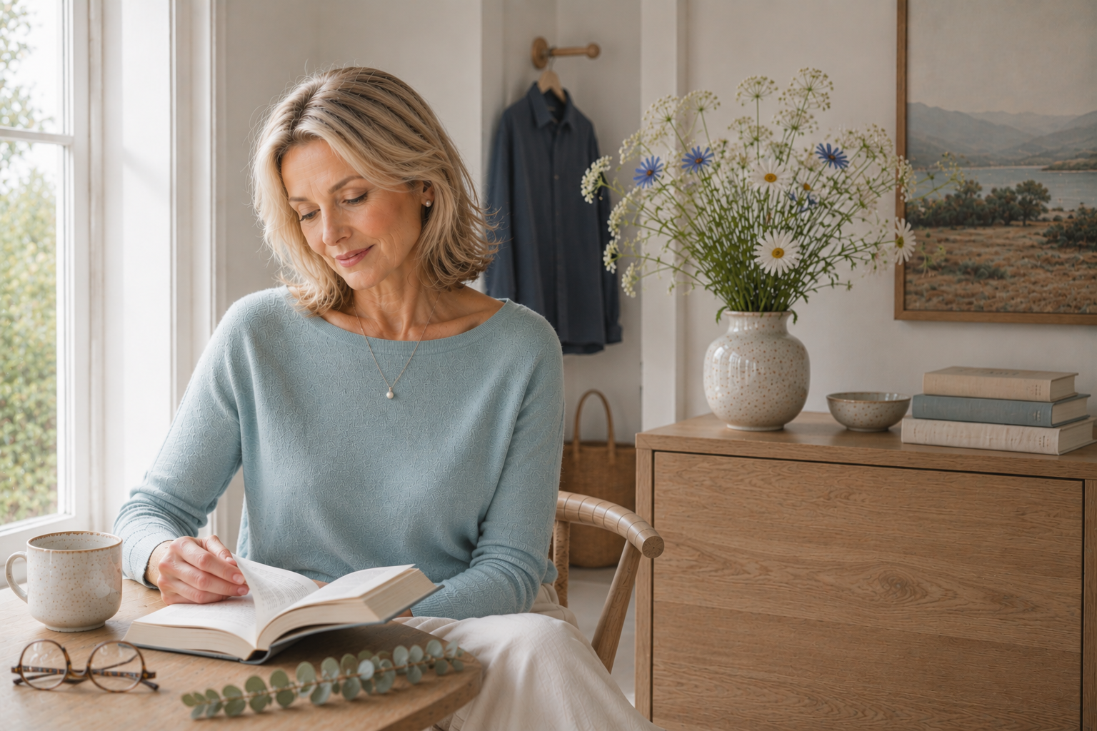
One of the loveliest parts of understanding your season is that getting dressed stops feeling like a chase. Trends lose their urgency. Instead of asking, “What’s in style right now?” you begin asking, “Does this feel like me?” For many Light Summers, that shift alone brings a surprising sense of ease.
The Light Summer palette naturally lends itself to a style that’s relaxed, refined, and quietly polished. It doesn’t rely on dramatic silhouettes or loud color combinations. Instead, its beauty comes from thoughtful details, graceful fabrics, and colors that blend together with effortless cohesion. The result is a wardrobe that looks elegant without ever feeling overdone.
Light Summer clothing feels most at home in natural fibers that move beautifully and soften with wear. Linen, lightweight cotton, silk, fine merino, cashmere, soft denim, and washed chambray all echo the palette’s understated character. Texture becomes part of the story—adding interest without needing bold contrast or busy patterns.
When it comes to prints, gentleness is key. Watercolor florals, subtle stripes, soft plaids, delicate botanicals, and low‑contrast patterns tend to feel more harmonious than large graphic designs. Prints shouldn’t dominate the outfit; they should settle into it, becoming one more layer of quiet beauty.
Contrast plays a meaningful role as well. While many wardrobes rely on stark pairings like black and bright white, Light Summers often look most balanced in softer combinations. Soft Navy with Pearl. Mushroom with Powder Blue. Seafoam with Light Dove Gray. These pairings create depth while preserving the calm elegance that defines the season.
Most importantly, a Light Summer wardrobe isn’t about owning more—it’s about choosing better. When your colors naturally coordinate, every new piece has the potential to work with what you already own. Over time, your closet becomes less crowded but far more versatile, making it easier to create polished outfits with very little effort.
If you’d like to see these principles come to life—through a beautifully curated wardrobe inspired by Scandinavian summer—my companion article, The Complete Light Summer Travel Capsule: Colors, Style & Travel Inspiration, explores how this palette translates into everyday dressing and travel with ease and intention.
Makeup for Light Summers
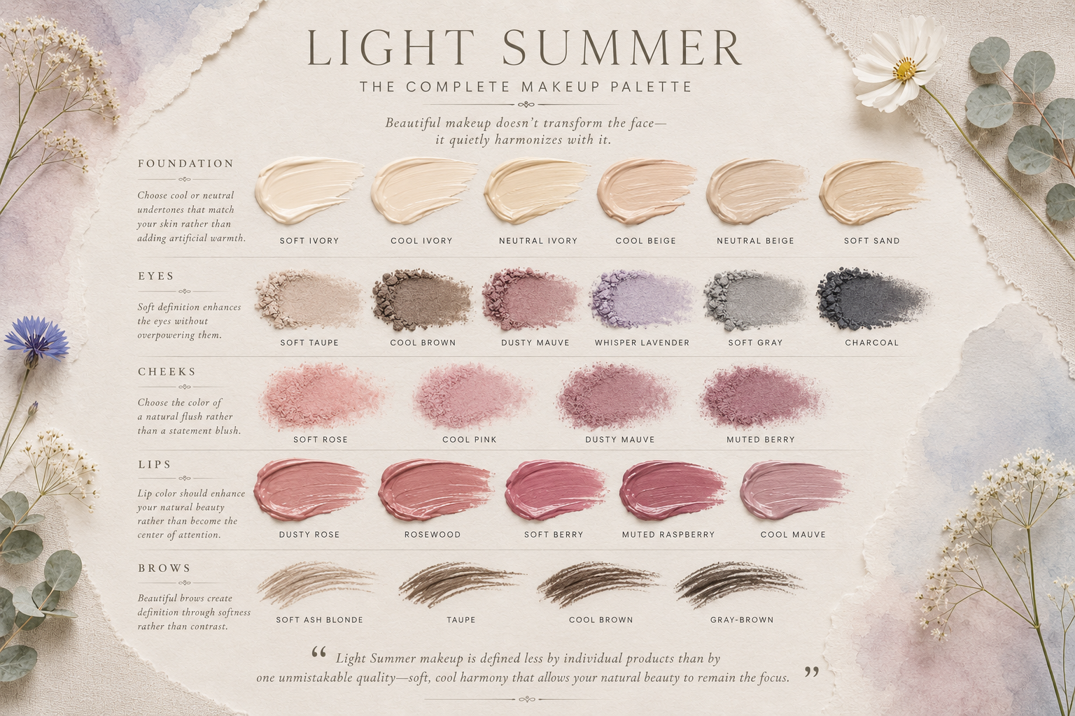
One of the loveliest surprises in discovering your seasonal palette is realizing that makeup doesn’t need to transform your features to be beautiful. For Light Summers, the goal is rarely drama—it’s to enhance the natural freshness and luminosity that already exist.
The most flattering makeup follows the same principles as the wardrobe: cool undertones, soft transitions, and gentle harmony. Think of Light Summer makeup as a watercolor painting—every shade blending seamlessly into the next, creating an effect that feels polished, effortless, and quietly radiant.
Foundation
Choose foundations with cool or neutral undertones that match your skin rather than trying to add warmth or an artificial bronze glow. A natural or satin finish tends to complement Light Summer’s soft complexion beautifully, allowing skin to look healthy and bright without appearing overly matte or overly dewy.
Eyes
Eyeshadow shades that echo the palette feel the most harmonious: soft taupe, cool brown, dusty mauve, muted lavender, gentle gray, and soft charcoal. These colors enhance the eyes without overwhelming them. Instead of harsh black liner, consider soft charcoal, slate, or cool brown—shades that define while preserving the palette’s signature softness.
Cheeks
Blush should recreate the look of a natural flush rather than making a statement. Soft rose, cool pink, dusty mauve, and muted berry tones add healthy color while blending effortlessly with the rest of your makeup. Cream formulas often create the most seamless, skin‑like finish.
Lips
Lip colors look their most flattering when they echo the palette’s gentle coolness. Dusty rose, cool pink, soft berry, rosewood, muted raspberry, and cool mauve all complement Light Summer beautifully. These shades enhance your natural lip color while bringing quiet balance to the face rather than becoming the center of attention.
Brows
Brows frame the face best when they follow your natural coloring. Soft ash blonde, taupe, cool brown, or gray‑brown shades often create the most harmonious result—defined enough to shape the face, but never so dark that they overpower your features.
The Overall Effect
The most beautiful Light Summer makeup is often the makeup people don’t immediately notice. Instead, they notice that your complexion looks fresh, your eyes appear brighter, and your features feel balanced. The colors work quietly in the background, allowing you to remain the focal point.
Seasonal color analysis isn’t about wearing more makeup—it’s about choosing shades that work in harmony with your natural coloring. Often, it's the smallest adjustments that make the biggest difference.
The Best Hair Colors for Light Summers
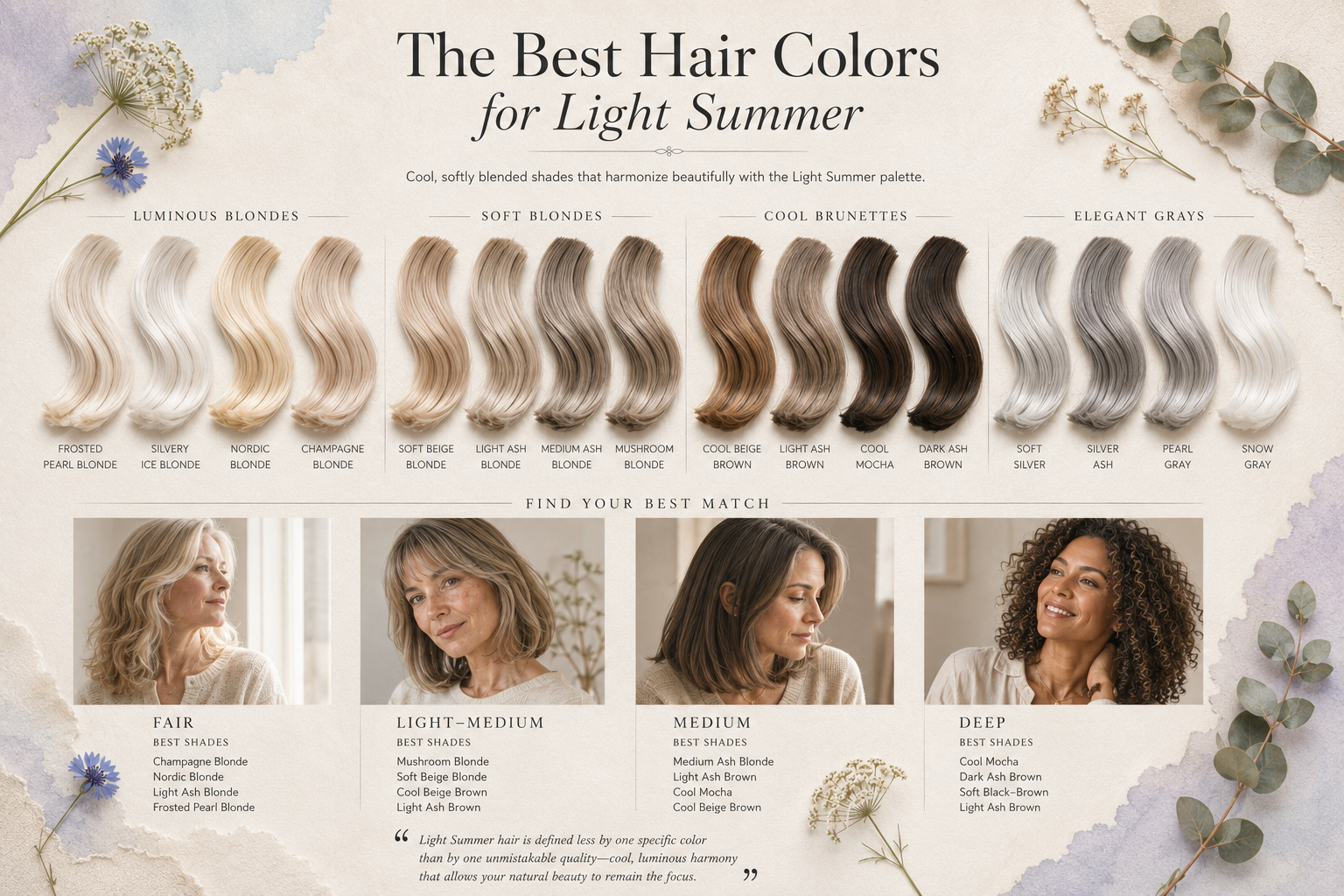
One of the unexpected gifts of understanding your seasonal palette is realizing why certain hair colors have always felt more “you” than others. Trends come and go, but the shades that harmonize with your natural coloring tend to feel timeless—like they’ve quietly belonged all along.
For Light Summers, the most flattering hair colors share the same qualities as the palette itself: cool, light, and softly blended. Instead of dramatic depth or bold warmth, these shades create effortless harmony, allowing your features—not your hair color—to remain the focus.
Blonde
Light Summer is one of the seasons that wears cool blonde beautifully. Ash blonde, champagne blonde, beige blonde, soft pearl blonde, and light sandy blonde all echo the palette’s luminous softness. These shades feel fresh, refined, and naturally elegant—never brassy, never heavy.
Brunette
If your natural coloring leans brunette, cooler tones are often the most flattering. Light ash brown, mushroom brown, cool mocha, and soft taupe brown add gentle definition while preserving the palette’s signature softness. They deepen your look without weighing it down.
Embracing Gray
Many Light Summers discover that gray hair feels surprisingly natural—almost inevitable in the best way—because silver already exists within the palette. Soft silver, pearl gray, and cool white‑gray blend beautifully with Light Summer skin tones, creating an elegant transition that feels authentic rather than abrupt.
If you choose to embrace your natural gray, supporting it with a wardrobe and makeup palette that share the same cool, luminous qualities creates a beautifully cohesive look.
Hair Colors to Consider Carefully
While personal preference always matters, some shades can overpower the delicate balance that makes Light Summer so flattering.
Colors that often feel too warm, too deep, or too high in contrast include:
Golden blonde
Honey blonde
Copper
Auburn
Rich caramel
Warm chestnut
Espresso brown
Blue‑black
High‑contrast highlights
These deeper or warmer tones can compete with your natural coloring, making the complexion appear less fresh and the overall look feel heavier than intended.
The Overall Effect
The goal isn’t to chase the “perfect” hair color—it’s to choose one that feels like it naturally belongs with you. When your hair, wardrobe, and makeup share the same gentle harmony, the result is beautifully understated. People may not notice your hair color first. They’ll notice that you look rested, radiant, and effortlessly put together.
Like every part of the Light Summer palette, the most flattering hair colors don't compete with your natural beauty. They simply allow it to shine.
The Best Nail Colors for Light Summers
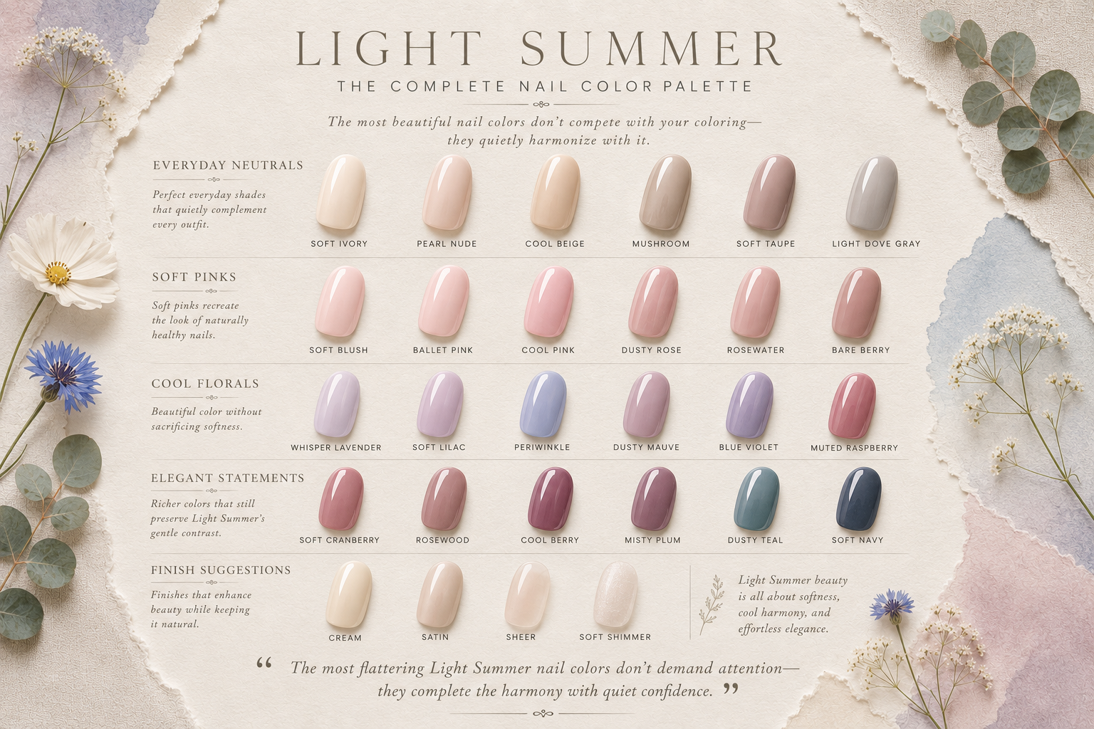
One of the simplest—and most overlooked—ways to bring your seasonal palette into everyday life is through your manicure. Nail color may seem like a small detail, but it has a surprisingly powerful effect because your hands are always in motion, always visible. When your polish harmonizes with your natural coloring, the whole look feels more polished, cohesive, and quietly elegant.
Like every part of the Light Summer palette, the most flattering nail shades are cool, light, and softly muted. They don’t shout. They don’t compete. They add a gentle finishing touch that supports both your wardrobe and your natural coloring.
Everyday Neutrals
These are the shades you’ll reach for again and again—timeless, understated, and beautifully aligned with the Light Summer aesthetic.
Ballet Pink
Cool Blush
Petal Pink
Soft Pearl
Soft Greige
Cool Taupe
Dove Gray
Milky White
Classic French Manicure (with a cool pink base)
These colors create a clean, refined manicure that never distracts from the rest of your look.
Fresh Summer Shades
When you want a little more color, Light Summer offers plenty of options that still feel soft and wearable.
Light Powder Blue
Dusty Blue
Soft Aqua
Seafoam
Cool Mint
Periwinkle
Pastel Lavender
Pale Chiffon Yellow
These hues capture the airy, luminous feeling of the season while remaining gentle enough for everyday wear.
Elegant Statement Colors
Even bolder shades can feel beautifully balanced when they stay within the Light Summer palette.
Dusty Rose
Muted Raspberry
Soft Berry
Cool Cranberry
Watermelon Pink
Cool Mauve
Soft Coral
These colors add quiet sophistication—perfect for evenings, special occasions, or cooler months when you want a touch more depth without sacrificing harmony.
Colors to Consider Carefully
Some shades can feel disconnected from Light Summer’s gentle balance. You may find these tones less flattering:
Orange Coral
Pumpkin
Gold
Warm Chocolate Brown
Black
Neon Pink
Bright Turquoise
Warm Tomato Red
Olive Green
Bright Fuchsia
This doesn’t mean you can never wear them. If a color brings you joy, enjoy it. Seasonal color analysis isn’t about restriction—it’s about understanding which shades naturally create the most harmony.
The Overall Effect
The most flattering Light Summer manicure rarely announces itself. Instead, it quietly supports everything else you’re wearing. Your nail color feels as though it belongs with your skin tone, your jewelry, your wardrobe, and your overall style.
Like every element of the Light Summer palette, the goal isn’t perfection—it’s cohesion. When every detail works together, even something as simple as your manicure becomes part of a beautifully harmonious whole.
Jewelry & Gemstones for Light Summer
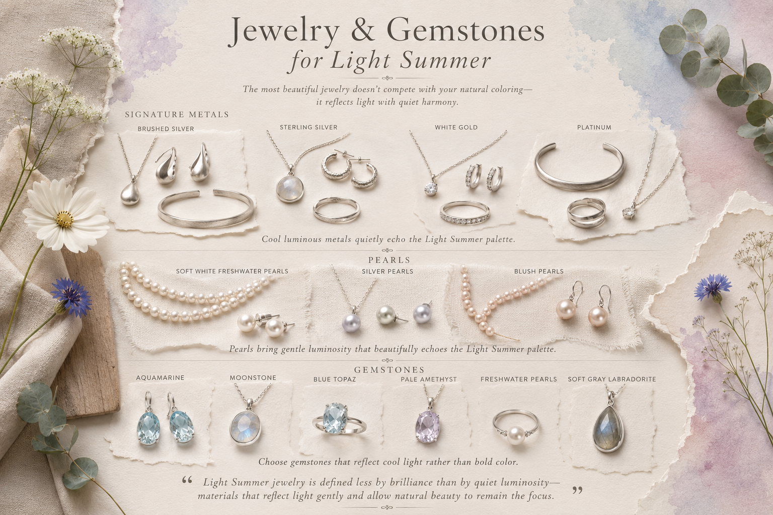
Jewelry is often the final touch that brings an outfit to life. Even though it seems small, the right metal can brighten your complexion, echo your natural coloring, and reinforce the effortless harmony that defines the Light Summer palette.
For Light Summers, the most flattering pieces share the same qualities as the palette itself: cool, light, and softly refined. Think of jewelry less as a statement and more as a quiet accent—adding light, texture, and elegance without ever competing for attention.
Silver
Silver is the natural signature metal for Light Summer. Its cool, luminous sheen mirrors the palette’s undertones and pairs beautifully with nearly every color you wear. Whether it’s a delicate chain or sculptural earrings, silver feels fresh, timeless, and effortlessly sophisticated.
White Gold
White gold offers the same cool elegance with a slightly more polished finish. It’s a wonderful choice for everyday pieces, engagement rings, and classic investment pieces that remain beautiful for years to come.
Platinum
For those who appreciate understated luxury, platinum complements Light Summer beautifully. Its naturally cool tone and soft sheen create a refined look that never feels ornate or flashy—just quietly exquisite.
Pearls
Few materials capture the spirit of Light Summer as perfectly as pearls. Soft white, silver, and blush pearls reflect light gently, bringing luminosity to the face while echoing the palette’s graceful simplicity. Whether worn as classic studs, a delicate pendant, or a modern layered necklace, pearls feel timeless rather than traditional.
Choosing Stones
Gemstones look their most harmonious when they reflect the cool, airy character of the season. The most beautiful gemstones for Light Summer echo the same cool, luminous softness found throughout the palette. Consider:
Aquamarine
Moonstone
Blue Topaz
Pale Amethyst
Freshwater Pearls
Soft Gray Labradorite
These subtle shades enhance the palette without introducing unnecessary contrast or warmth.
Jewelry to Consider Carefully
Some metals and finishes can feel heavier against Light Summer coloring. You may find these tones less flattering:
Bright Yellow Gold
Copper
Brass
Heavy Oxidized Metals
Oversized, high‑contrast statement pieces
This doesn’t mean you can’t wear them. If a piece is meaningful or brings you joy, enjoy it. Pairing warmer metals with Light Summer colors often softens the effect and creates a more balanced look.
The Overall Effect
The most flattering Light Summer jewelry rarely becomes the focal point. Instead, it catches the light in quiet, thoughtful ways—adding a finishing touch that feels elegant rather than excessive.
Like every other element of the Light Summer palette, jewelry works best when it supports your natural beauty instead of competing with it. When your wardrobe, makeup, hair, nails, and accessories all share the same gentle harmony, the result is a style that feels timeless, effortless, and unmistakably your own.
Common Styling Mistakes Light Summers Make
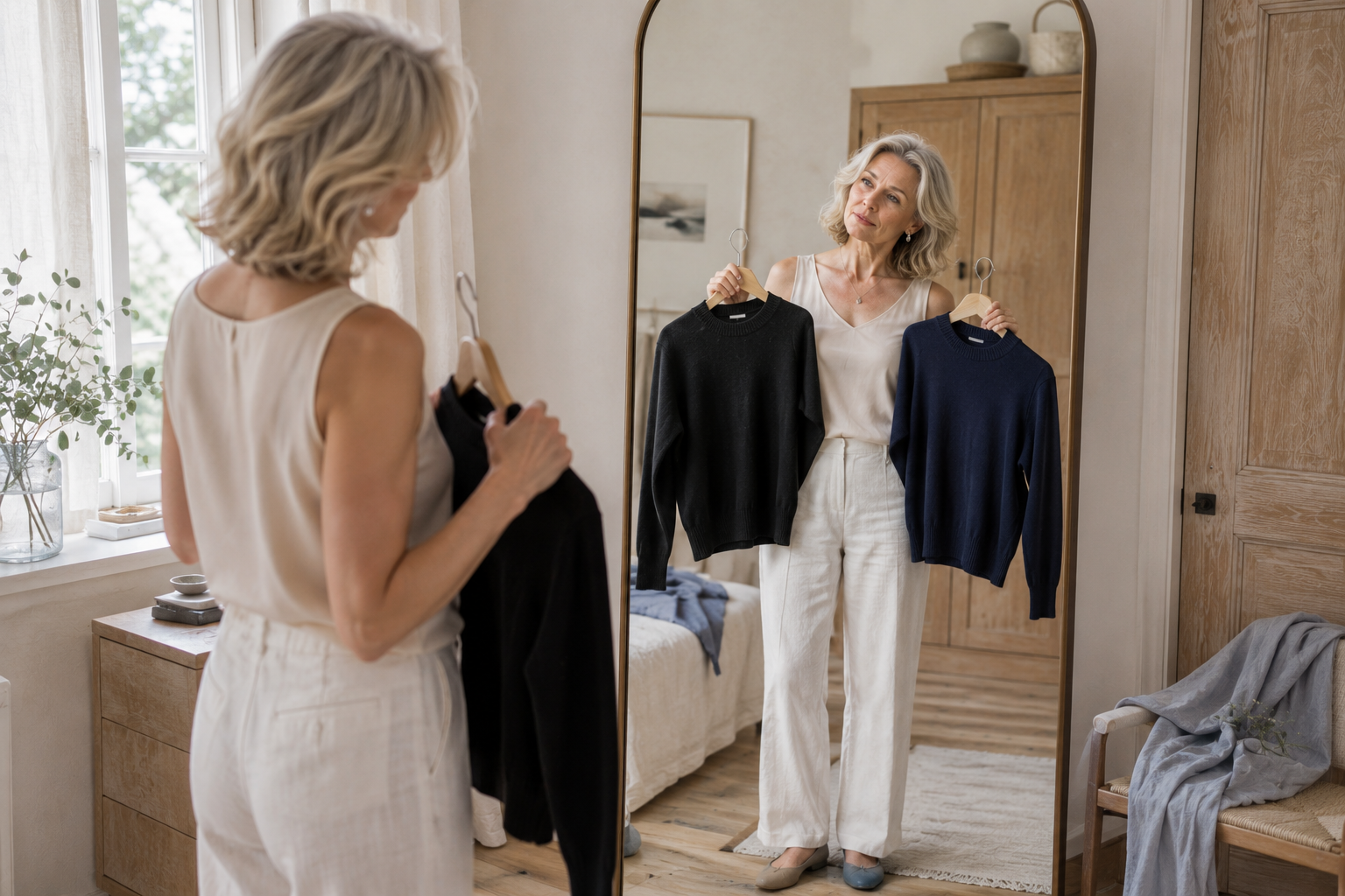
The beauty of seasonal color analysis is discovering that looking your best rarely requires a complete wardrobe overhaul. More often, it’s about small, intentional shifts that let your natural coloring shine.
If you’re a Light Summer, you’ve likely worn many of the colors or styles below—and that’s completely normal. These aren’t “fashion mistakes.” They’re simply choices that can compete with the quiet, airy harmony that makes the Light Summer palette so special.
Wearing Black Instead of Soft Navy
Black is a universal staple, but on Light Summers it often feels too sharp and heavy. Soft Navy offers the same practicality while blending more gently with your natural softness.
Choosing Warm Neutrals
Camel, golden beige, rust, and chocolate brown introduce warmth that sits outside the Light Summer range. Cooler neutrals—Mushroom, Weathered Stone, Pearl, Light Dove Gray—create a fresher, more balanced look that supports your coloring rather than competing with it.
Wearing Highly Saturated Colors
Bright fuchsia, electric cobalt, vivid turquoise, and neon tones can overpower Light Summer’s delicate undertone. Muted, softened versions of these shades still bring personality to an outfit but in a way that feels harmonious rather than loud.
Creating Too Much Contrast
High‑contrast combinations—black with stark white, or very dark paired with very light—tend to pull focus away from your features. Light Summer shines in gentle transitions, where colors flow softly from one to the next.
Choosing Heavy Makeup
Strong contouring, bold brows, dark eyeliner, and intense lip colors can overshadow Light Summer’s natural freshness. Soft definition, blended edges, and airy color usually create a more radiant, effortless effect.
Overlooking Texture
An outfit made entirely of smooth fabrics or highly polished accessories can feel flat. Light Summer comes alive with subtle texture: linen, soft cotton, cashmere, brushed metals, woven leather, washed denim. These textures add quiet dimension and help create the relaxed refinement that feels so characteristic of the Light Summer palette.
Thinking You Have to Follow Every Rule
The biggest misconception is believing seasonal color analysis demands perfection. It doesn’t.
Your palette is a guide—not a restriction. If you adore a color outside Light Summer, wear it. Pair it with your best neutrals, keep it away from your face, or use it as an accent rather than a main piece.
The goal isn't to remove joy from getting dressed. It's to help your wardrobe feel more intentional, more cohesive, and more authentically you.
How Does Light Summer Compare to the Other Summer Seasons?
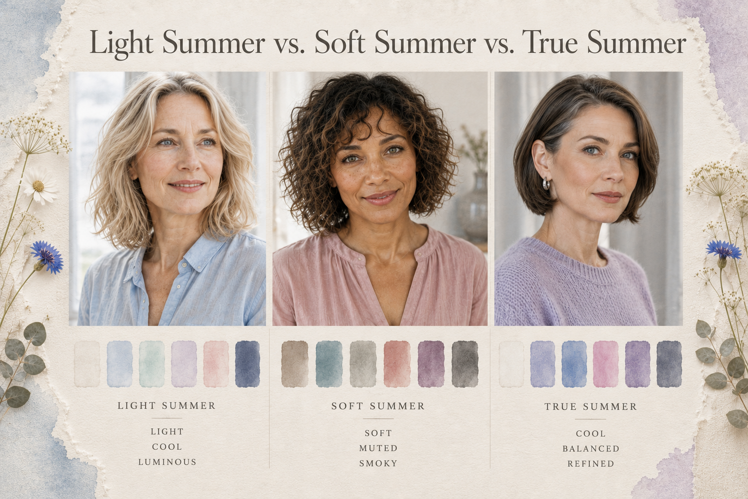
All three Summer seasons share one important characteristic: they're cool-toned. What distinguishes them is the quality that takes center stage within the palette. Understanding those differences can make identifying your season much easier.
Light Summer
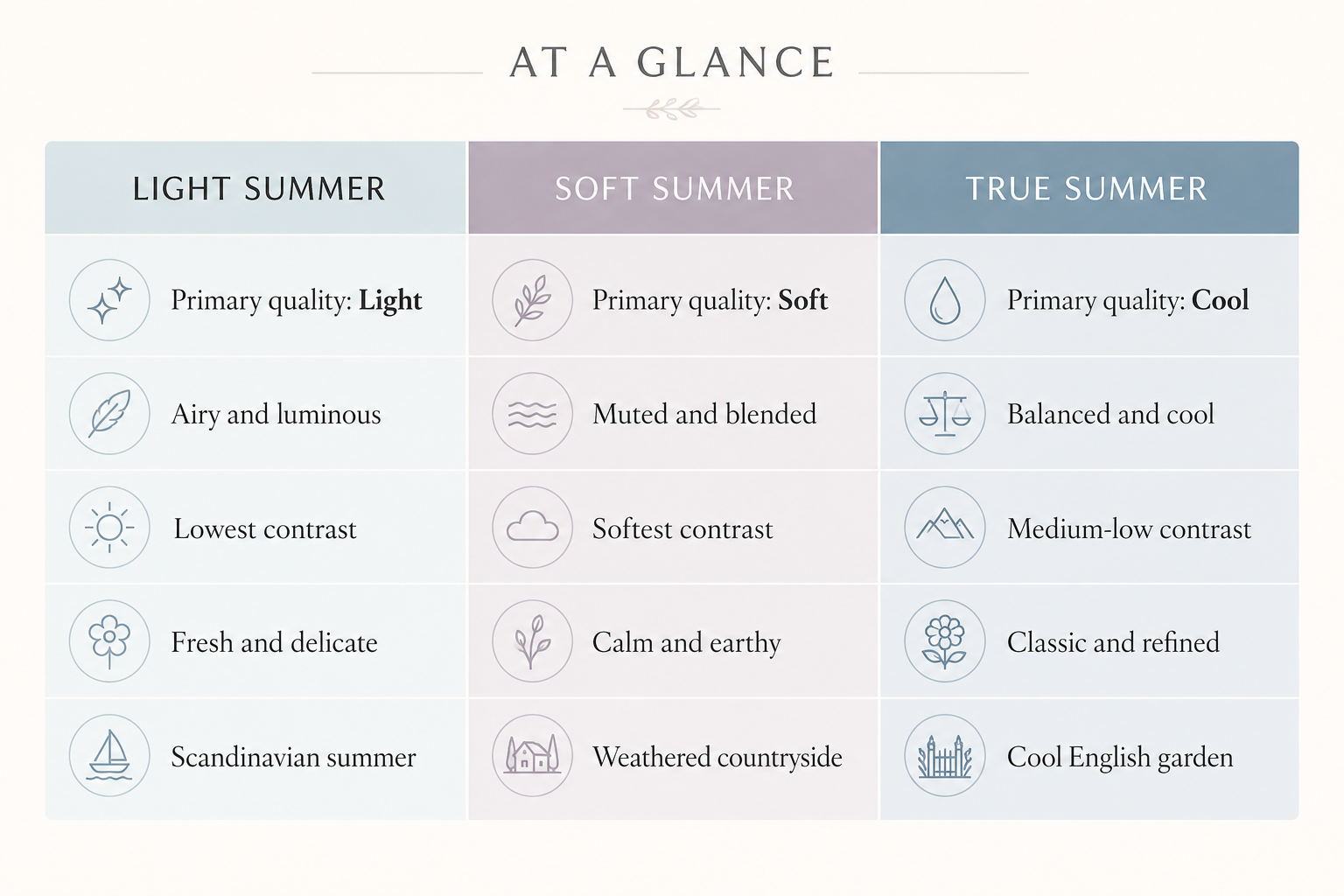
Light Summer is defined primarily by lightness.
Its colors are airy, luminous, and delicate, creating a fresh, effortless feeling. Contrast is low, and the overall impression is soft, bright, and graceful. Think pale blue skies, sea glass, linen, and the gentle light of a Scandinavian summer morning.
Soft Summer
Soft Summer is defined primarily by softness.
While it remains cool, its colors are more muted and slightly deeper than Light Summer. The palette has a gentle, smoky quality inspired by weathered landscapes, eucalyptus, faded denim, and dusty rose. The overall effect is relaxed, understated, and quietly sophisticated.
True Summer
True Summer is defined primarily by coolness.
Unlike Light Summer's airy brightness or Soft Summer's muted softness, True Summer sits at the very heart of the Summer family. Its colors are cool, balanced, and classically elegant, with slightly more saturation than Soft Summer and more depth than Light Summer. The palette evokes hydrangeas, lavender fields, cool rain, blue-gray skies, and polished silver.
If you're still deciding which Summer palette feels most like you, don't worry. Many women find themselves identifying with more than one season before recognizing the subtle differences. The good news is that all three palettes share a similar sense of effortless elegance, making them some of the easiest wardrobes to build over time.
For a more detailed side-by-side comparison, be sure to explore my companion guides:
Soft Summer vs. Light Summer
Light Summer vs. True Summer(coming soon)
Soft Summer vs. True Summer(coming soon)
Frequently Asked Questions About Light Summer
Can Light Summers Wear Black?
Yes—though it’s rarely the most flattering neutral.
Black often creates more contrast than Light Summer coloring naturally supports, which can make it feel a bit harsh against the complexion. If you enjoy wearing black, you don’t need to give it up. Try wearing it farther from your face or softening it with Light Summer-friendly accents like a scarf, necklace, or jacket in Soft Navy, Pearl, or Powder Blue.
For everyday dressing, Soft Navy offers the same versatility with a much gentler, more harmonious effect.
Can Light Summers Wear White?
Absolutely.
The key is choosing the right white. Optic white can feel too crisp and stark, while Soft White, Pearl, and cool creamy whites blend beautifully with the palette’s natural softness.
These gentler whites brighten the complexion without creating unnecessary contrast.
Can Light Summers Wear Warm Colors?
Yes—but they tend to be most flattering when they're softened and balanced. Pale Chiffon Yellow, Soft Coral, and certain muted pinks offer a gentle touch of warmth without overpowering the cool harmony of the Light Summer palette. Tomato red, rich oranges, mustard, rust, and golden browns are usually more challenging because they introduce warmth that isn't naturally present in Light Summer coloring.
Can Light Summers Wear Gold?
Yes—many do.
Silver, white gold, and platinum naturally complement Light Summer’s cool undertones, but yellow gold can still work, especially if it holds sentimental value or simply feels like “you.”
If you prefer gold, choose soft, light yellow gold rather than deep, saturated tones. Pairing gold with Light Summer colors also helps maintain overall balance.
Can Light Summers Wear Denim?
Yes—and denim is one of the easiest fabrics to fit into a Light Summer wardrobe.
The most flattering washes are light wash, soft medium wash, and cool gray denim. These tones sit comfortably within the palette and pair effortlessly with nearly every Light Summer color.
Very dark indigo or heavily distressed denim can sometimes create more contrast than Light Summer typically supports.
Do I Have to Wear Only Light Summer Colors?
Not at all.
Seasonal color analysis is a guide—not a rulebook. It helps explain why certain colors feel especially harmonious, but it should never limit your creativity or personal expression.
If a color makes you feel confident and happy, wear it. You can always incorporate it thoughtfully—farther from your face, in accessories, or balanced with your best Light Summer neutrals.
The goal isn’t perfection. It’s making your wardrobe feel easier, more intentional, and more authentically you.
Final Thoughts
What I love most about seasonal color analysis is that it isn’t really about rules at all—it’s about understanding yourself more deeply.
When you discover the colors that naturally echo your own features, getting dressed becomes less about chasing trends or second‑guessing your choices. Instead, it becomes an exercise in alignment—choosing pieces that feel like an extension of who you already are. That quiet confidence extends far beyond your closet. It simplifies decisions, brings intention to what you buy, and allows your personal style to evolve with ease rather than pressure.
Light Summer shows us that elegance doesn’t need to be bold to be memorable. There is beauty in softness, in luminosity, in thoughtful restraint, and in colors that complement rather than compete. It’s a palette built on harmony—not just in what you wear, but in how you move through the world.
My hope is that this guide has helped you see Light Summer as more than a collection of swatches. I hope it’s given you insight into why certain shades have always felt instinctively right, why others never quite settled, and how small, intentional choices can shape a wardrobe that feels both timeless and deeply personal.
If you’re ready to explore further, I’ve created companion guides to help you put these ideas into practice—from building a beautifully coordinated travel capsule wardrobe to diving deeper into Light Summer colors, comparisons, and styling inspiration.
Wherever you are on your style journey, remember this: your best colors aren’t meant to change you. They’re simply there to help you feel even more like yourself.
Shop the Light Summer Guide
One of the most rewarding parts of discovering your seasonal palette is realizing that you don't need more—you simply need pieces that work beautifully together.
The following collection includes timeless wardrobe staples, beauty essentials, jewelry, and home inspiration that reflect the cool, soft, luminous harmony of the Light Summer palette. Rather than chasing trends, these are the kinds of pieces that quietly earn their place in your wardrobe and become favorites for years to come.
Modern Wardrobe Essentials
Build a wardrobe that feels effortlessly coordinated with beautifully made basics in cool, luminous neutrals.
Jewelry That Complements Light Summer
The right jewelry reflects light rather than demanding attention.
Look for cool metals and softly luminous gemstones.
Beauty Favorites
Soft, cool makeup enhances your natural coloring while allowing your skin to remain the focus.
Makeup
Brushes
Nails
Choose colors that quietly harmonize with your natural coloring.
Beautiful Accessories
The Light Summer palette extends beyond clothing.
Even everyday accessories can reinforce the same sense of harmony.
Style Inspiration
Continue exploring color analysis.
Editor's Note
Seasonal color analysis isn't about replacing everything you own overnight. It's about learning to recognize the colors, textures, and materials that already feel like home.
Over time, every thoughtful addition makes getting dressed a little easier, every outfit feels a little more harmonious, and your wardrobe gradually becomes a reflection of your natural beauty rather than the latest trend.
